
Charm in the Center of Our Home + Helpful Tidbits
Written by Bethany Curee, God’s Daughter – Freckled & Free
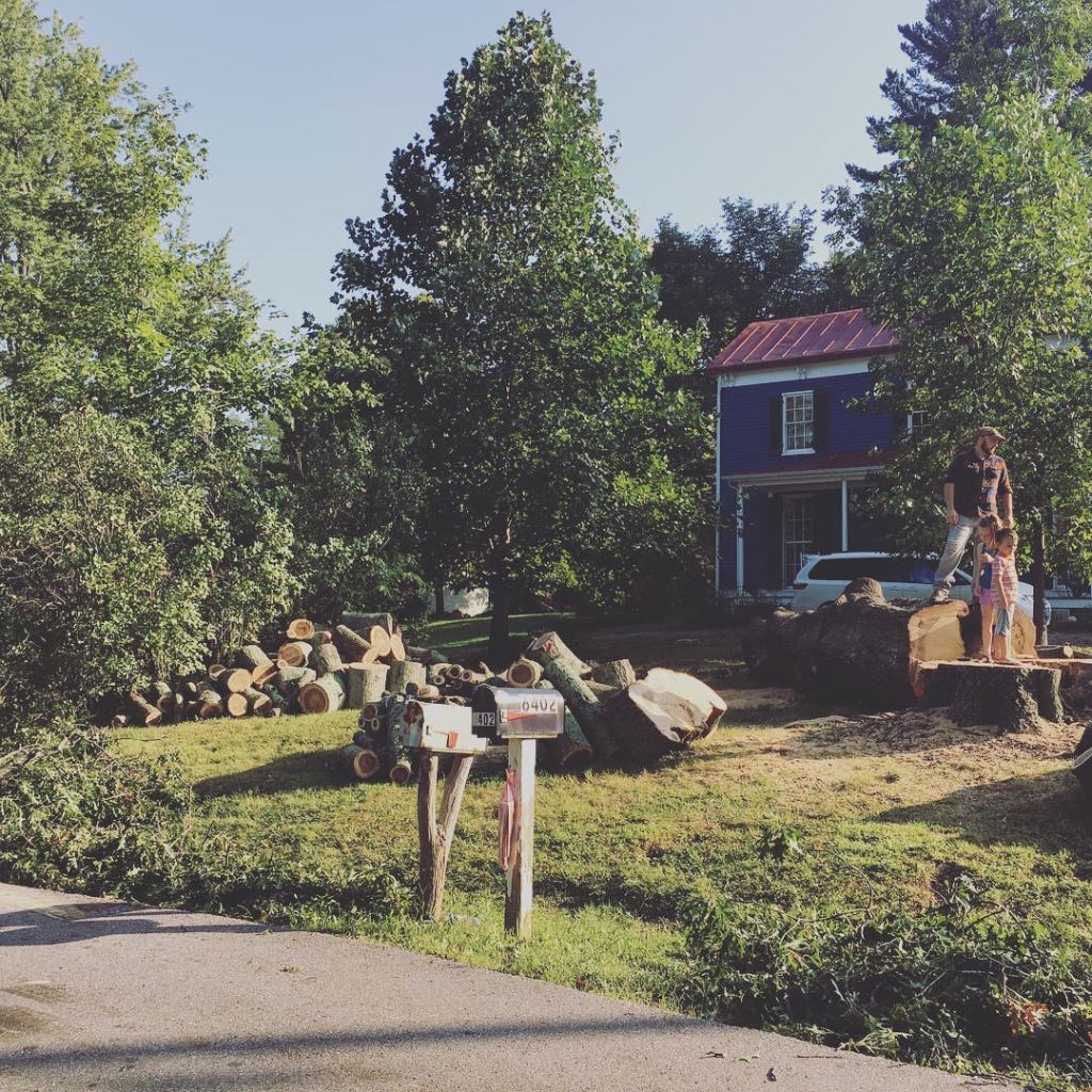
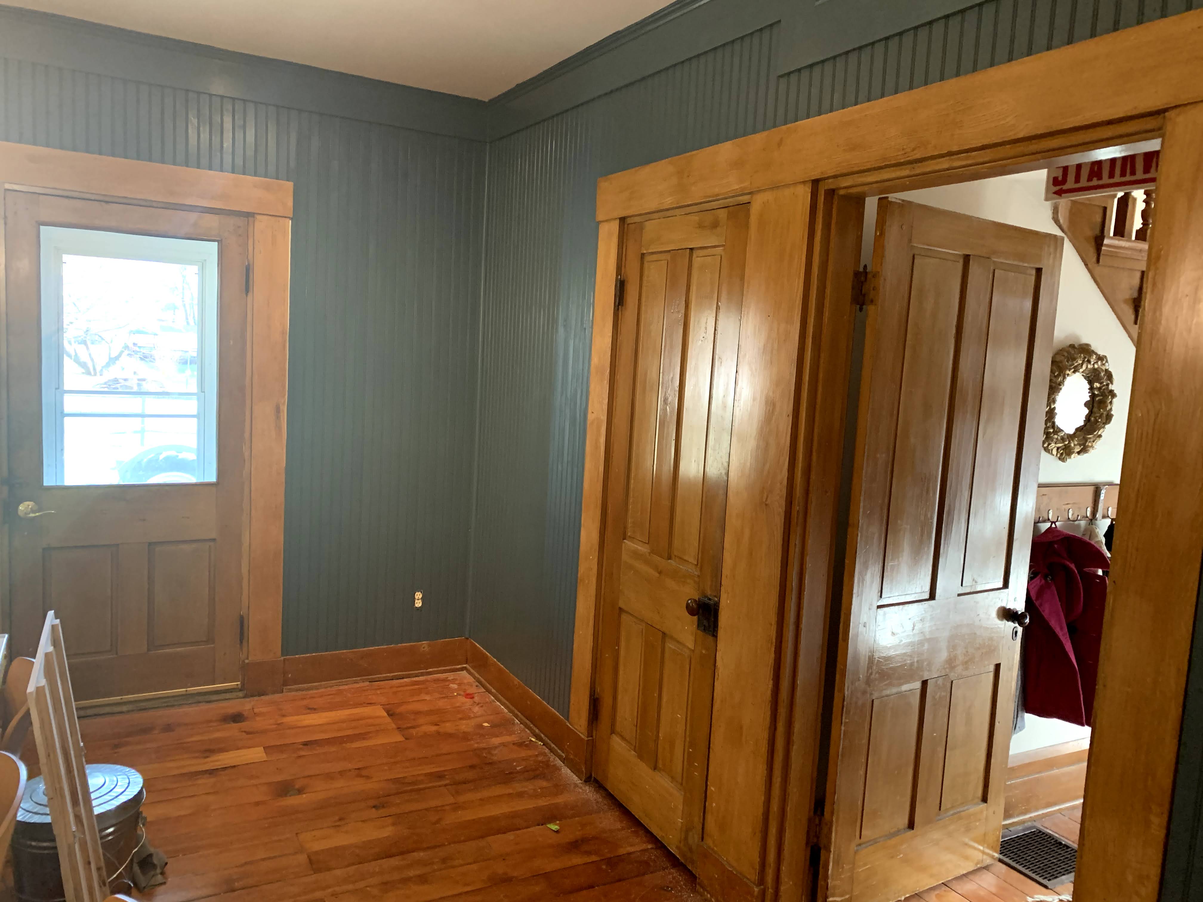
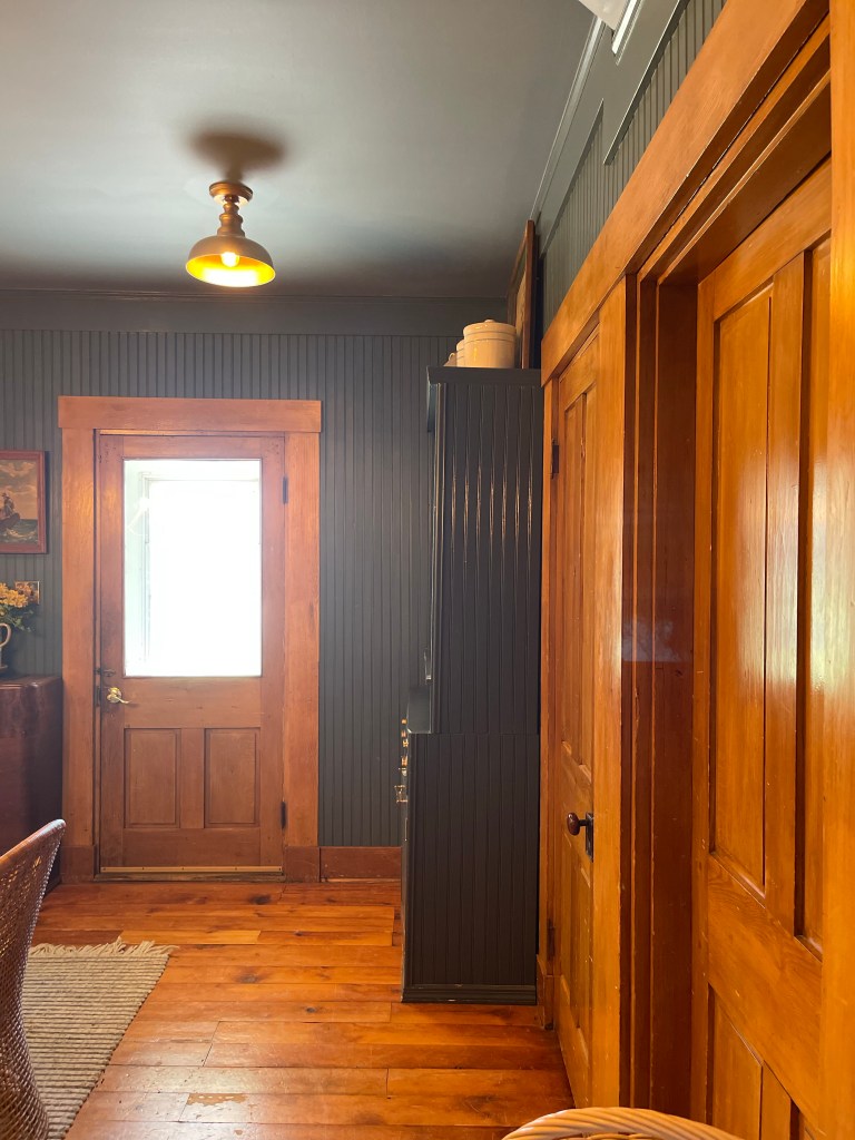
When living in our 1855 historical home our life was crazy. So I’m sure you won’t be surprised to know that it too took quite some many years before even getting to lay a fingerprint of design on her. I had a lot of time to think about what made sense for the oh-so-special dining room of our home. Laying smack dab in the center of our house, it was the hub for all traffic. It led to the kitchen, back porch and yard, or it could lead you to the side porch and side yard, or to the one downstairs bathroom, hall and washroom; or perhaps to the basement and the living room and even to the front hall which would take you either upstairs, or out the front door. Sheesh. That’s a crazy amount of touch points.
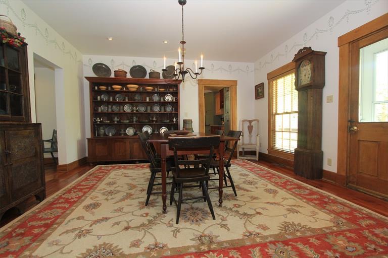
This nucleus of our well loved home needed to be the anchor. The grounding place. Setting the tone for the rest of the house with the ability to flow from all viewpoints due to the multiple rooms that it encountered. It most importantly had to flow into the kitchen as the rooms sort of had to exist together. By our choice of course (you will see that later). I wanted it to plank our home just right. To establish. Setting the foundation of our home as strong, honorable, homey, collected and rich in beauty. A place where all the pieces told a story of a well loved home.
THE CREATION PROCESS
Frankly, as our world spun around us, I quietly dreamed and dreamed, and thought. Researched and sketched. Lived in the space, utilized the space on an everyday basis and began to gather the inspiration I was pondering up. Sometimes losing sleep with the latest idea on what I was going to do.
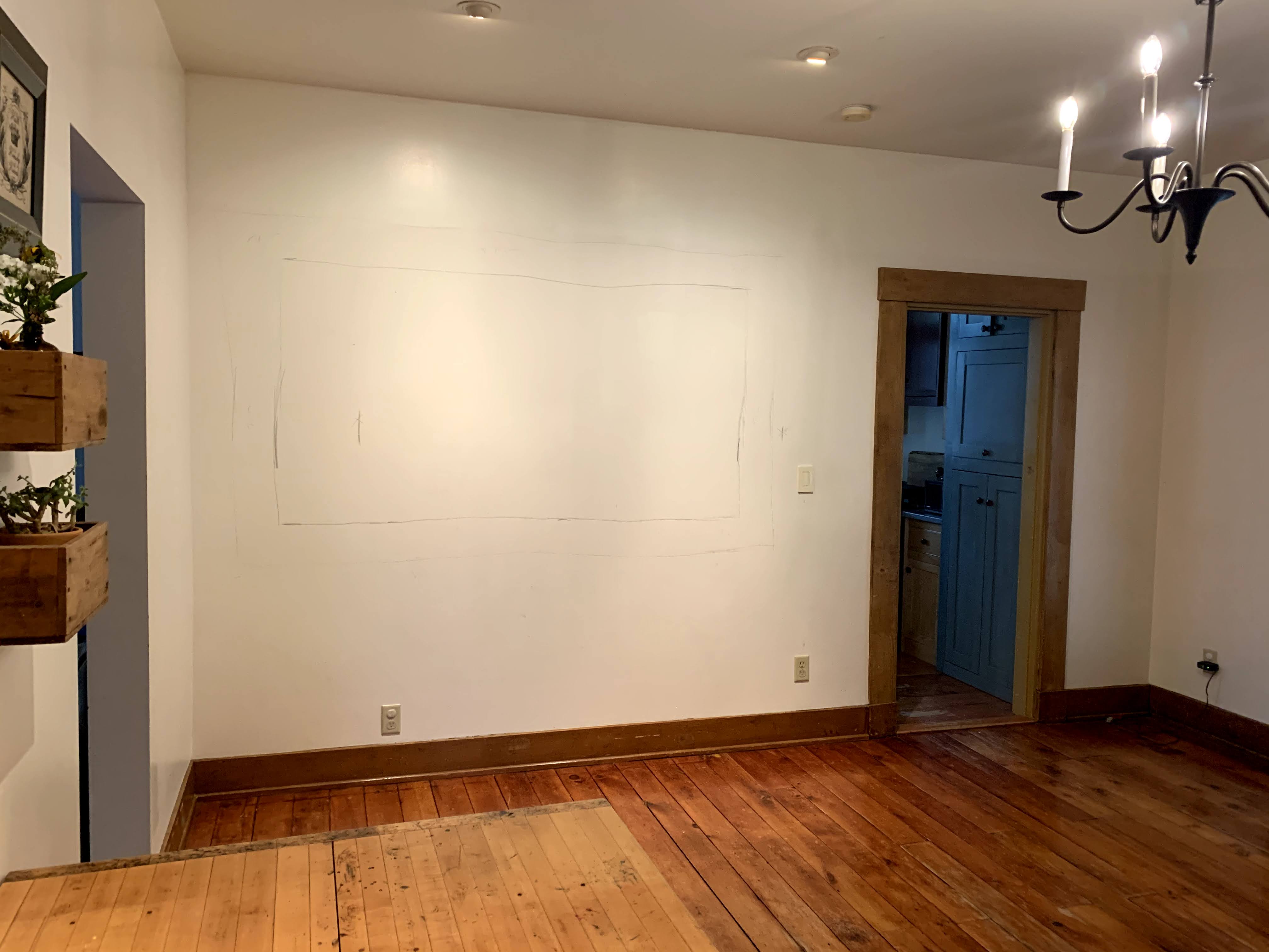
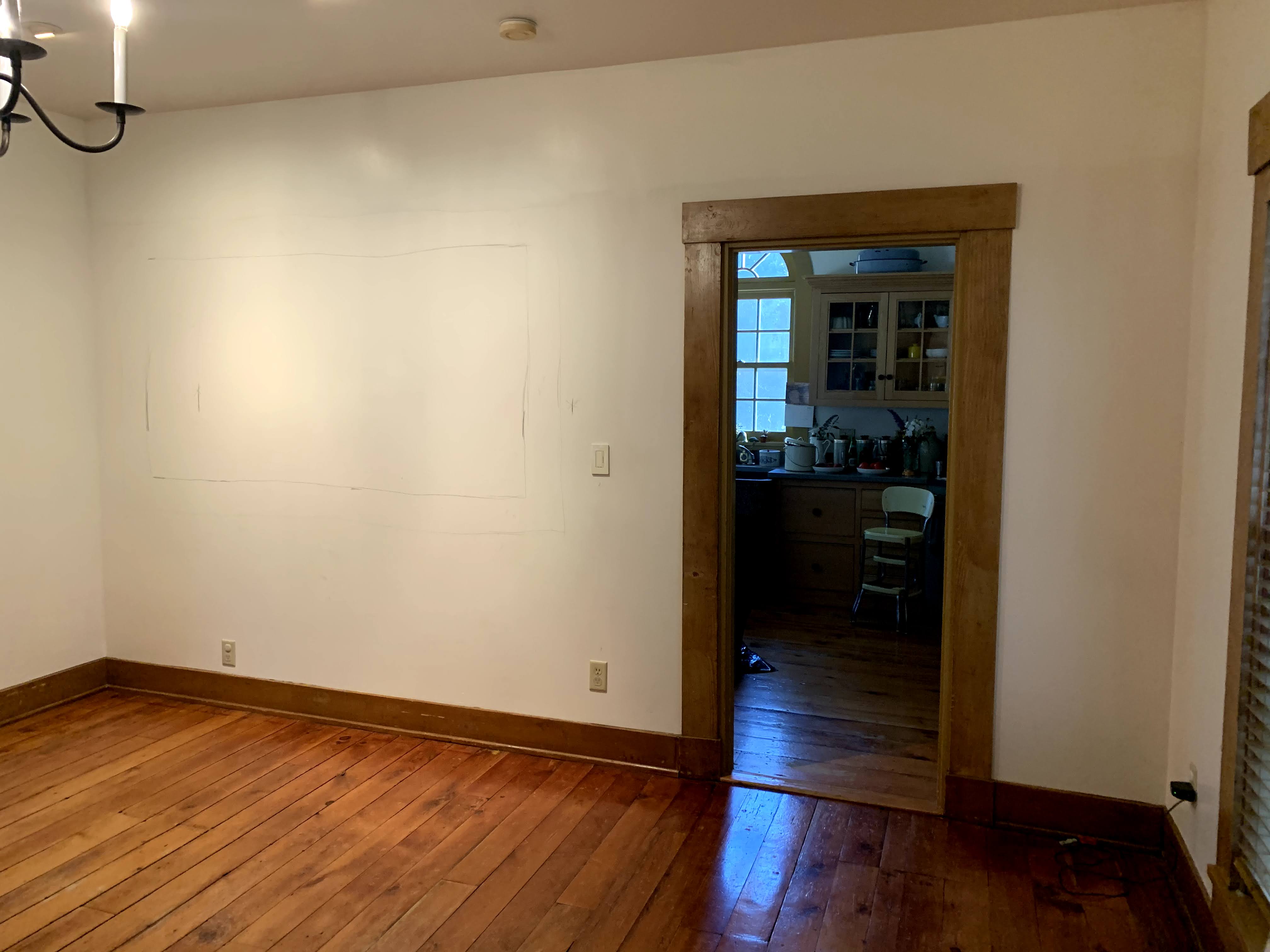
My first “mock up” utilized some epic antique wooden barn doors we had scored that we originally planned to use on a pole barn we were going to build. We knew that wasn’t turning out so I was determined to use them. I sketched up a test wallpaper to get the feel for it in the room with some of the concepts I had in mind for the space initially.
I spent a lot of time looking for that perfect wallpaper, that perfect pattern and color. After sometime, however, I knew this wasn’t right for the middle of our home. I really wanted a wallpaper—but felt for the center of the home I needed a color with depth to bring it all together. In this space wallpaper would have been too busy for its needs. Allowing myself time to reflect on that made it obvious. Wallpaper was coming baby, but not in this room.
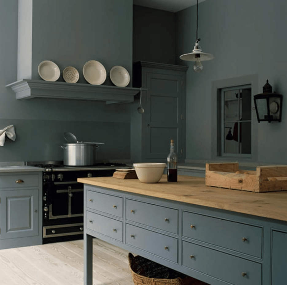
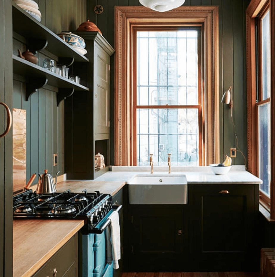
There were many ideas that felt right, but I eventually squashed them. The more I lived in the space, the more I understood what design it truly needed. I was strongly inspired by color drenching. Enveloping the entire space in similar hues that almost looked one. Some of my inspiration came from these stunning examples below by Plain English Design and Farmhouse on Boone.
Dreamy right? Before we could get to that dreamy stuff though, we had to nail down the function of the space.
FUNCTION OF THE SPACE
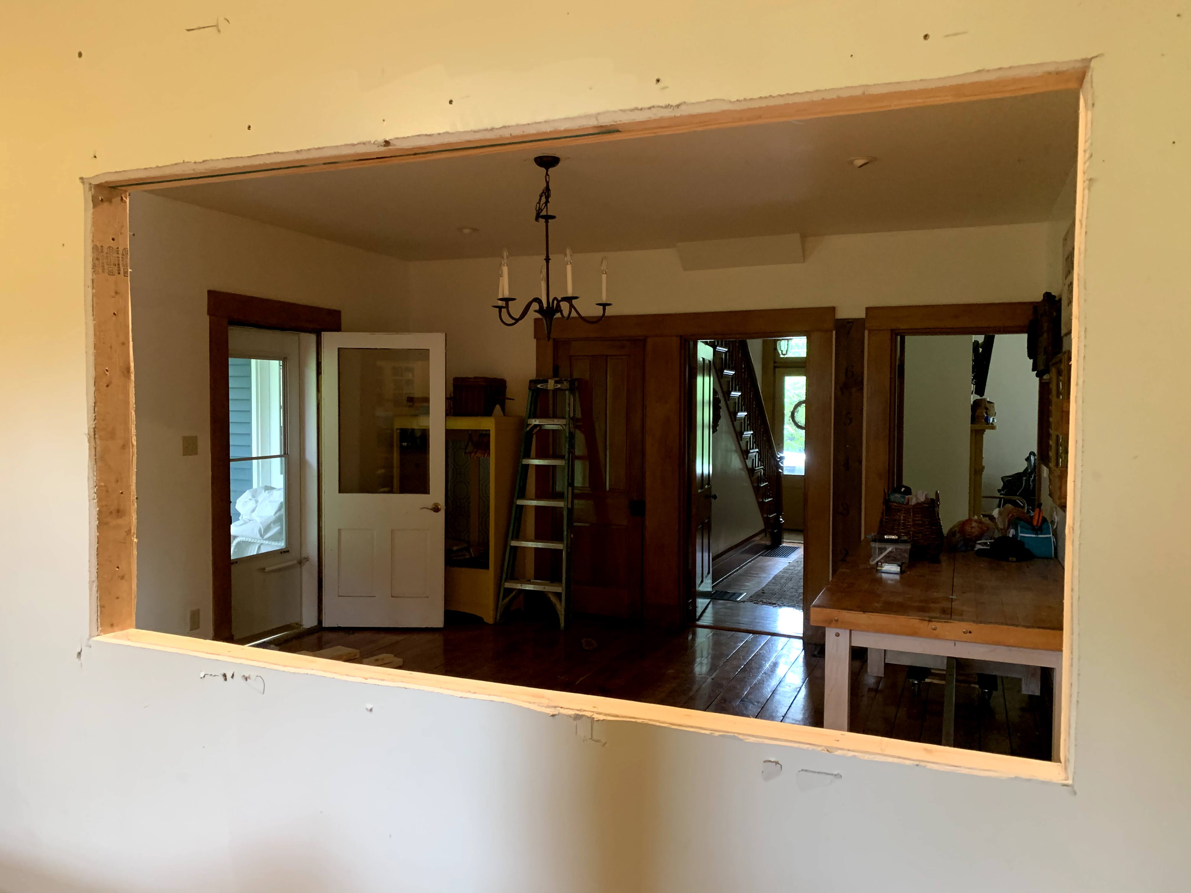
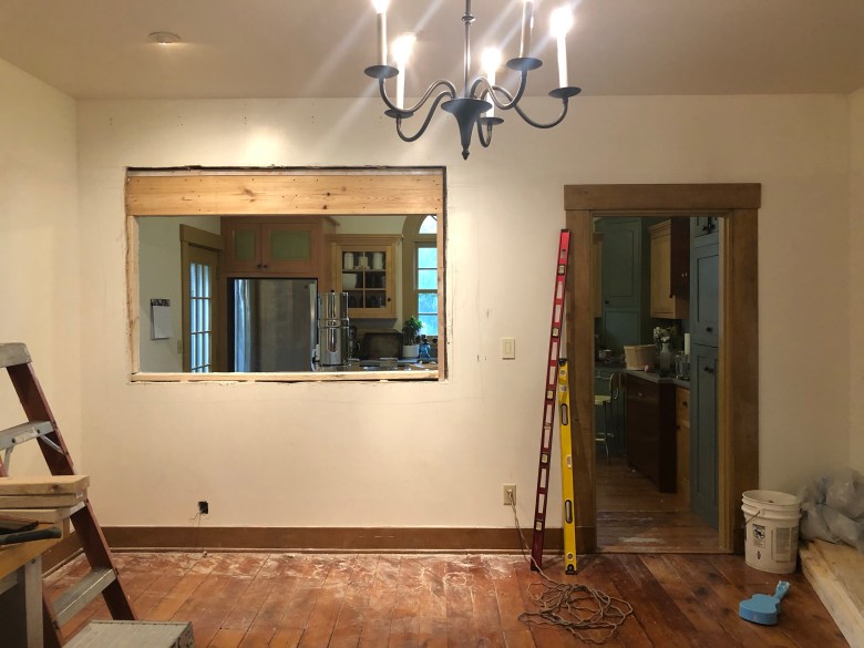
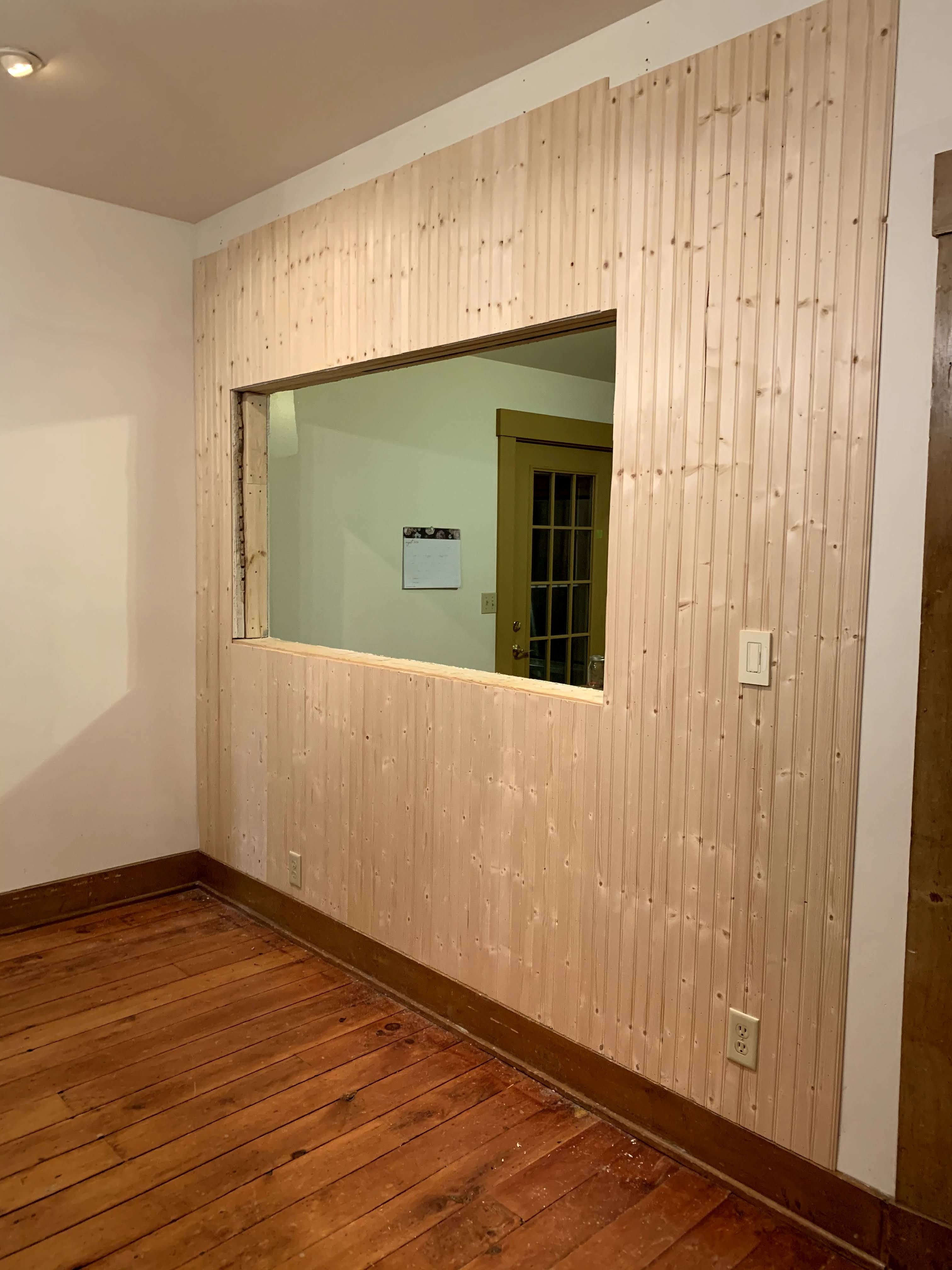
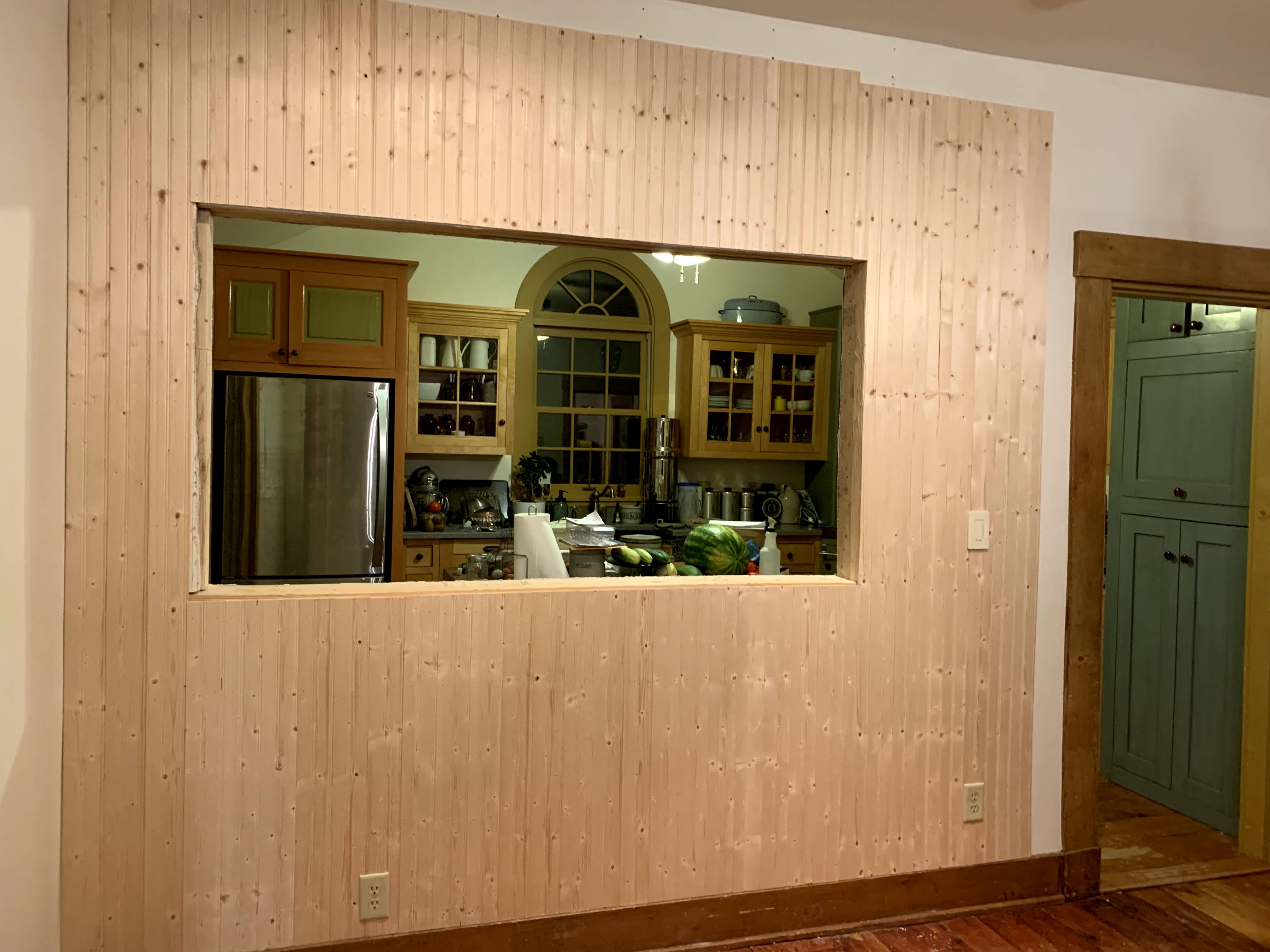
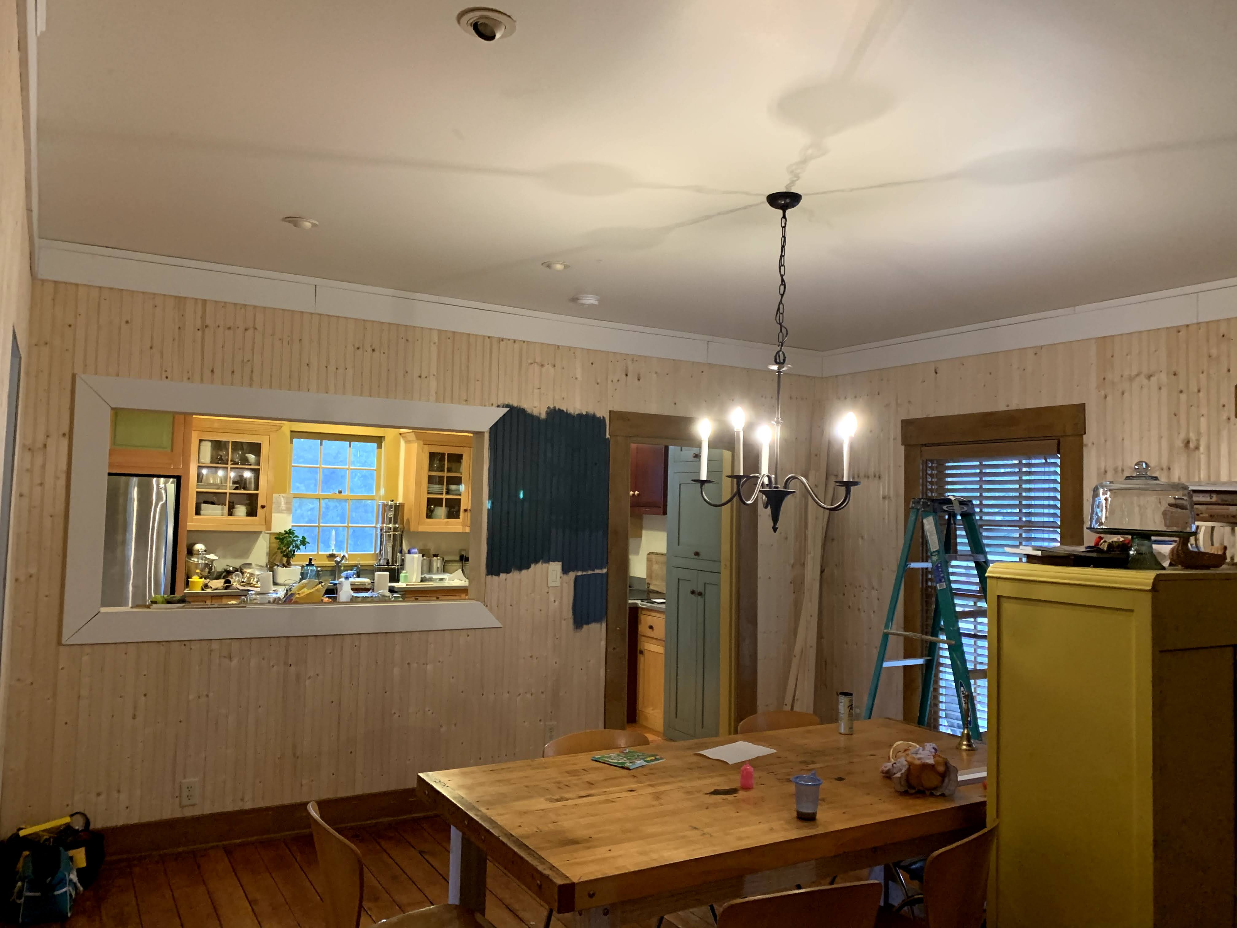
What did it need to function better as the center of our home? In its current state you could not see into the kitchen, and vice versa.
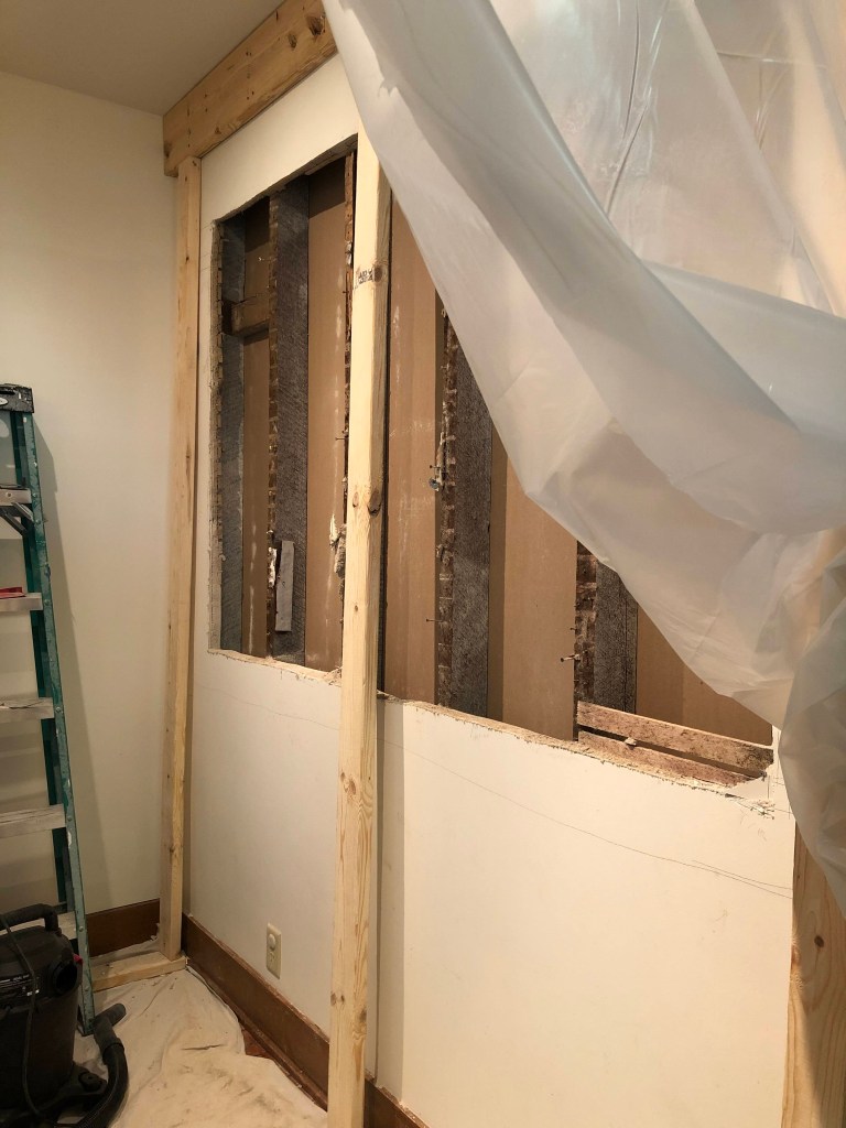
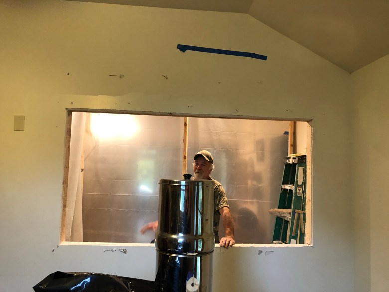
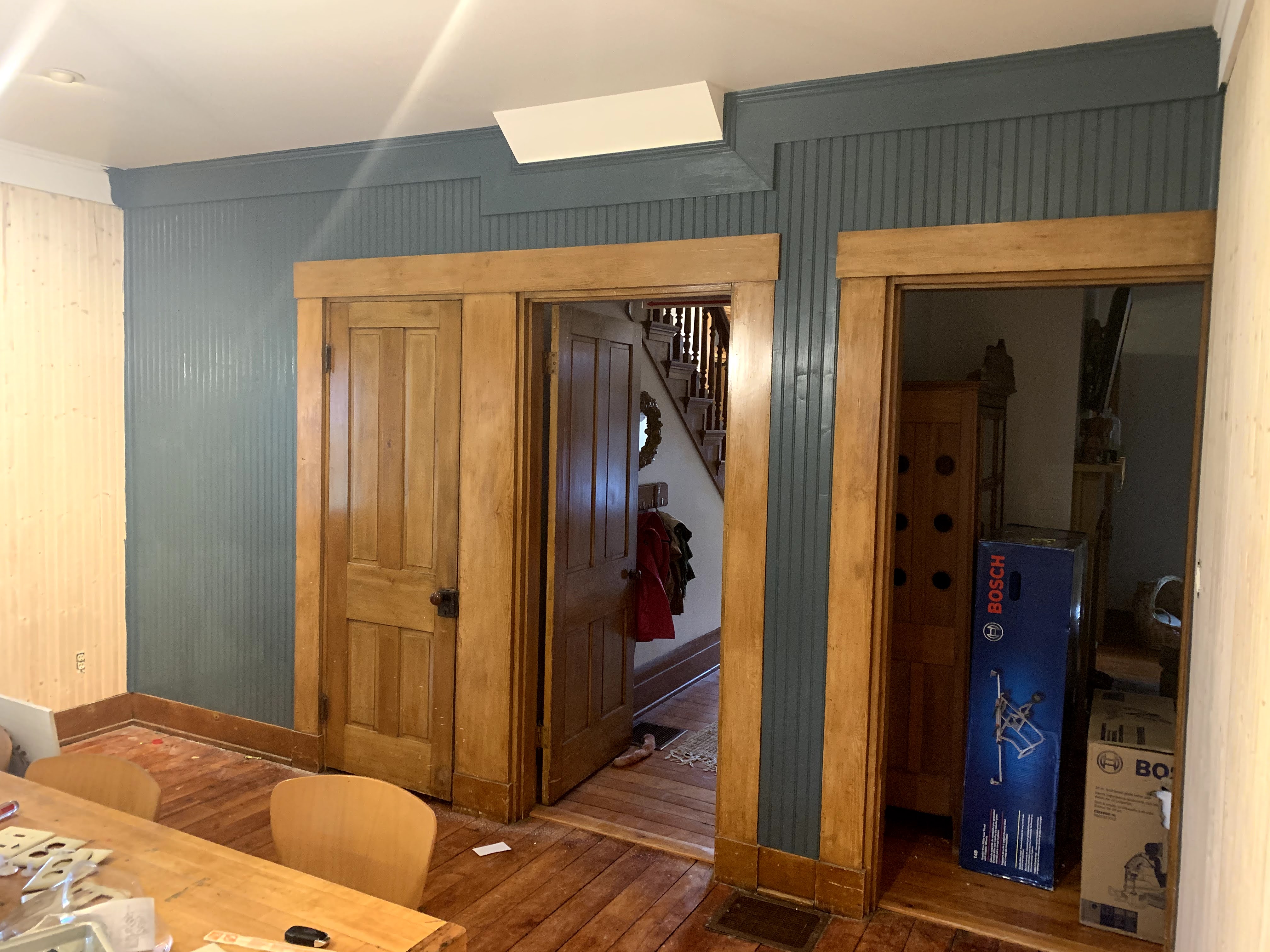
Because our kitchen was located at the very back of our home, and the space I was needed the most in, I had a hard time keeping up with what my little kiddos were into while I was in there. Running back and forth was a constant thing to check on them. We knew I had to have better eyes on the rest of home from that kitchen. Our four kiddos were small and into it all. Knowing this we knew one thing had to happen. We needed to open up the wall.
Now we didn’t want to do a whole “open floor plan” thing, because part of the charm of an old home is separate rooms. In honoring that, a total tear down wasn’t happening. We wanted to open it up enough to have eyes and ears to the rest of the house while keeping the charm of an older home intact. Our solution to that problem was to create a unique breakfast nook for the kiddos and all the entertaining we constantly did. Extra seating was a bonus. We of course had not yet done this ourselves. We had built walls but not tore them down. My husband, Tom, is never afraid of a challenge, but once we discovered it was a load bearing wall we decided that was the one job we would hire out for this space for our first time.
Thankfully, we ended up finding one of the carpenters who originally worked on our home with the previous owners who had completely restored it. He already knew the ins and outs of our entire house, so we knew he was the right choice for the job.
And so it made sense to start the project here.
Let the fun began.

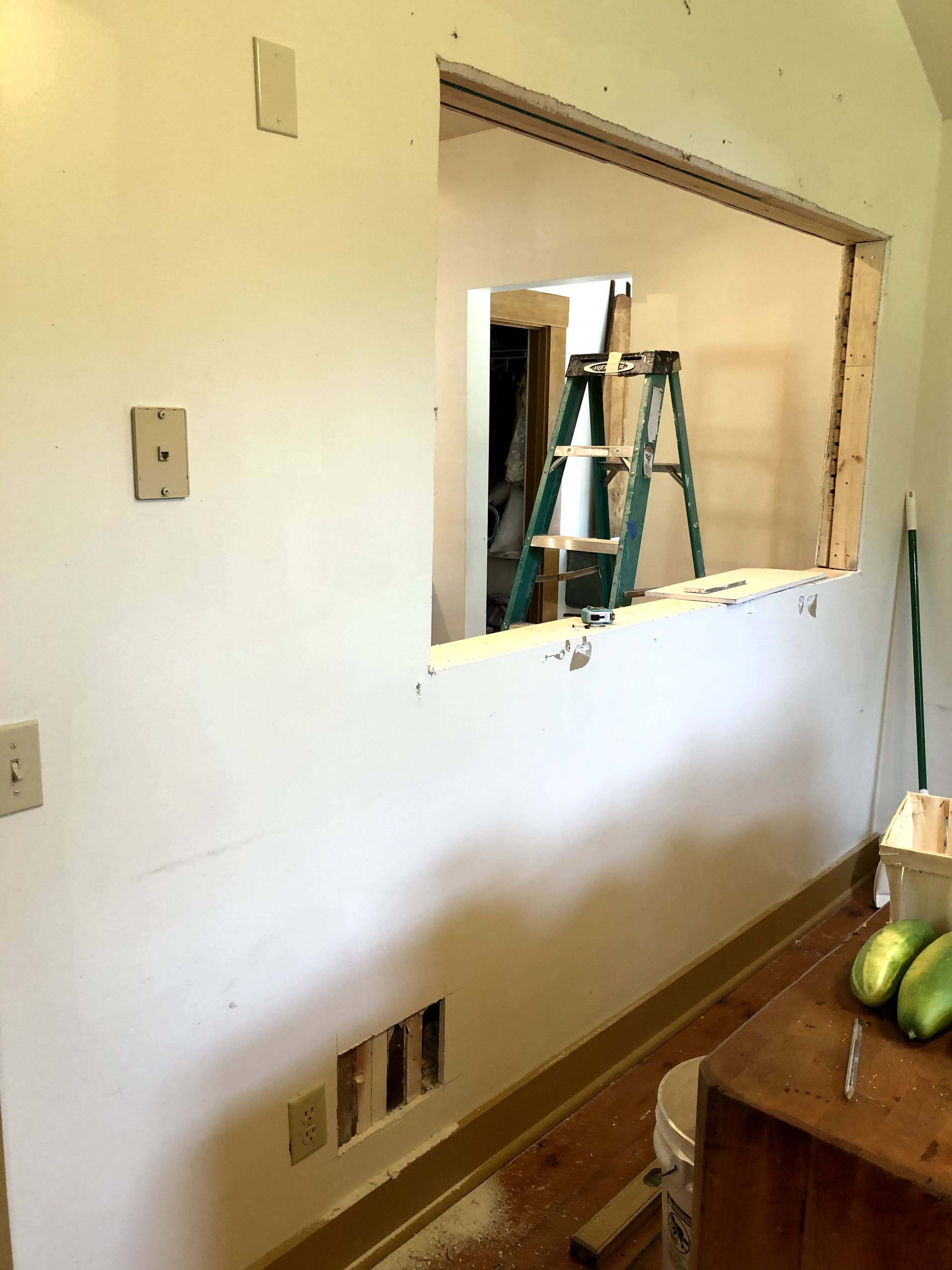
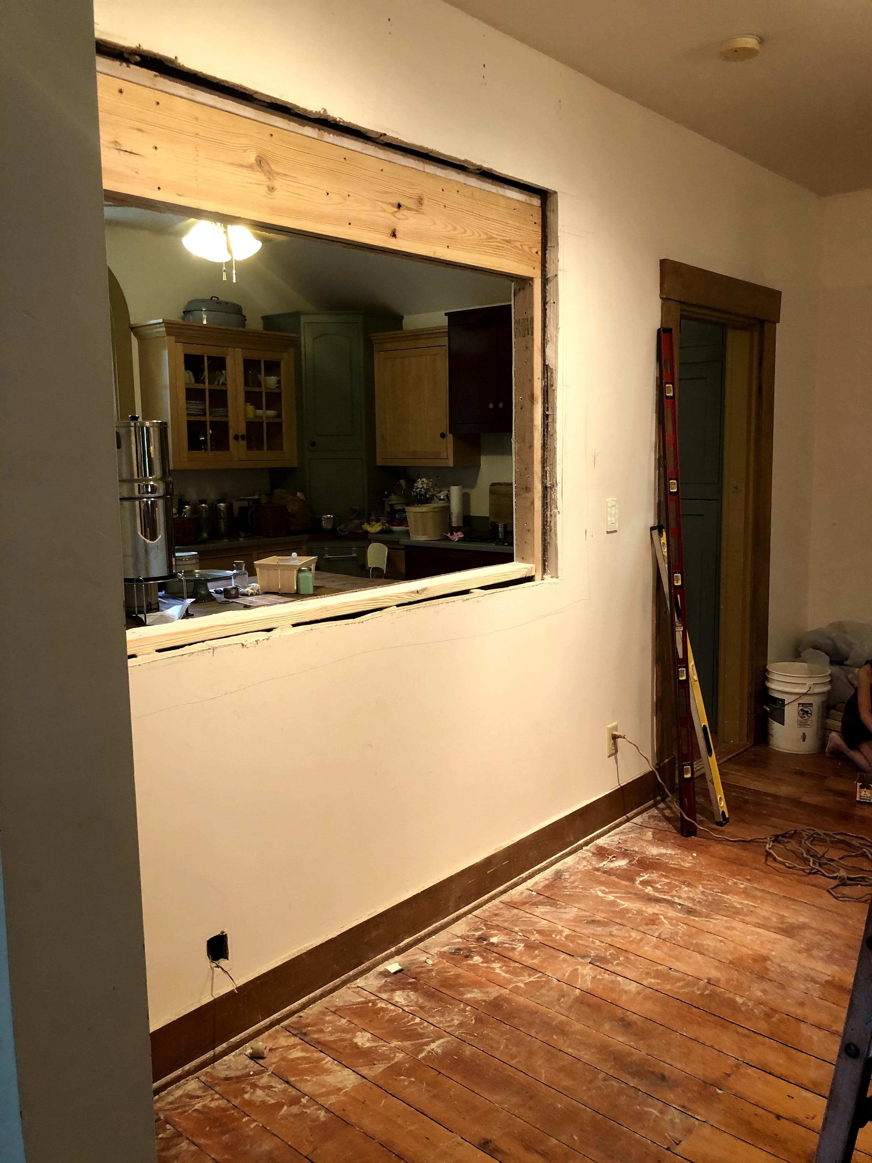
In a couple of days work he had knocked it out of the park. He created a temporary wall and then placed a new header beam in the opening to support it for our breakfast nook. Worth every penny and it did not break the bank either.
PHASE 2 PLANNING
Now that this functional upgrade was in place. Tom began laying out his plans for framing out the opening and how he would build the breakfast bar.
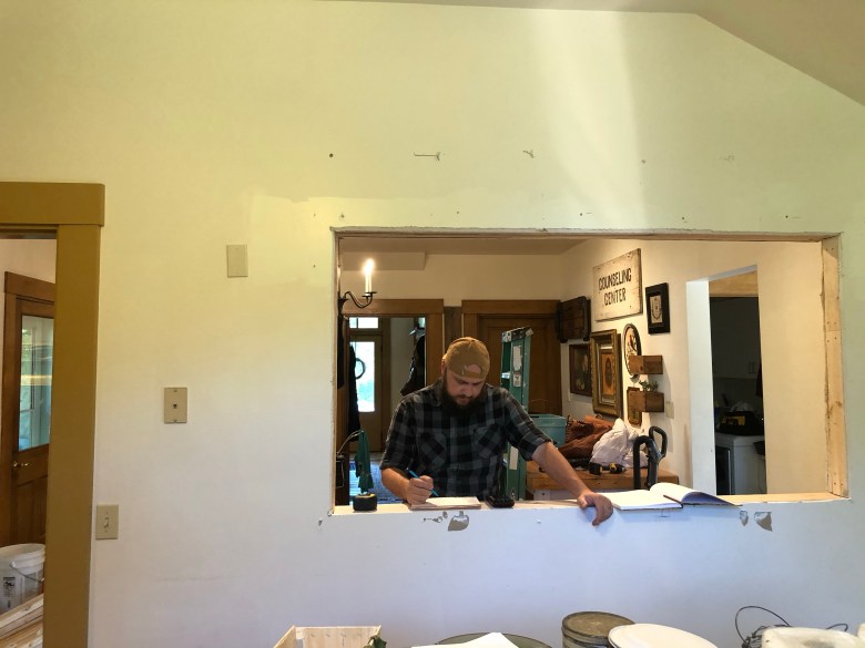
With the kitchen now being exposed through the dining room, I needed to spend some more extra time thinking through how the spaces would live as cohesively as they could while also being separate spaces. I didn’t want to make it all look like one, but wanted each room to compliment the other. We knew the day we moved in that the kitchen would need to be calmed to one color overall on the cabinets.

LAYERING ADDITIONAL CHARACTER
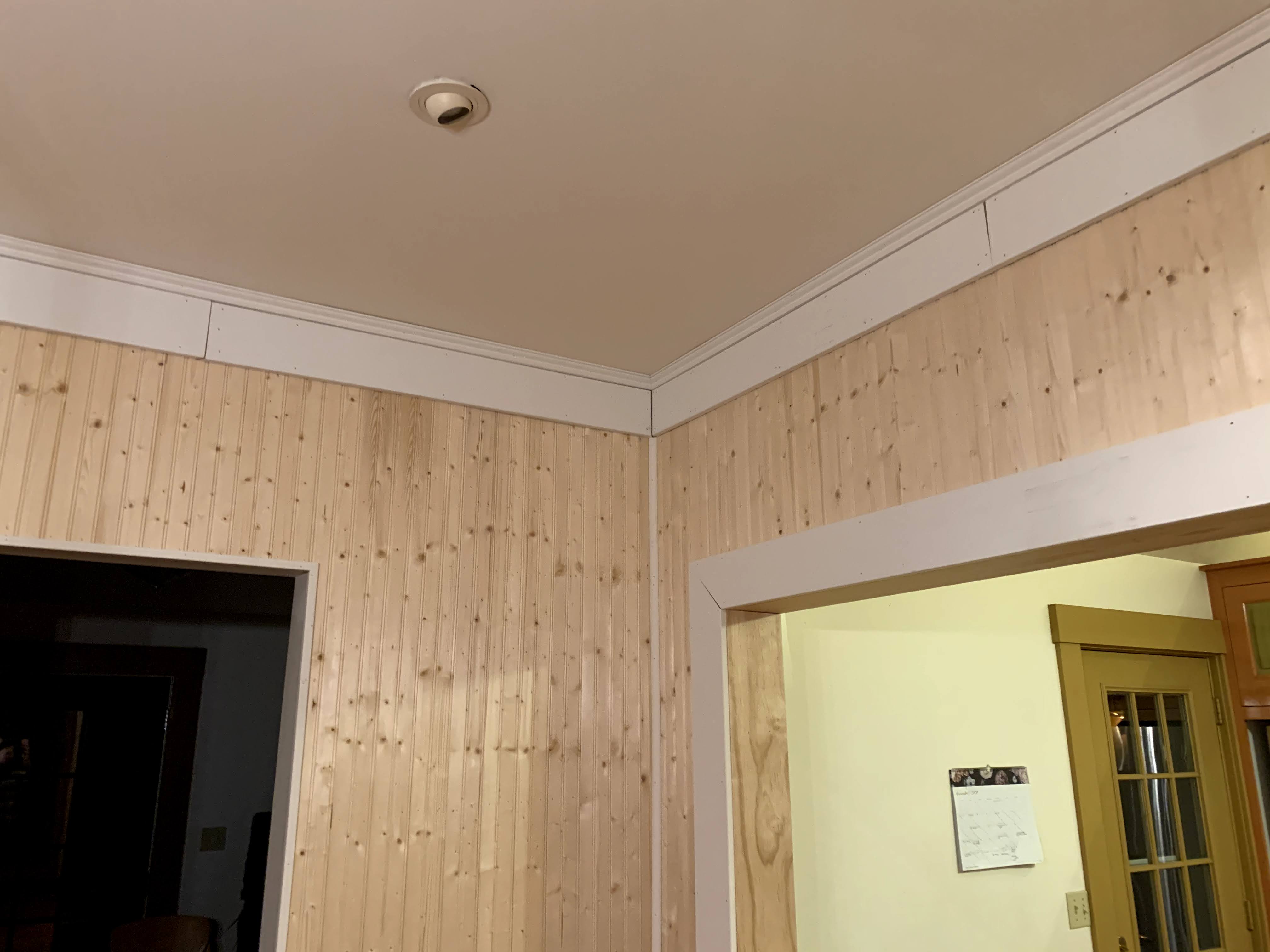
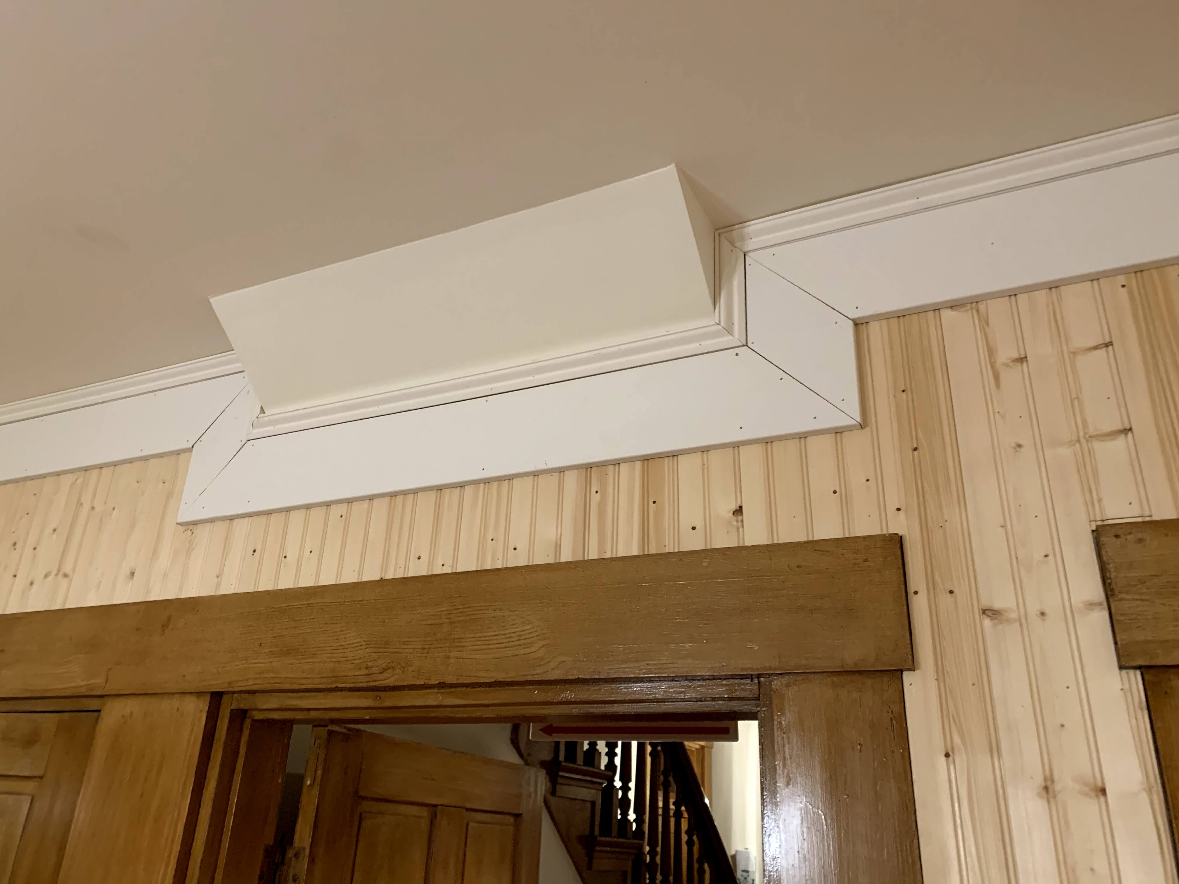
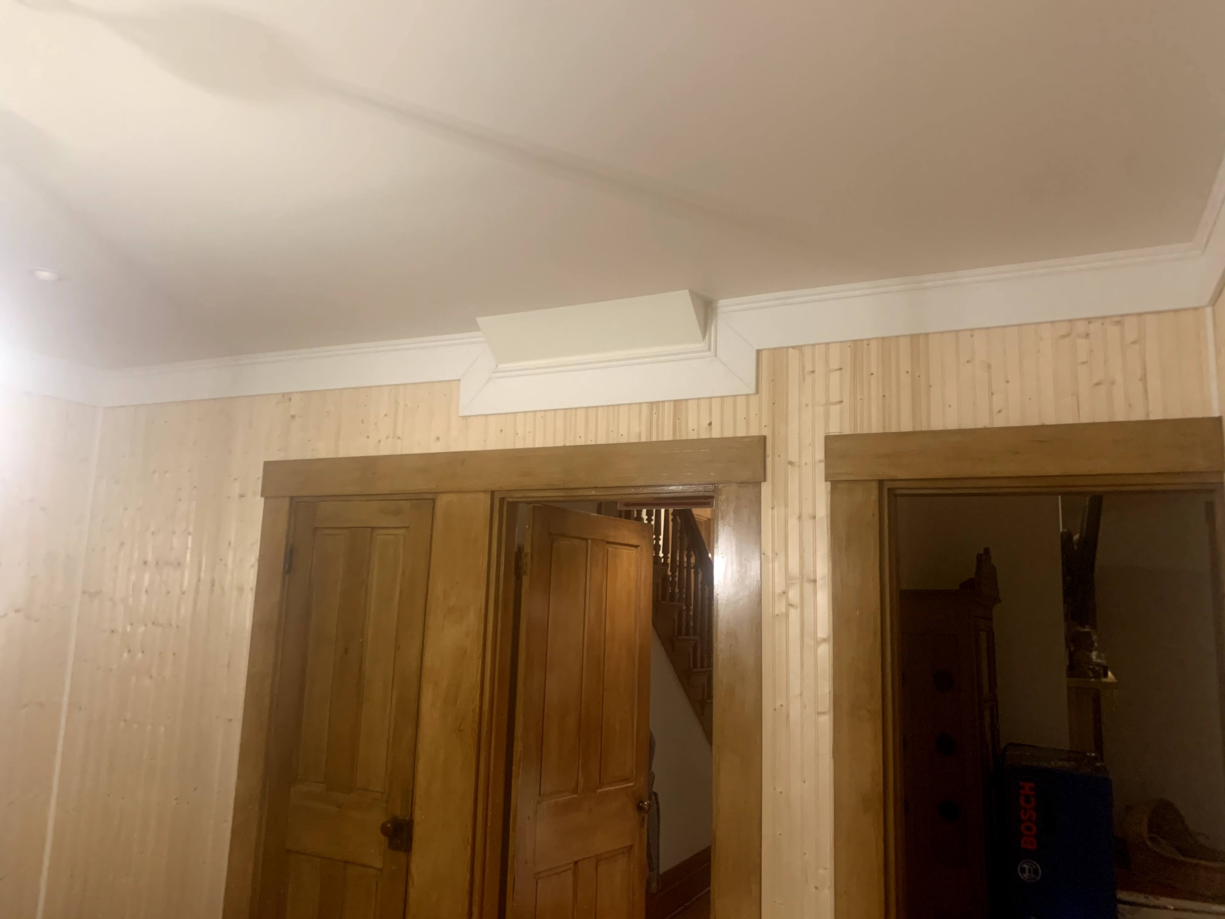
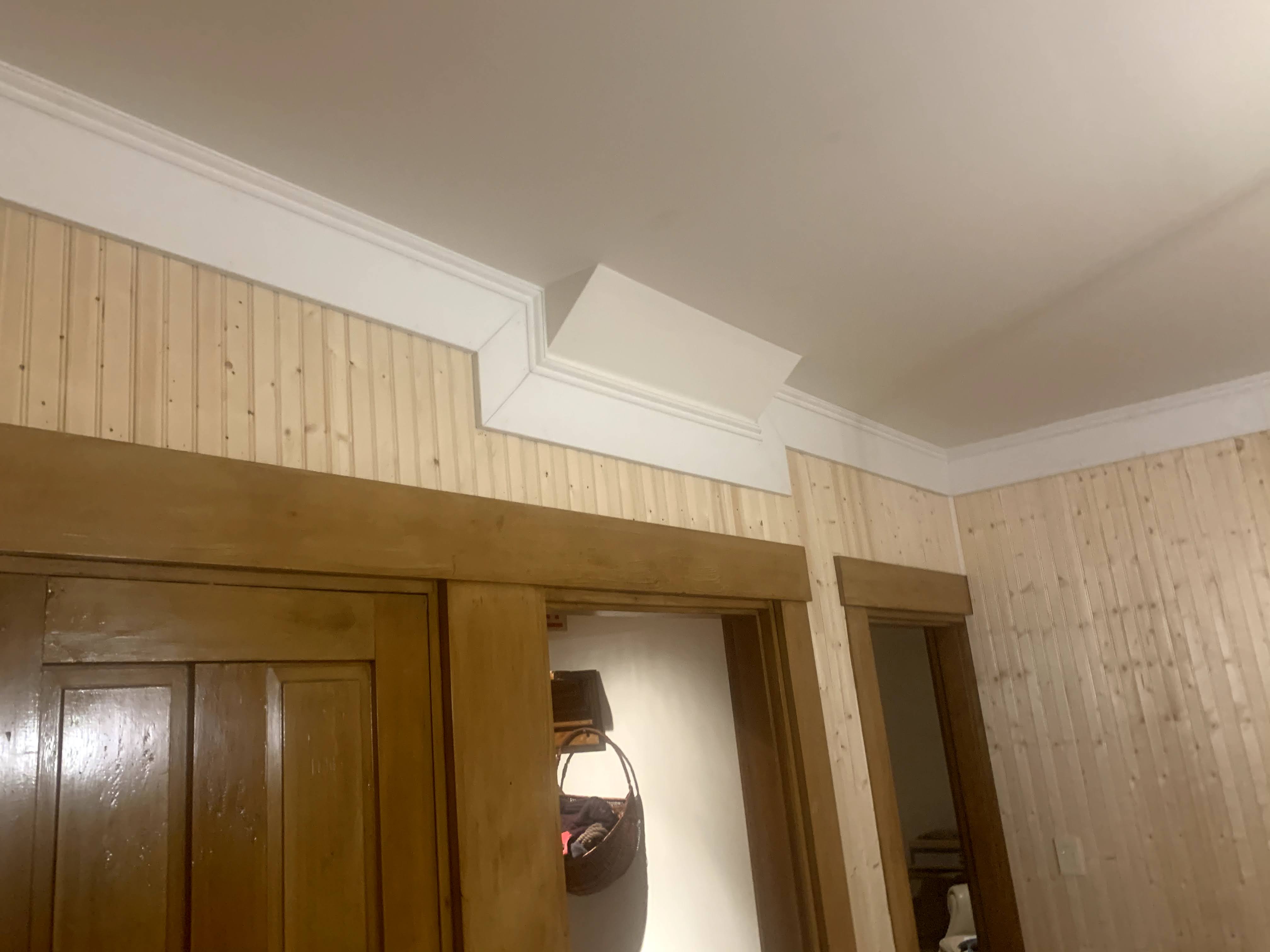
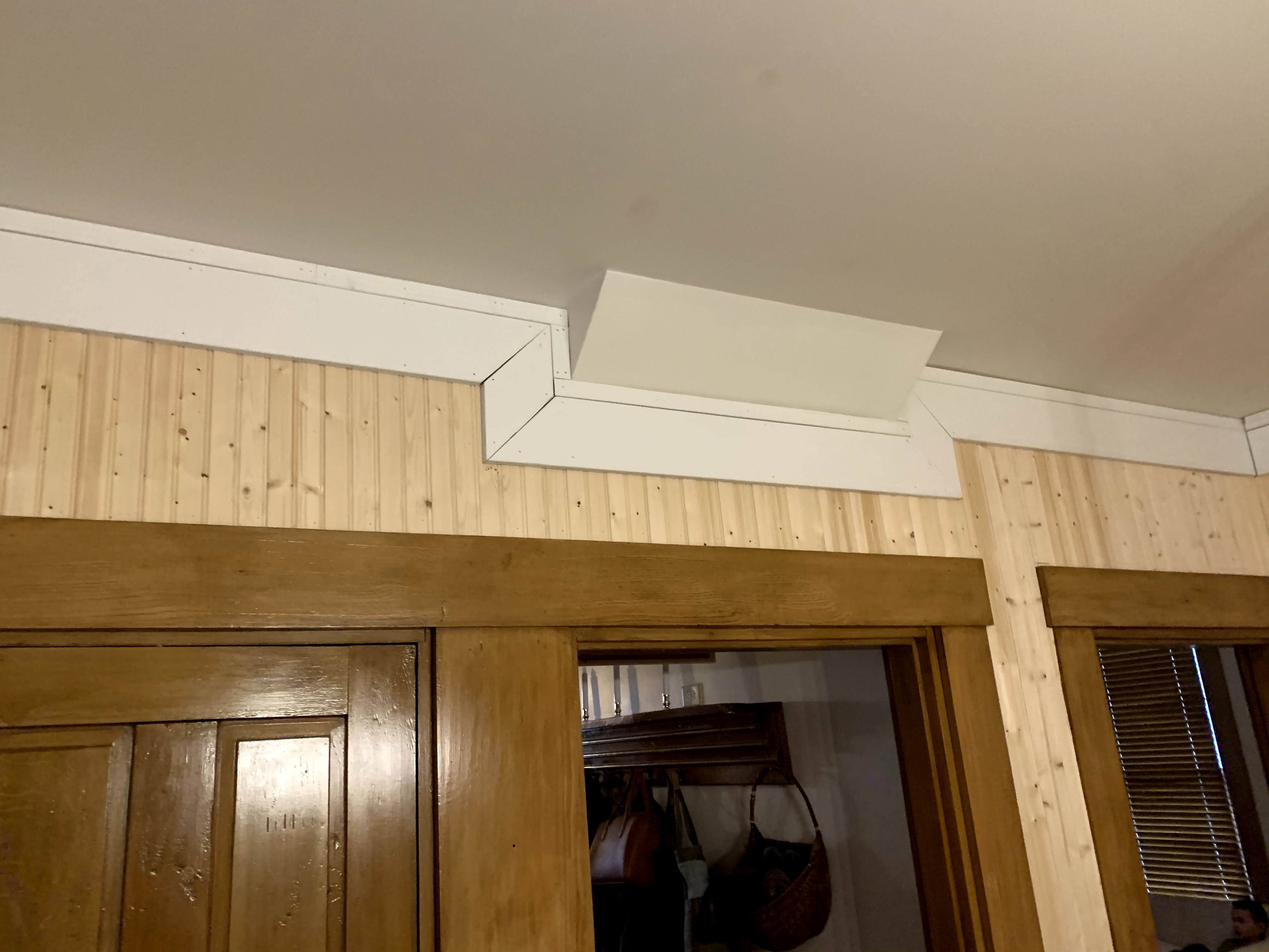
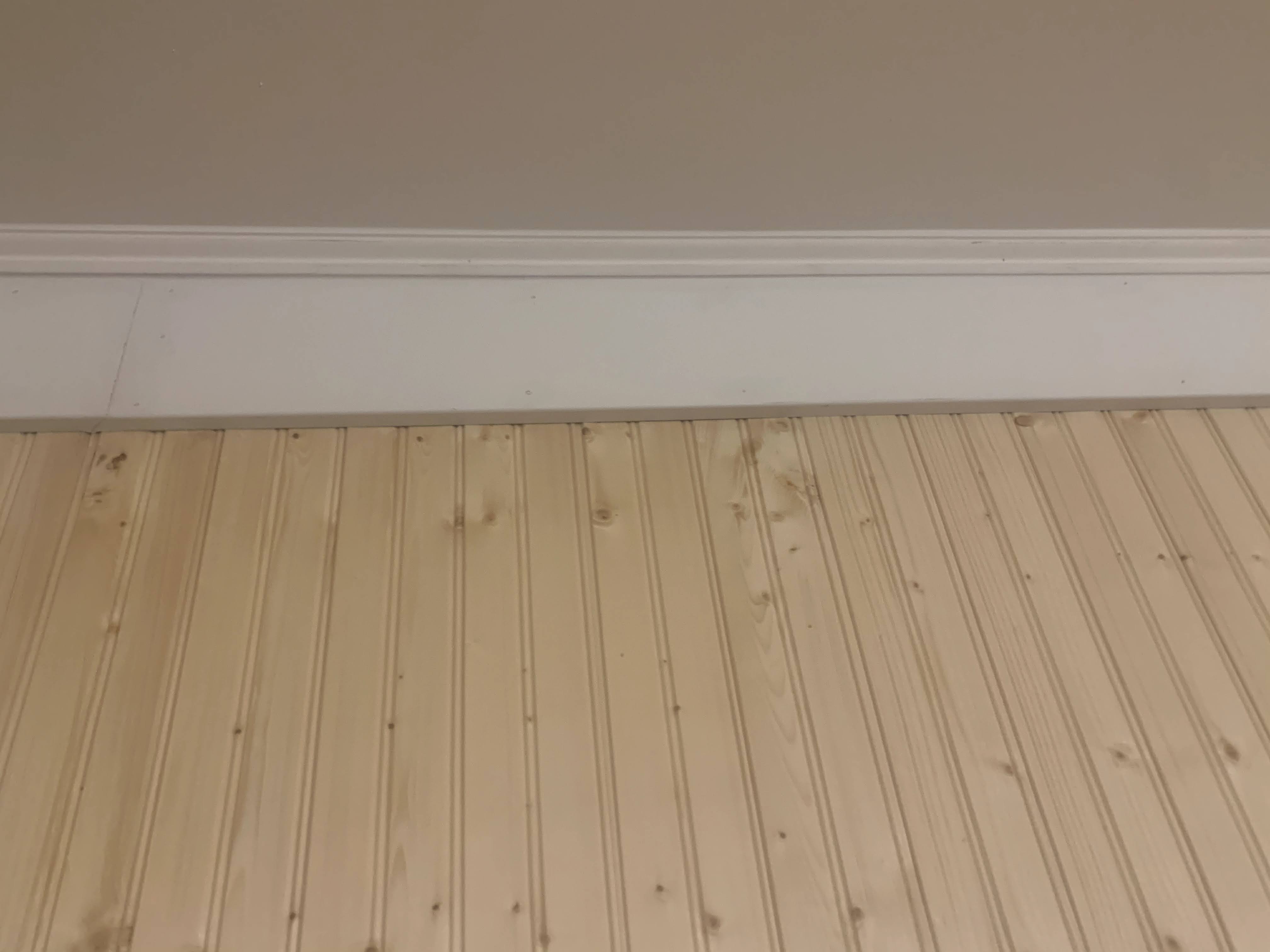
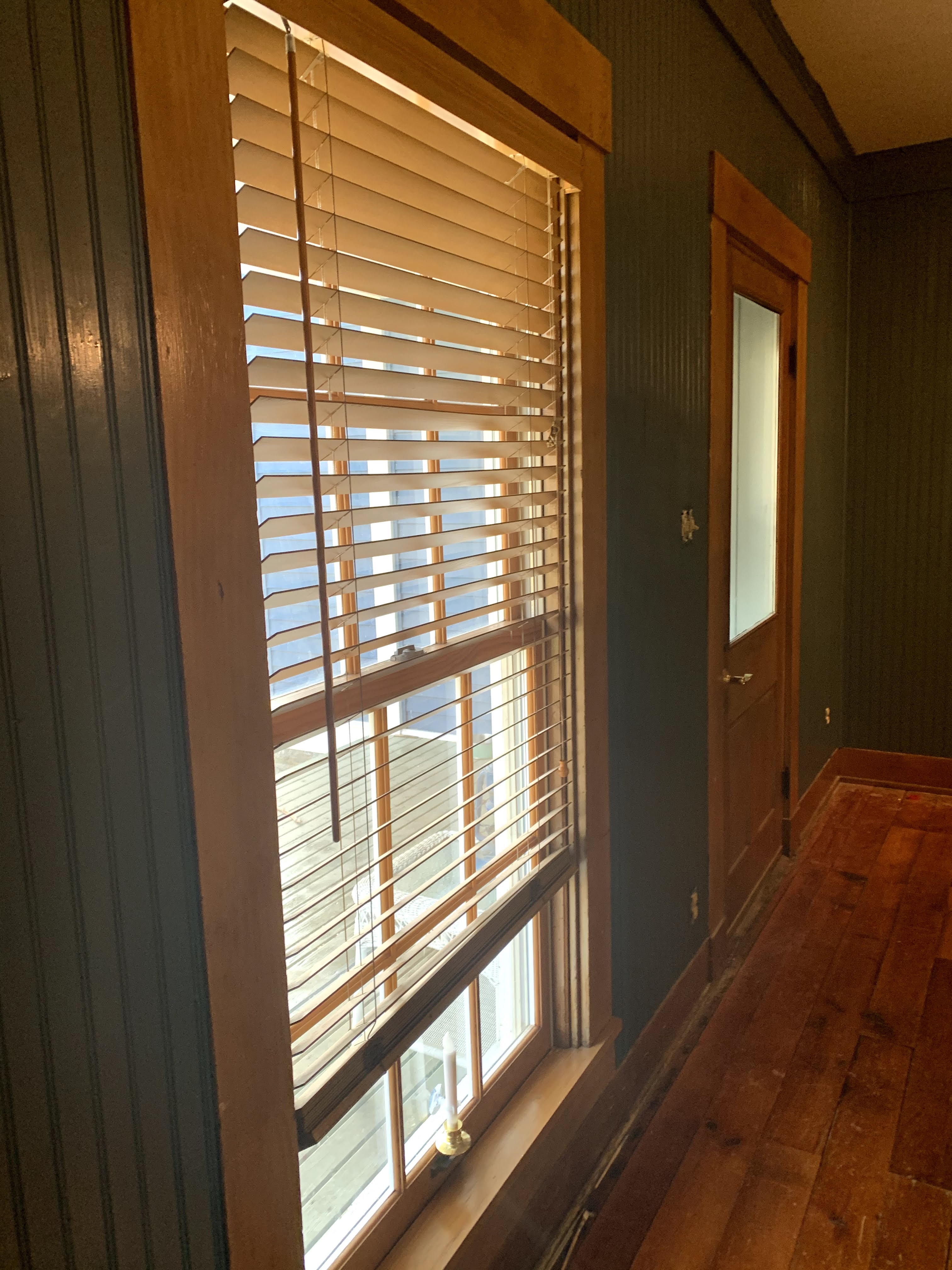
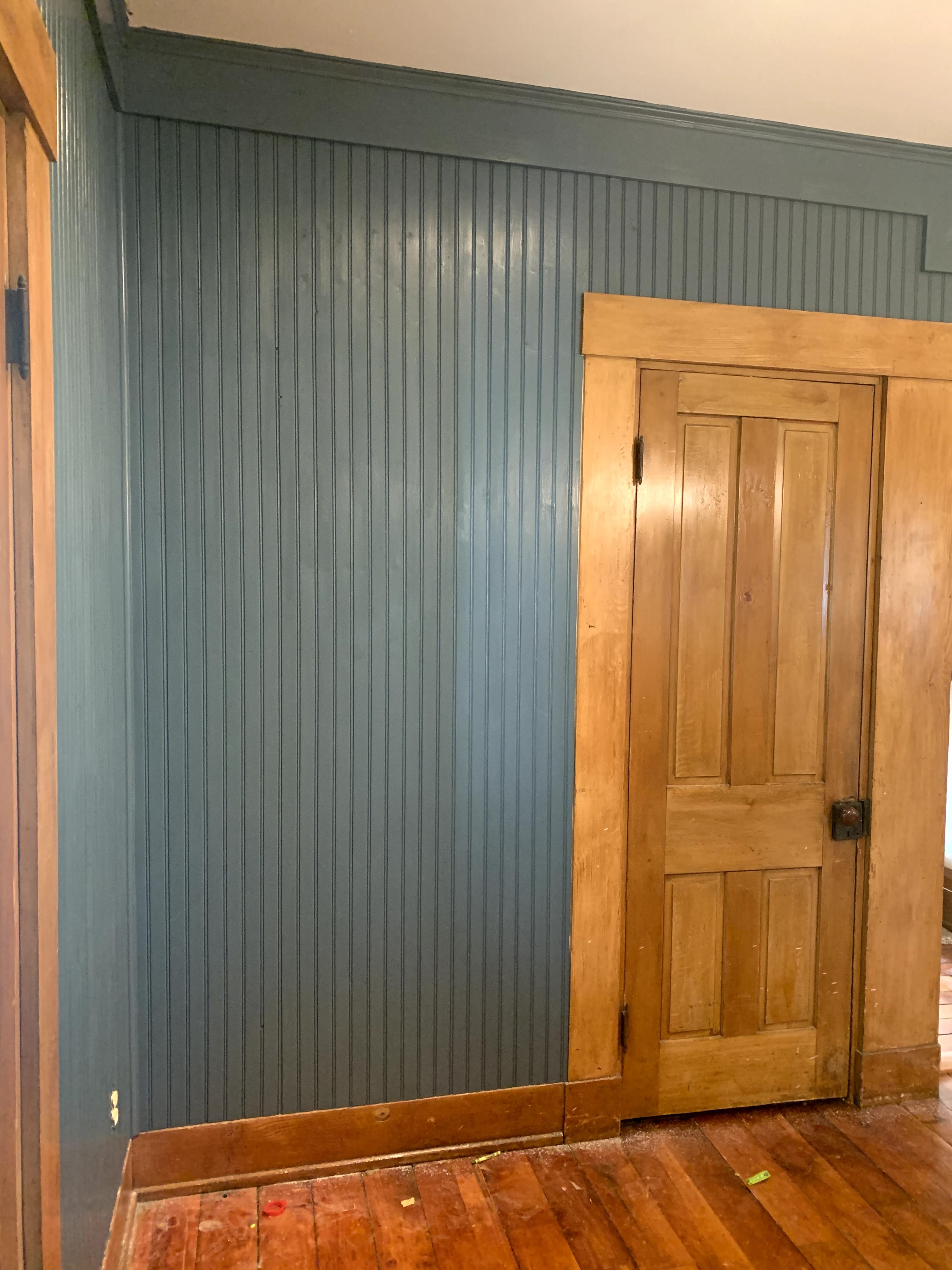
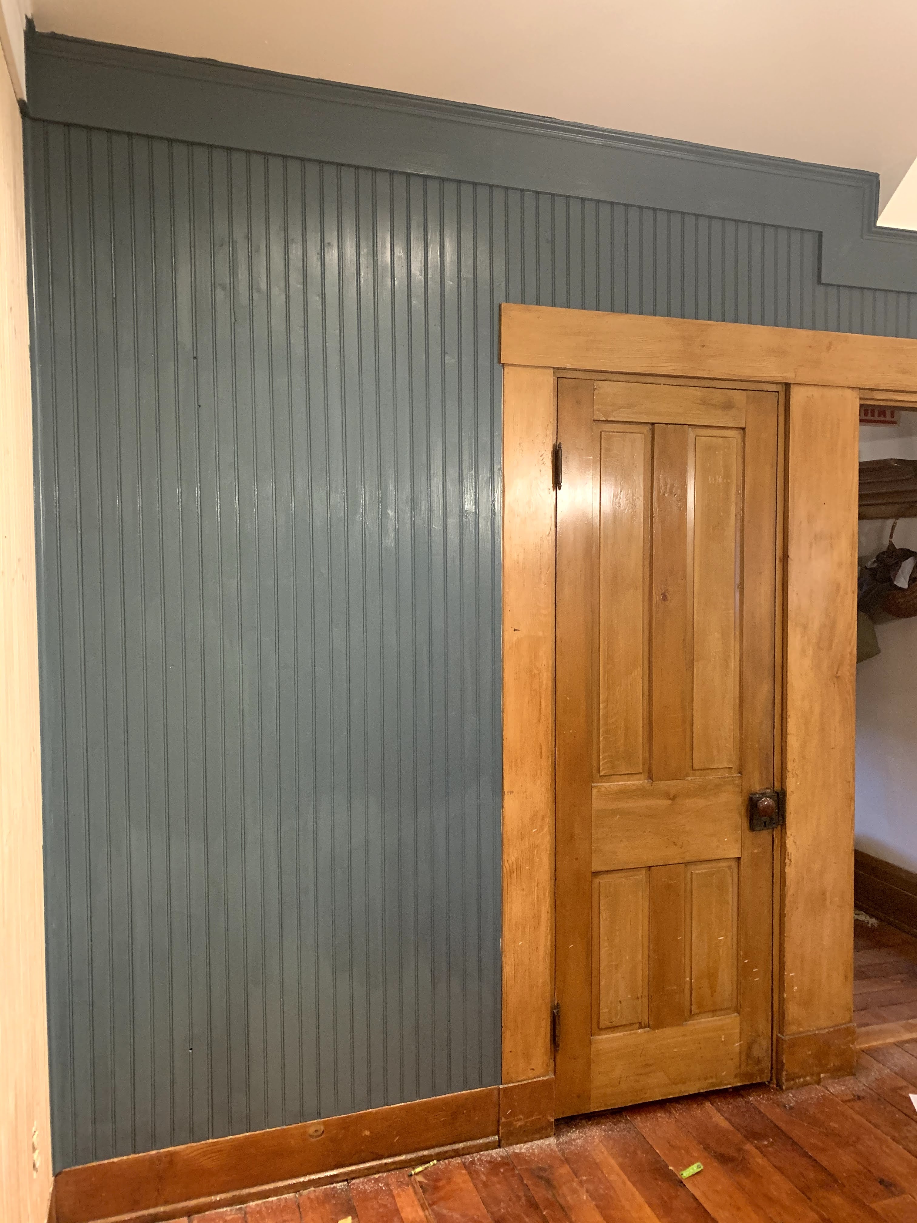
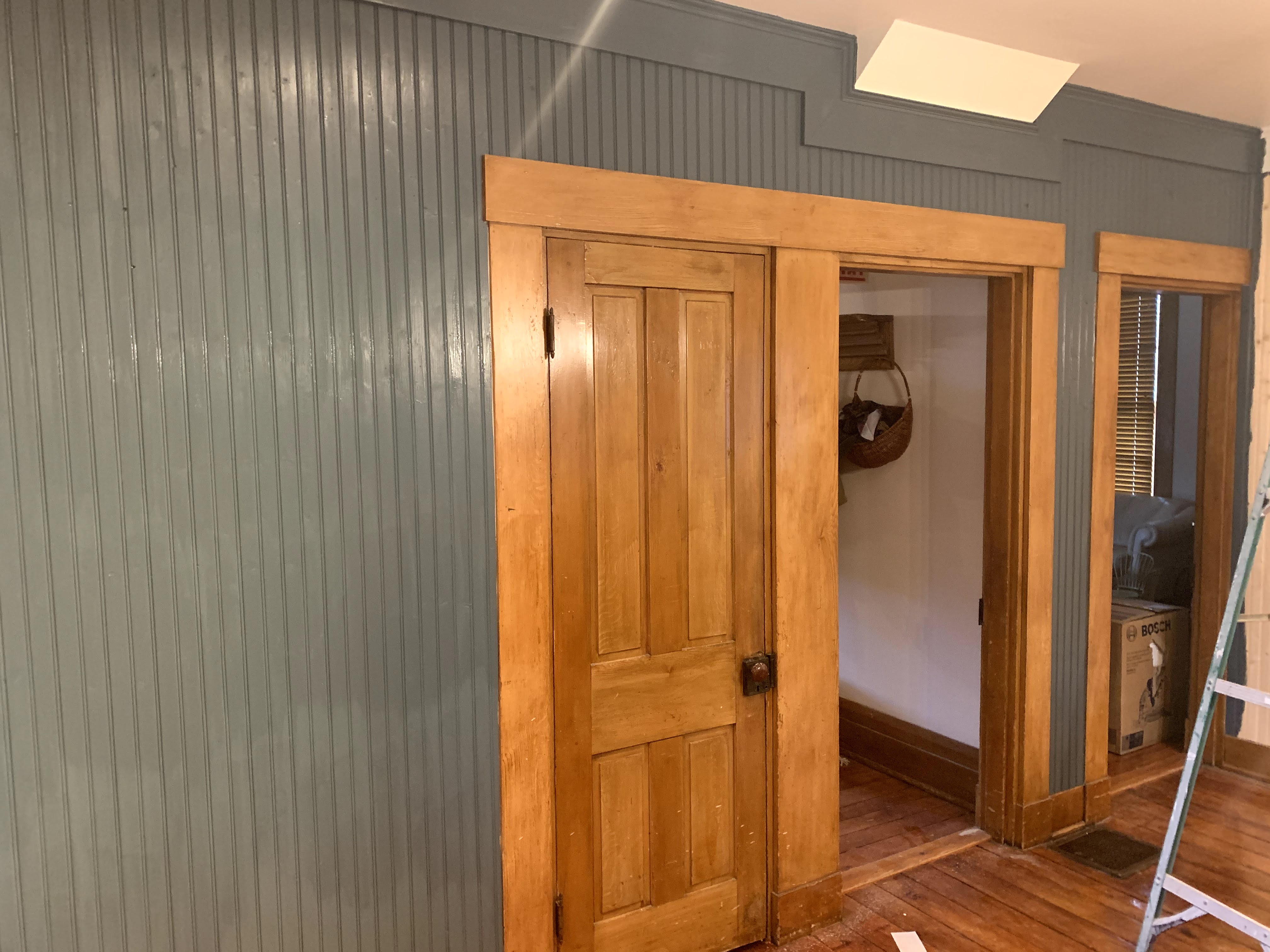
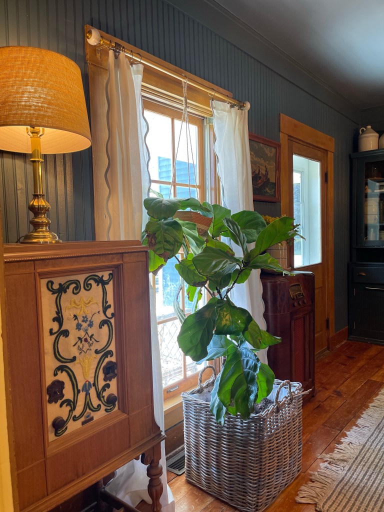
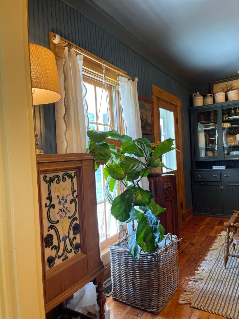
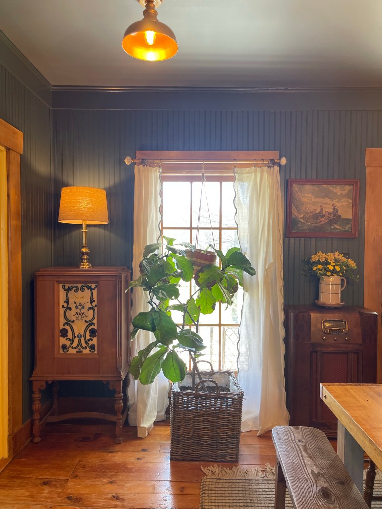
While I thought on these things, we began to layer in some character. Character fitting for this old charmer. We chose to go with an entire room of bead board. It instantly added such classic matureness to the space.
To help us out on this project, we chose our boy, Judah. He was daddy’s assistant along the way.
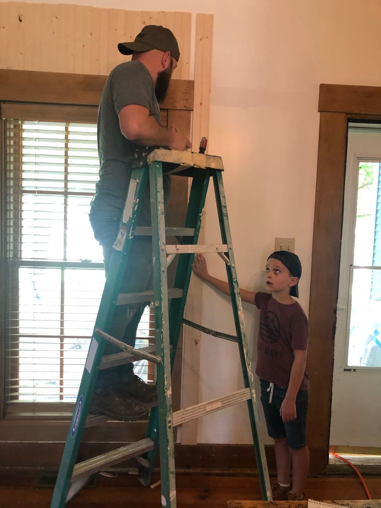
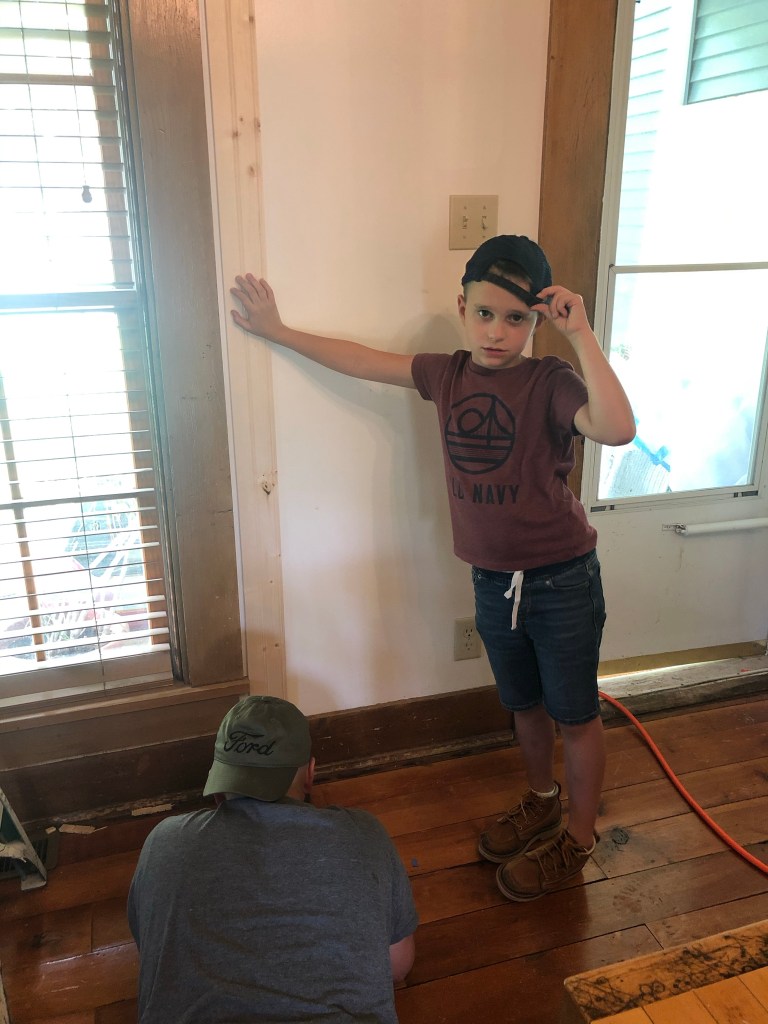
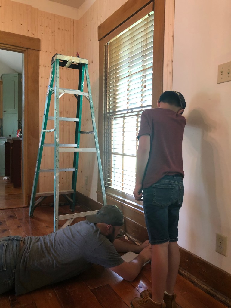
We knew we wanted to add large thick trim around the space to dramatize it even more. To save some money but accomplish the same look as an old farm house we used MDF since we were color drenching the space anyways. Tom learned some new tricks trimming and cutting angles and we both grew grateful for the amount of miracle working a good caulk job can do to clean up any mistakes before paint.
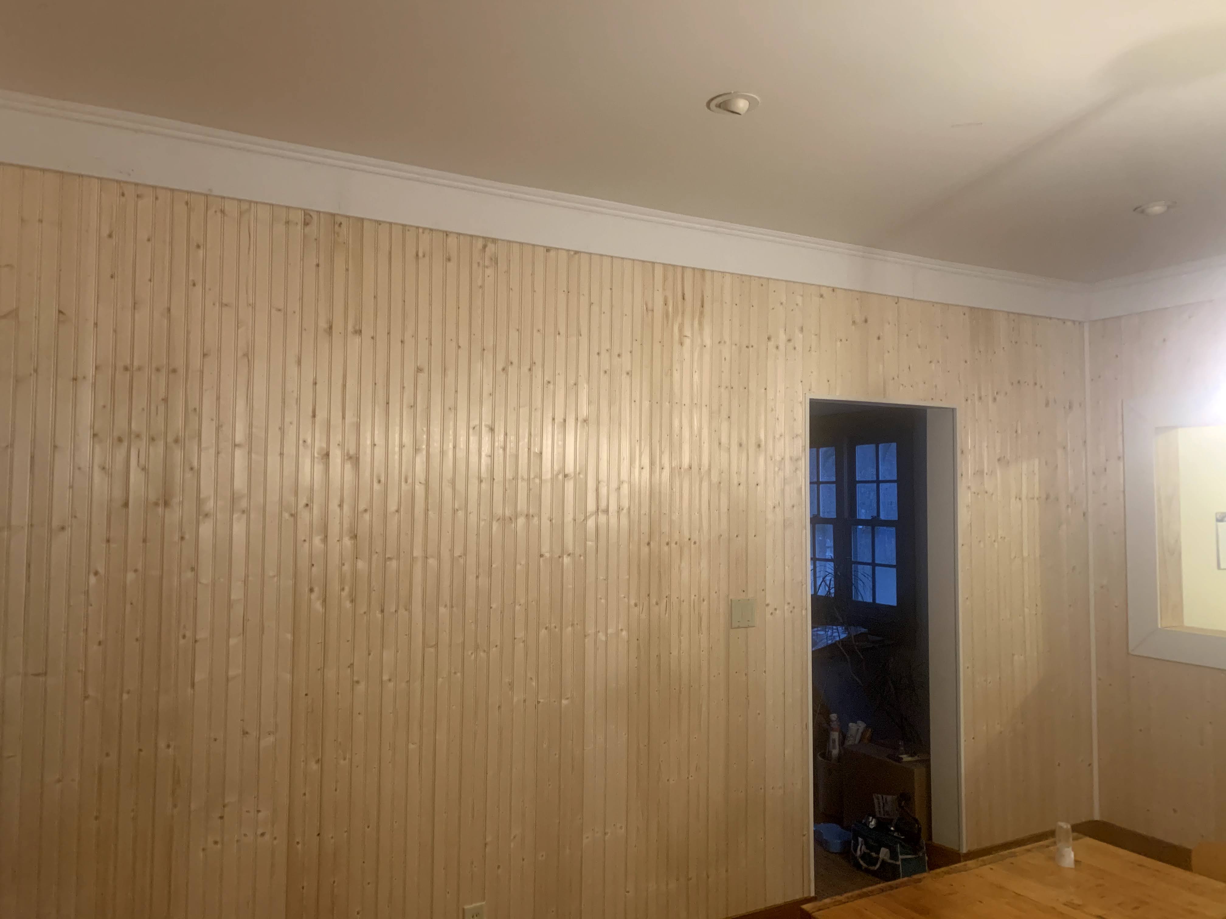

From the flat walls, the space was already beginning to take shape into something well established.
PICKIN’ THAT PAINT
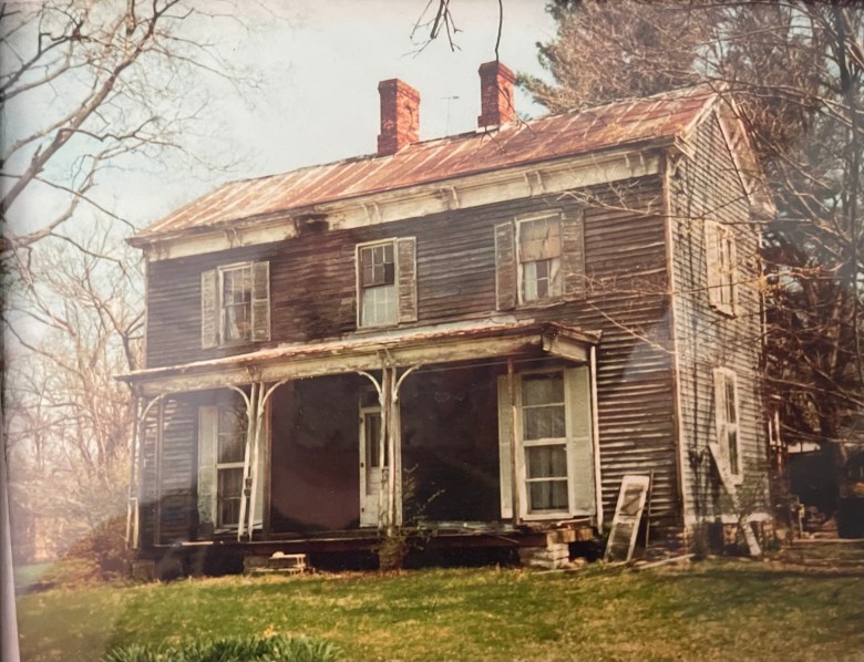
Looking back on my inspiration picks/mental mood board, I knew a deep rich color was coming. I also felt inspired by our exterior makeover that had to happen in the space back in April of 2017. A large chunk of a tree fell on our house, ripping the siding down on the right side.


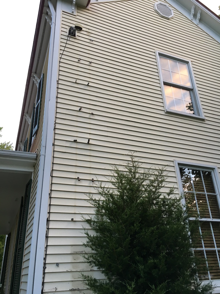

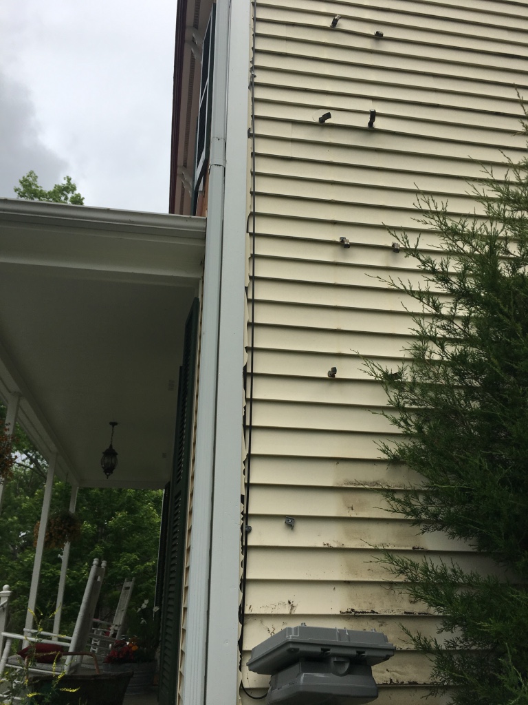

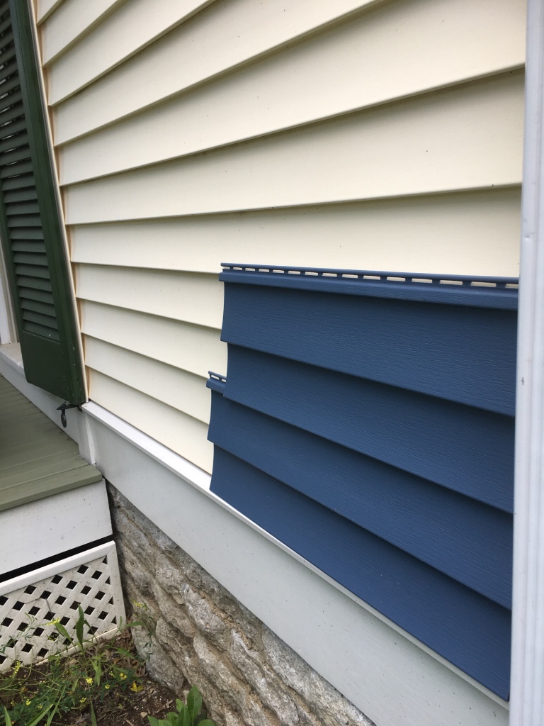
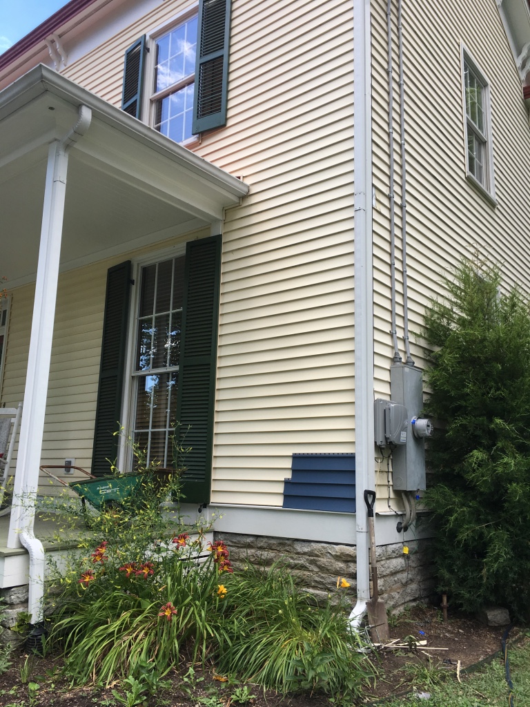
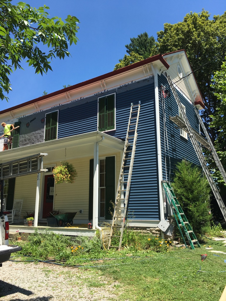
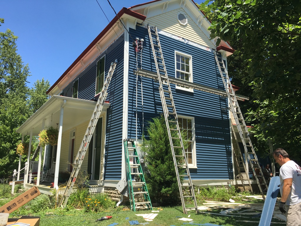
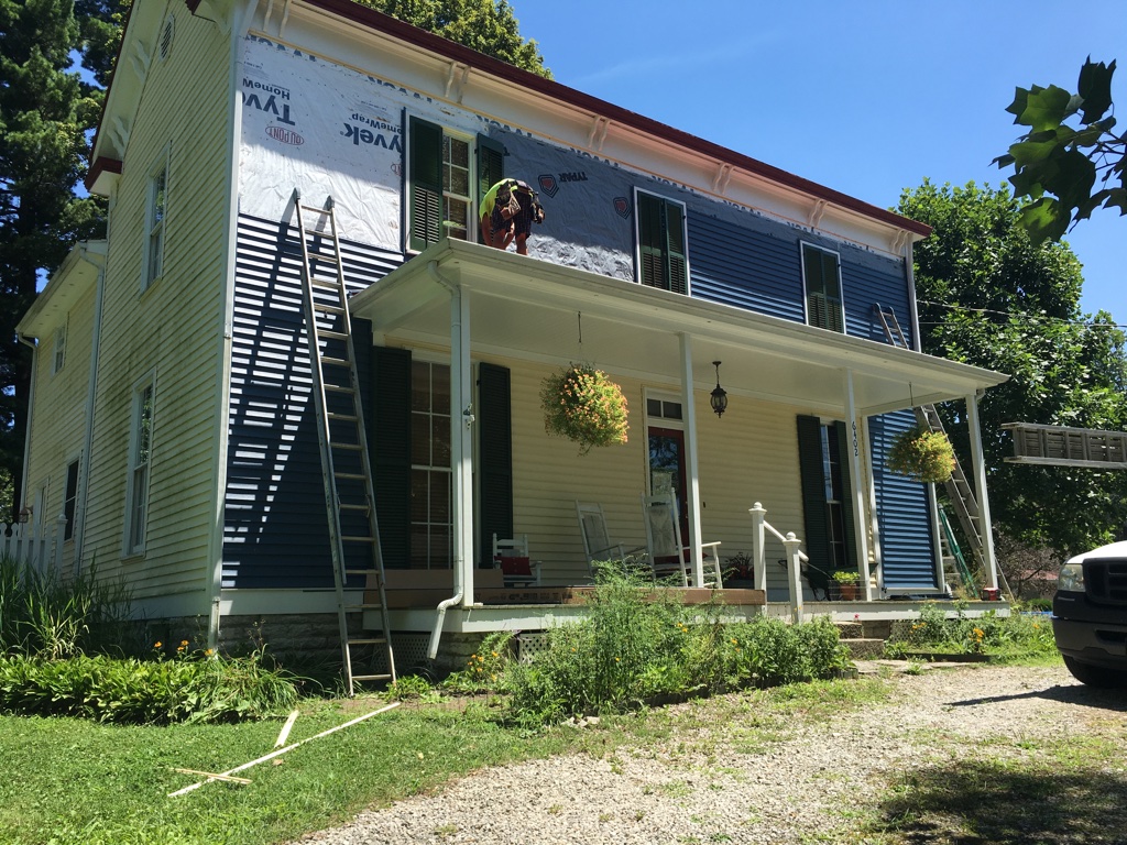
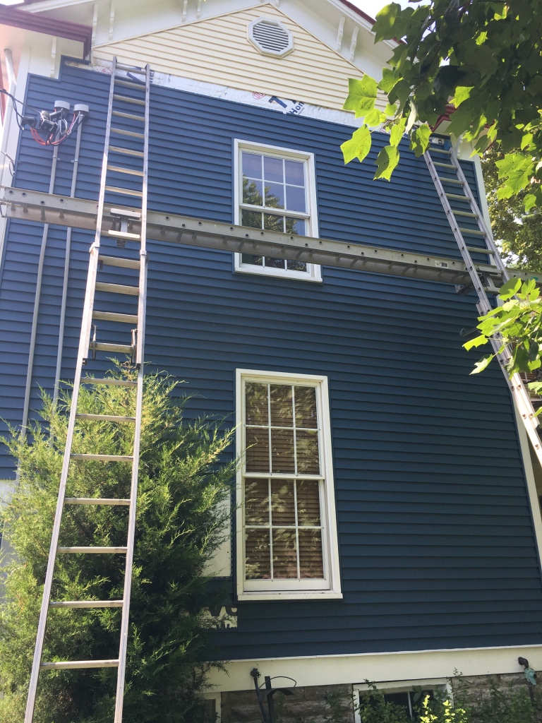
We so loved the yellow farmhouse we had purchased, but unfortunately, when this happened, they were no longer selling the matching siding.
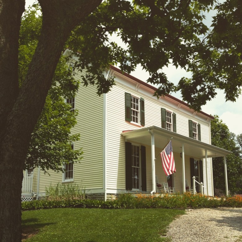
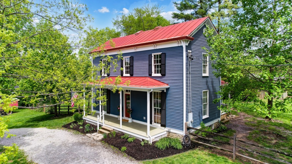
We had to go with a whole new color, as at the time, the current yellow options available were more neon yellow or cream-colored. With the original photos of the farmhouse showing in a grey blue tone, we decided to go back to its original roots and completely change the exterior color of the home.
It felt quite fitting for the center of our home to take some inspiration from our exterior. Hence the color options we were thinking through below.
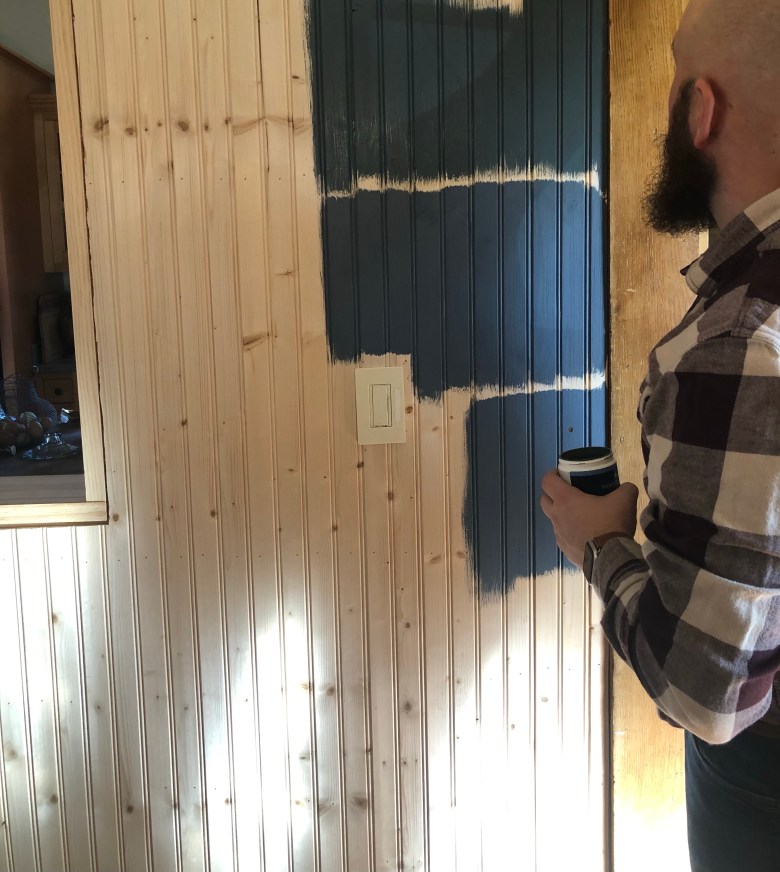

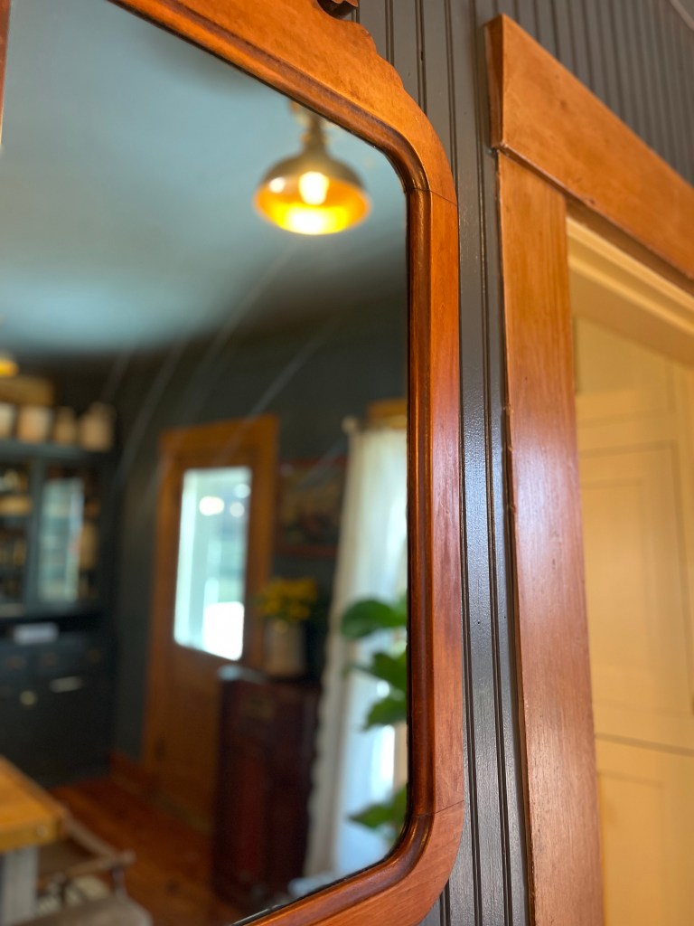
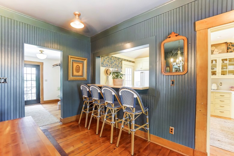
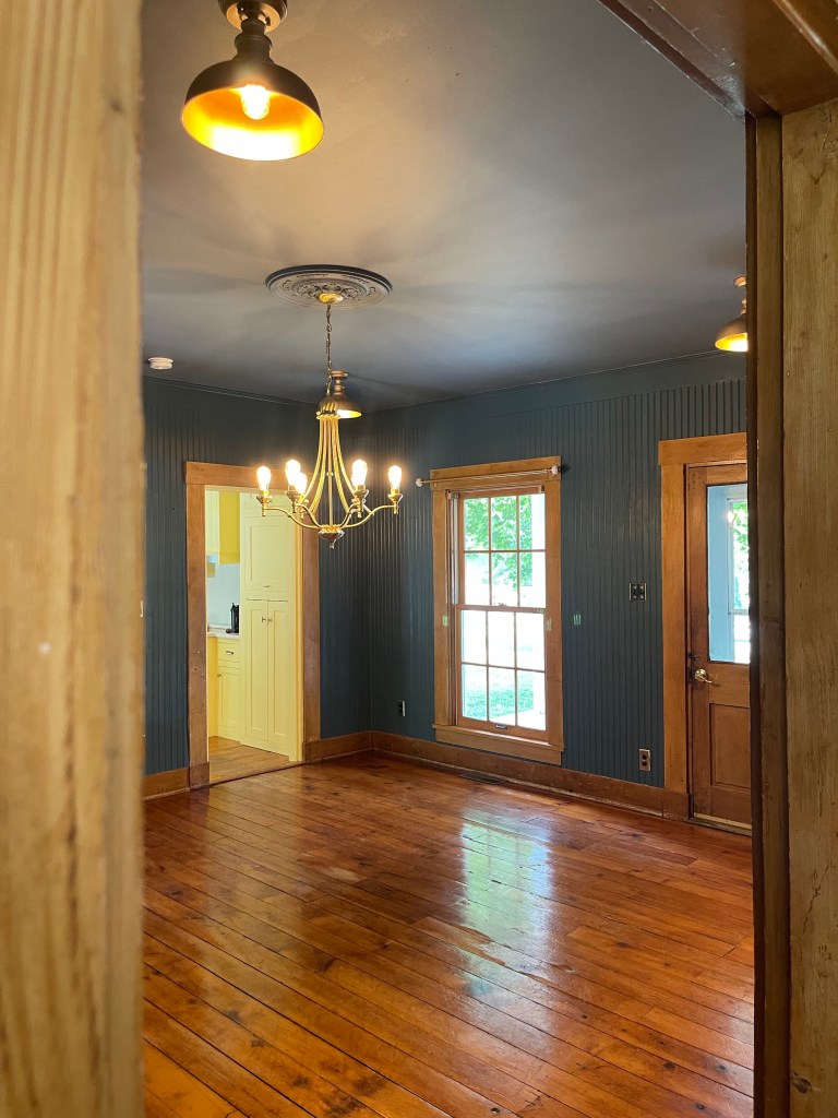
We ended up choosing a deep blue grey called Whale Gray by Marquee Behr Paint from Home Depot and absolutely loved how it turned out. You might recall, Tom kicked me out at this part of the project, as a gift to me for Christmas that year. You can read about that here. During my time away, he knocked out the painting of the dining room. Thanks love.

While I enjoyed my time away, I was happy to see that the color really made all the original wood tones pop, but I was definitely not feeling a bright white ceiling against it as I figured I would feel. It was too loud. Aligning with my desire to color drench the space.

Now, I didn’t choose the exact same color as the walls, but went with a little bit lighter, yet similar tone, using another Marquee Behr Paint, this one called Adirondack Blue from Home Depot. I think it complimented it perfectly.
Onward we go.
TO CUSTOMIZING
GETTING THOSE PIECES RIGHT
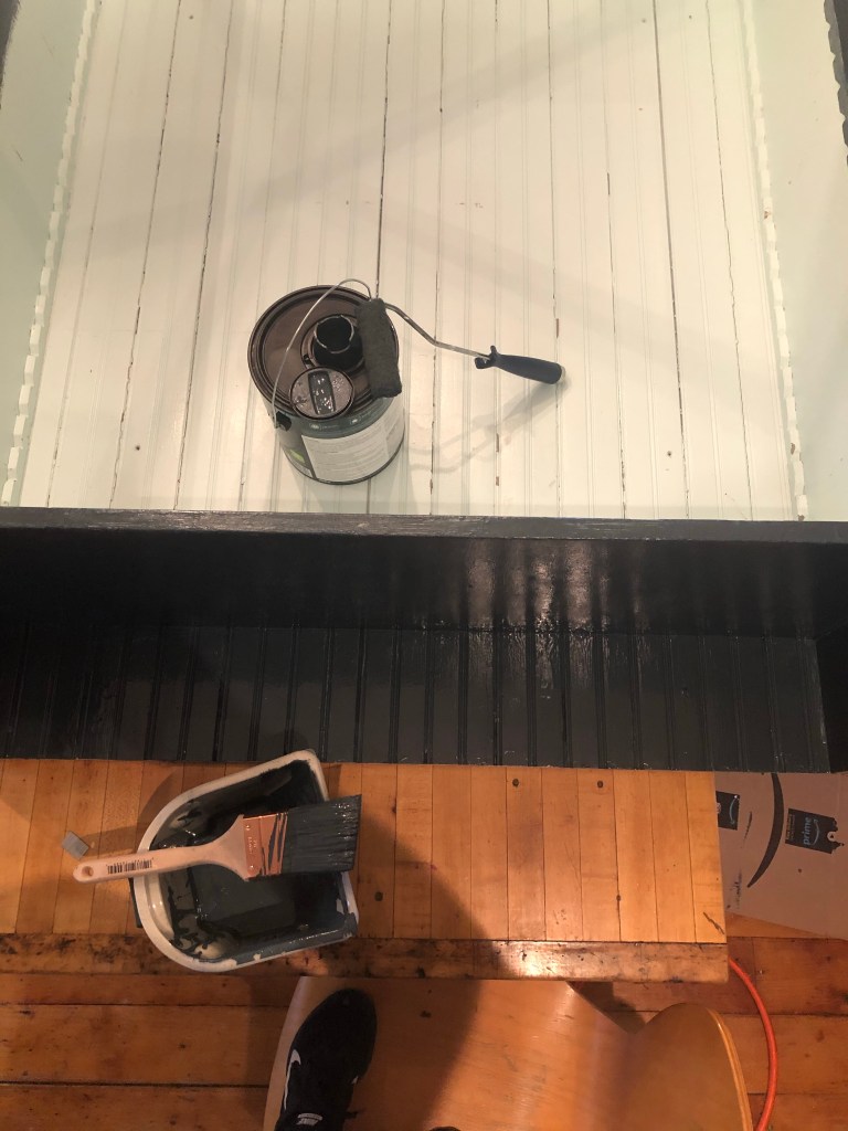
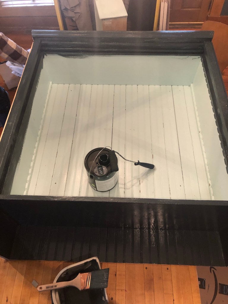
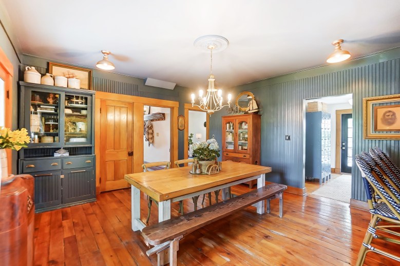
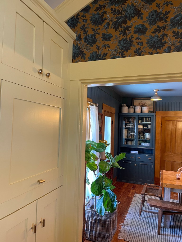
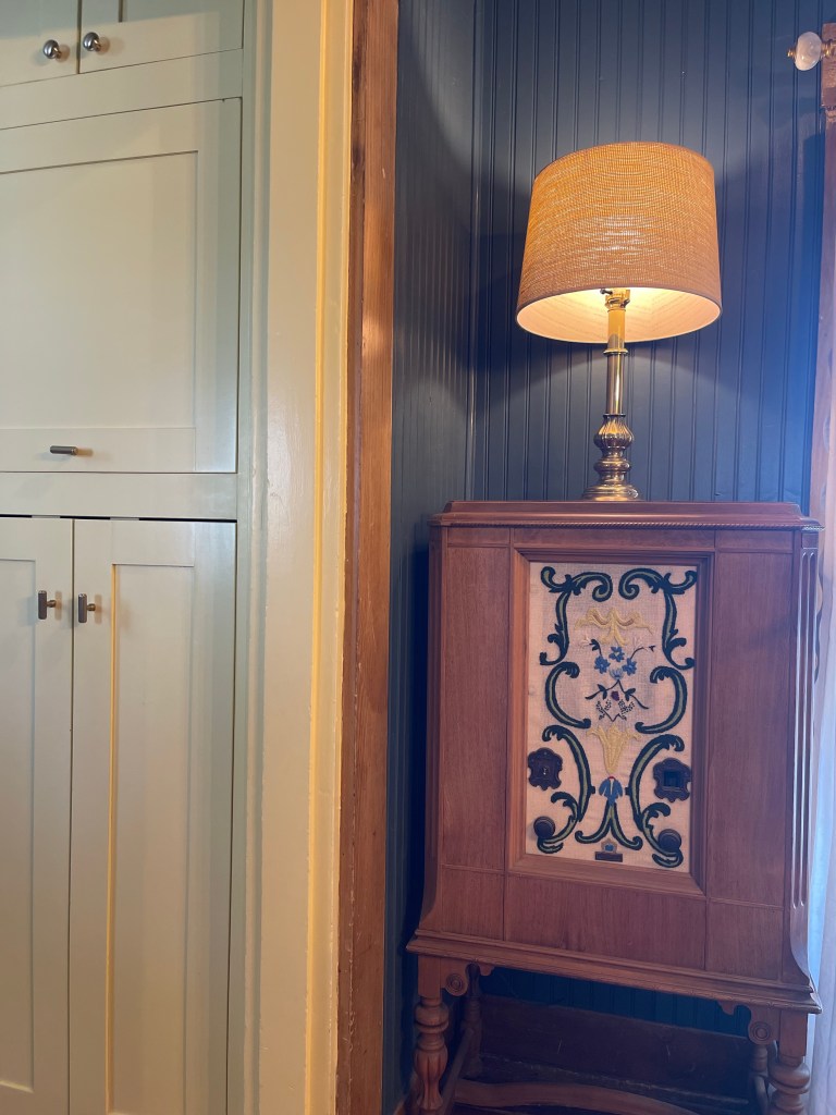
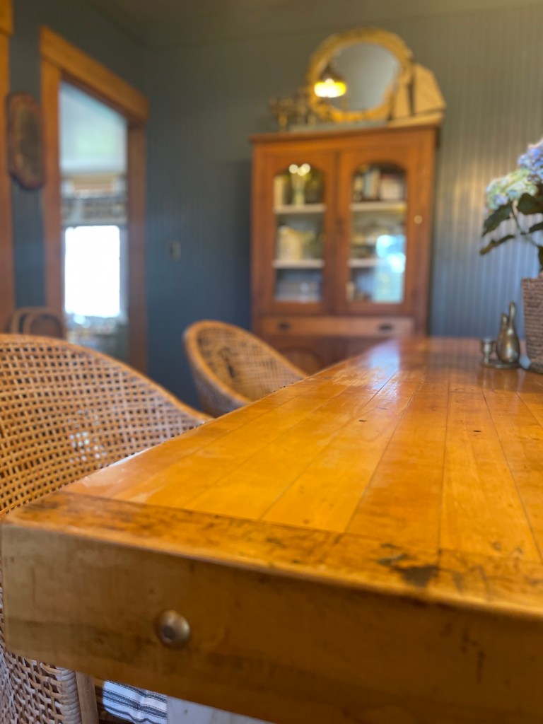
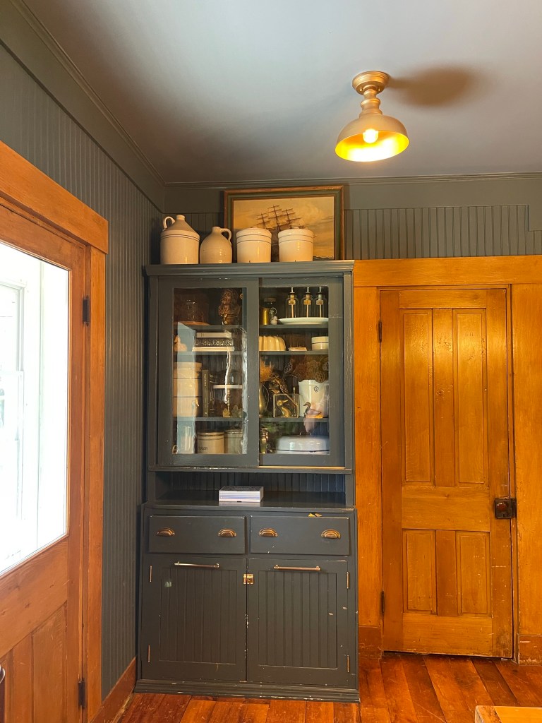
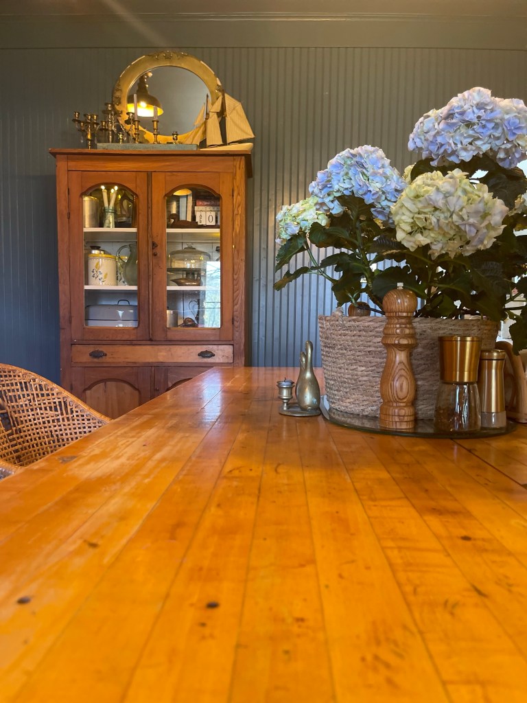
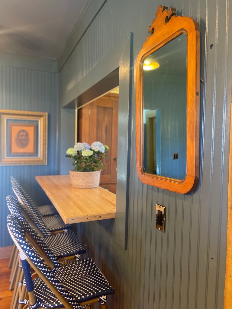
To unify the space more, we painted a very special piece that’s dear to my heart, my Aunt Kelly’s hutch. Since a little girl I have loved this piece. We wanted to make it look as if it were a built-in without actually being a built-in. We chose again, a very similar color but slightly darker, Marquee Behr Paint, Submarine Gray, from Home Depot.
For a more cohesive look we added bead board to the bottom doors, cleaned up the drawer pulls and added new hardware on the piece.

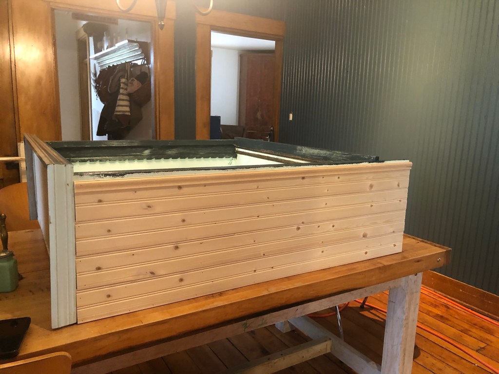
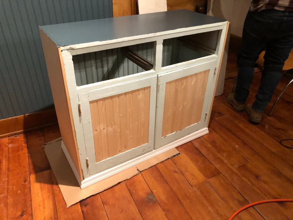
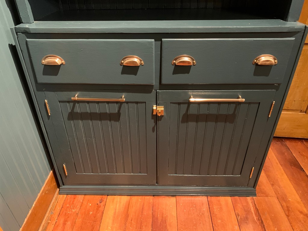
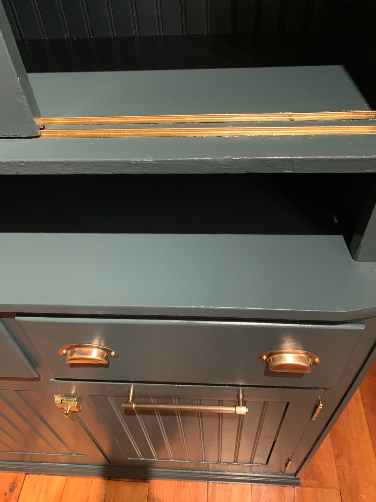
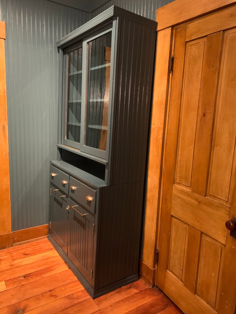
Now it looked one with the space and as if it had always been here. Might we add it fit perfectly in this spot.
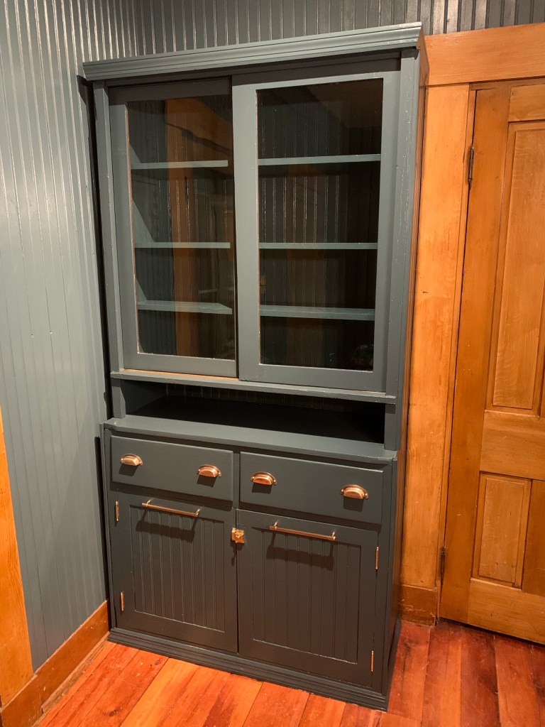
What a beauty.
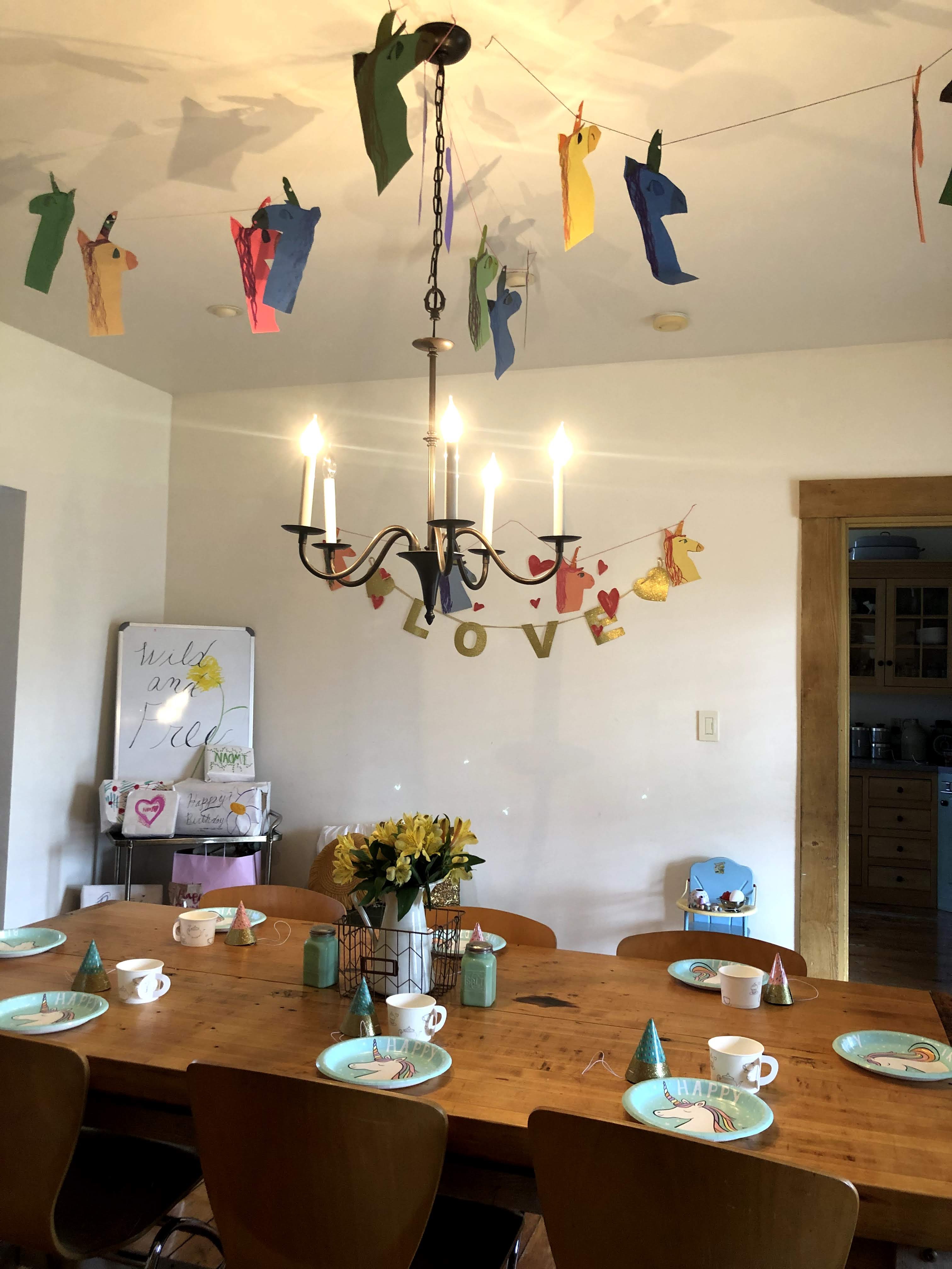
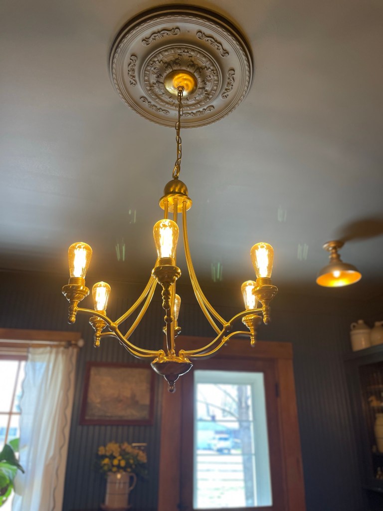
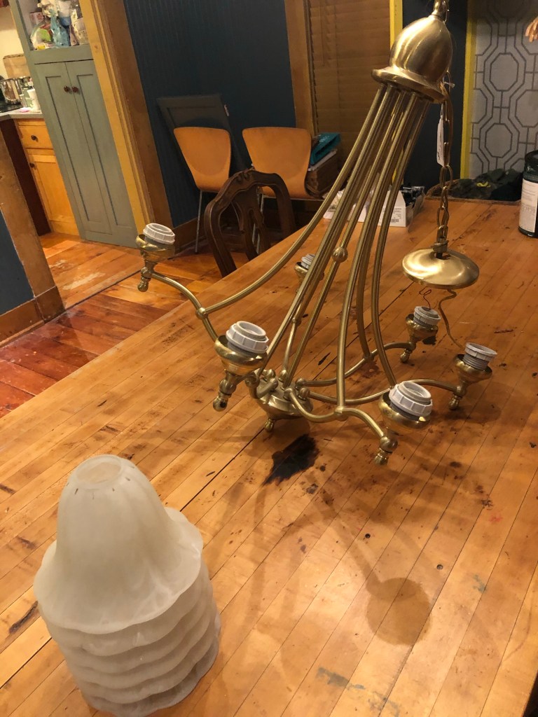
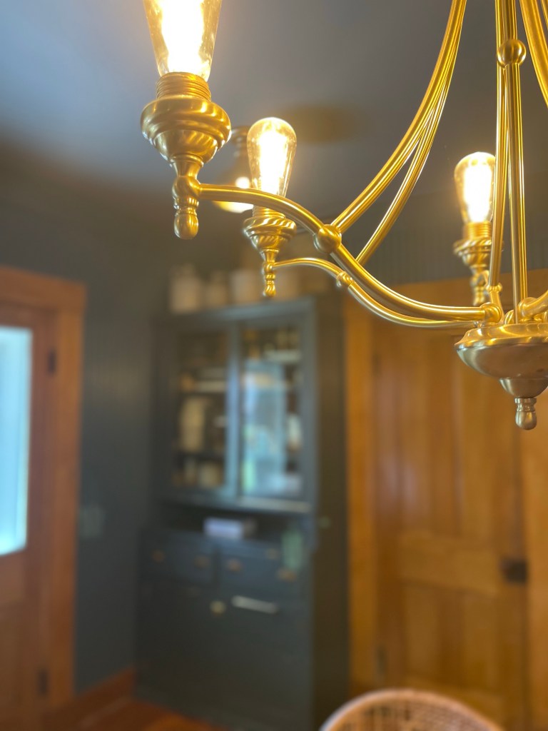
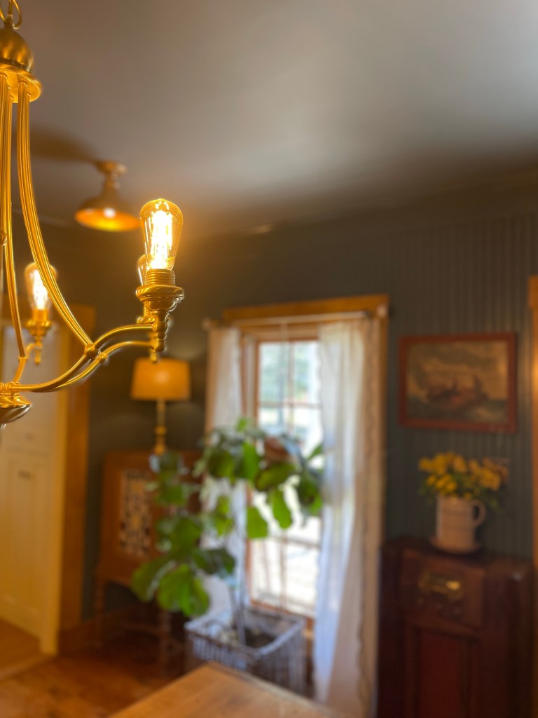
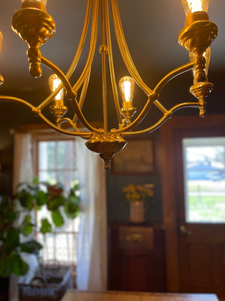
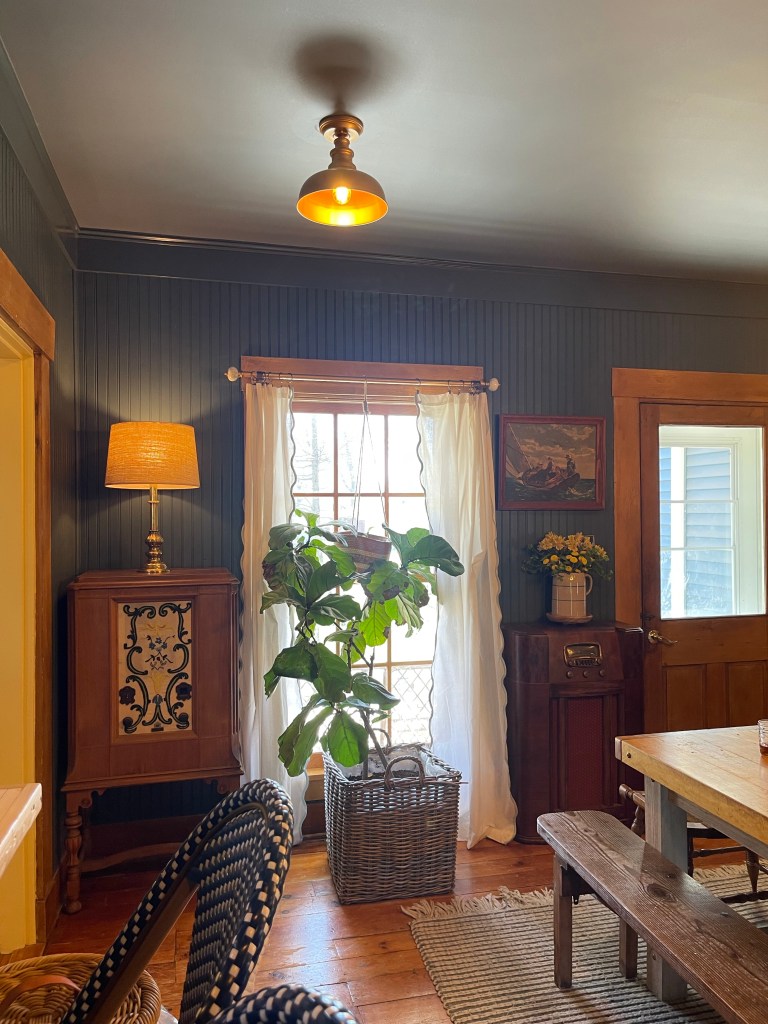
LIGHTING FUN
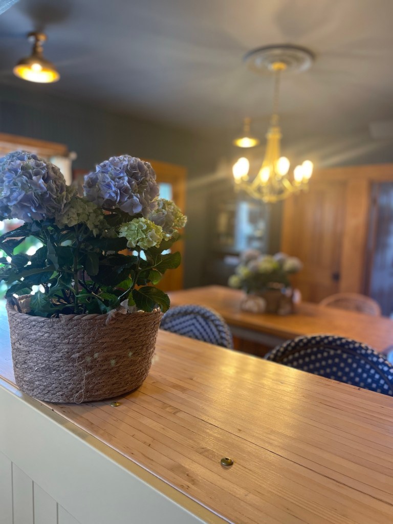
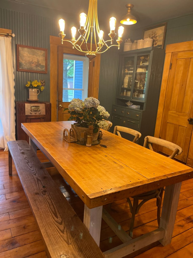
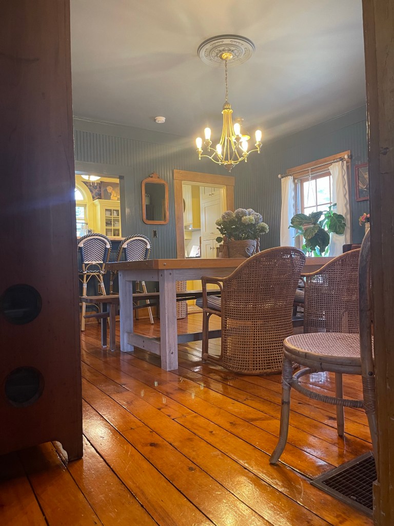
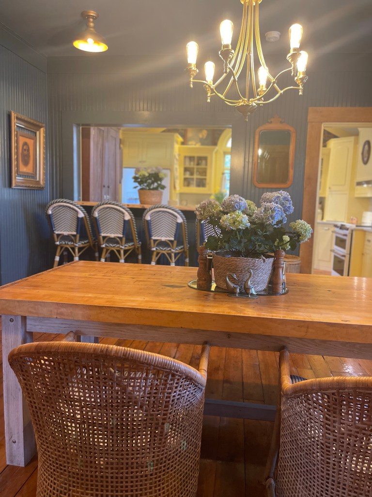
While you saw a sneak peek of this above, we had swapped out the chandelier. We scored this one at a Habitat for Humanity store for $20 bucks. We simply removed the glass laterns, painted the white lightbulb sockets brass and placed Edison bulbs for a simple upgrade. I originally had other editions I was going to make, but ended up nixing the idea for simplicity.
And it was all that was needed.
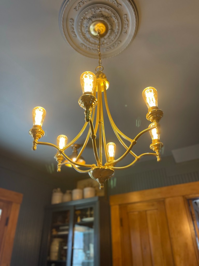
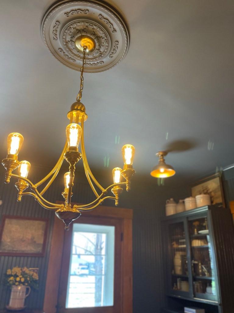
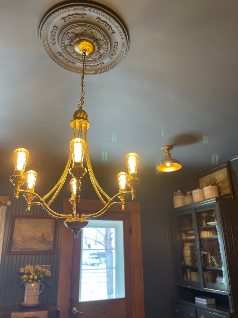
Due to the dining rooms location in the home, it only had one window and a glass paneled door to let light in. The room was fairly dark, but we didn’t have an opportunity to add more windows so we opted for additional lighting. We replaced the original can lights with small brass like lanterns. We would have preferred putting in antique ones, but at the time we were unable to find what we needed in a timely manner, and four matching ones at that.
FIXIN’ THE FLOORS
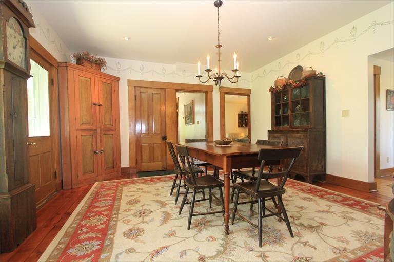
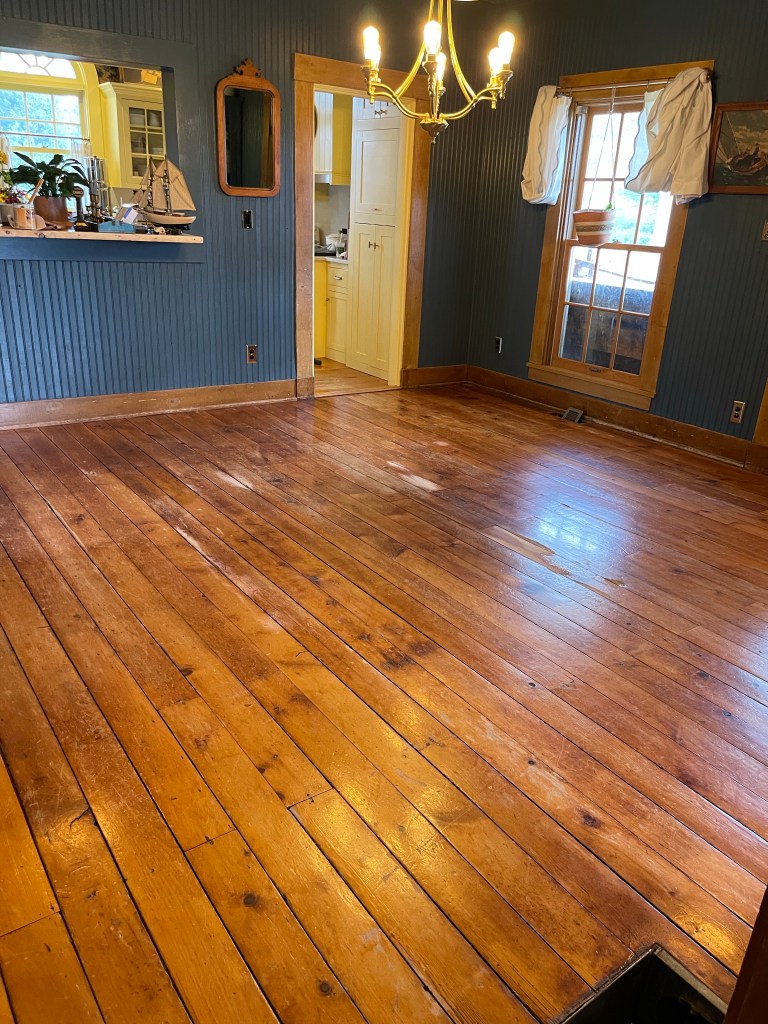
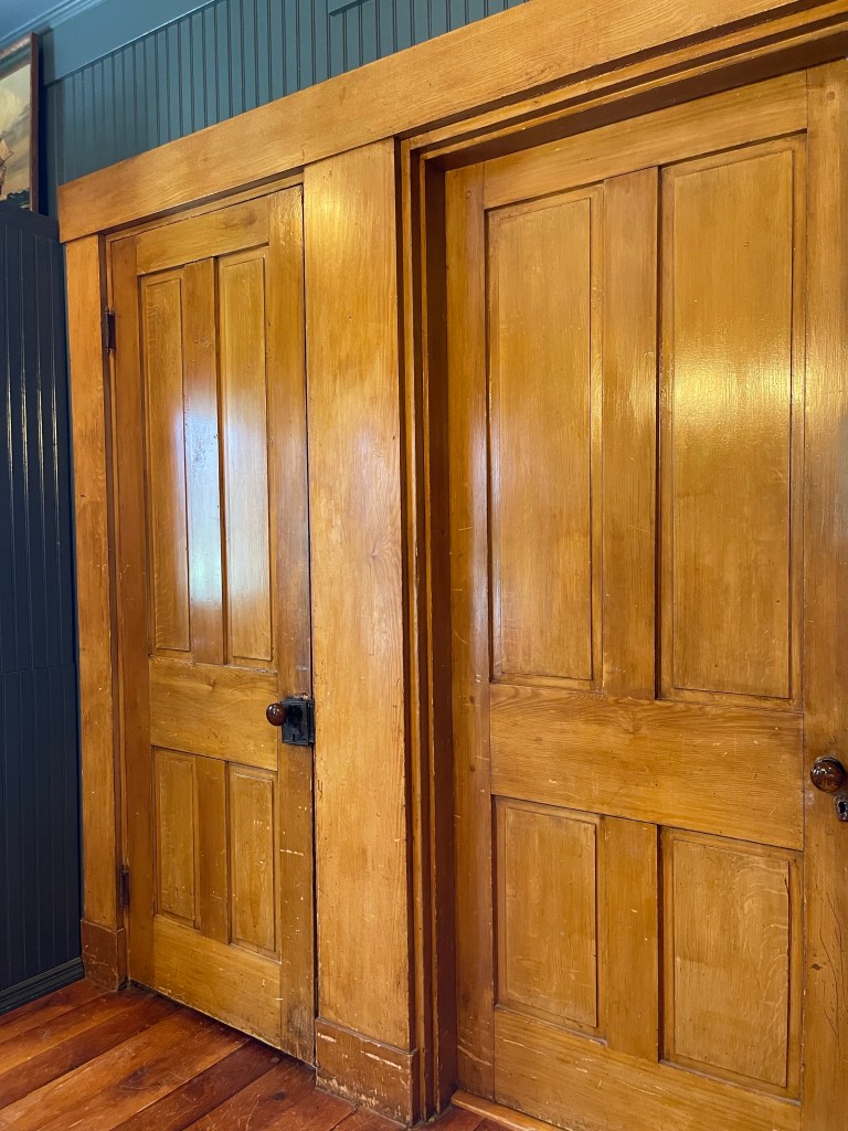
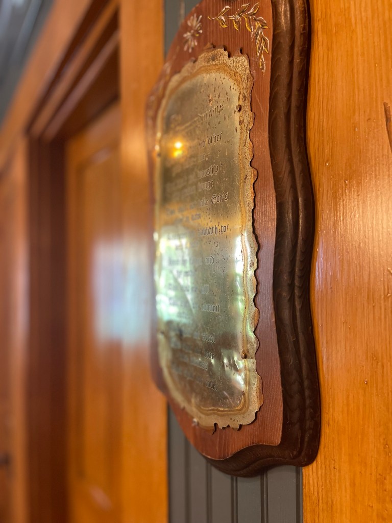
One of the treasures of this old home, was those original wide planked pine floors, doors and trim. We bought it with the foundational beauty already there, we enjoyably just got to add the extra pretty layers and detailing.
We didn’t have too much to do however. A simple clean up from all their wear and tear using Zinsser Bulls Eye Shellac in Amber. It was all they needed.
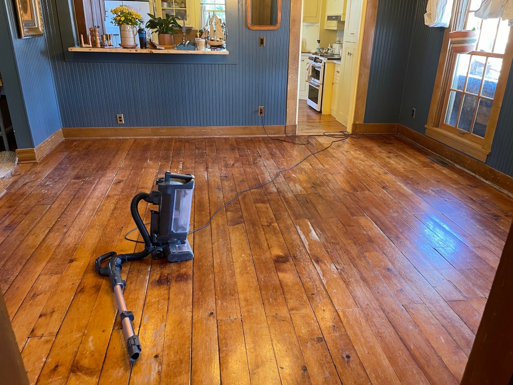

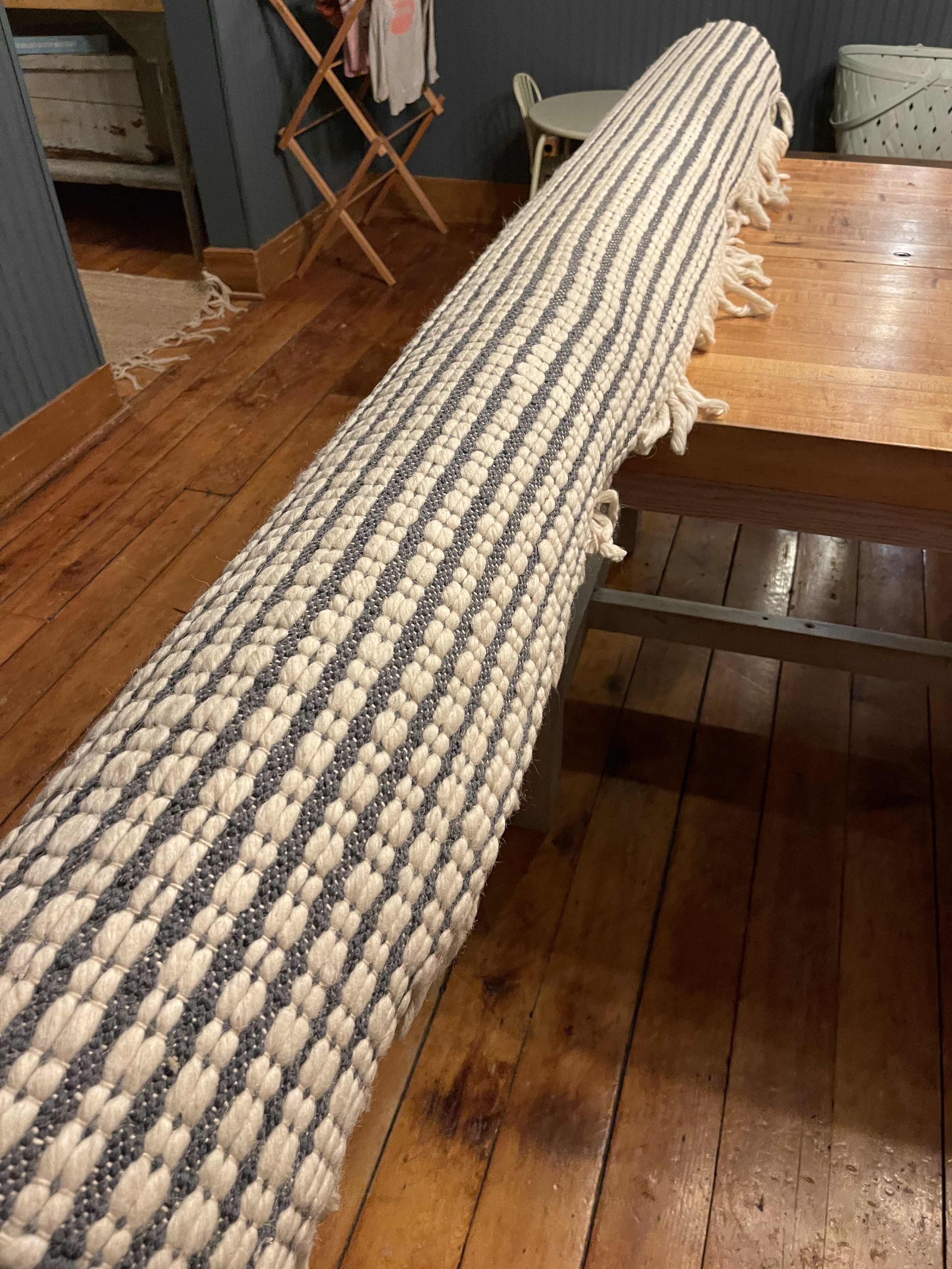
We felt we were really adulting when we purchased this rug from the beloved Target to protect these bad boys a little more.
TRIAL AND ERROR
We learned to not be afraid to try things. Sometimes what you think might work doesn’t end up being practical. We tested out many different things for a while working to get the function and use of the space just right.
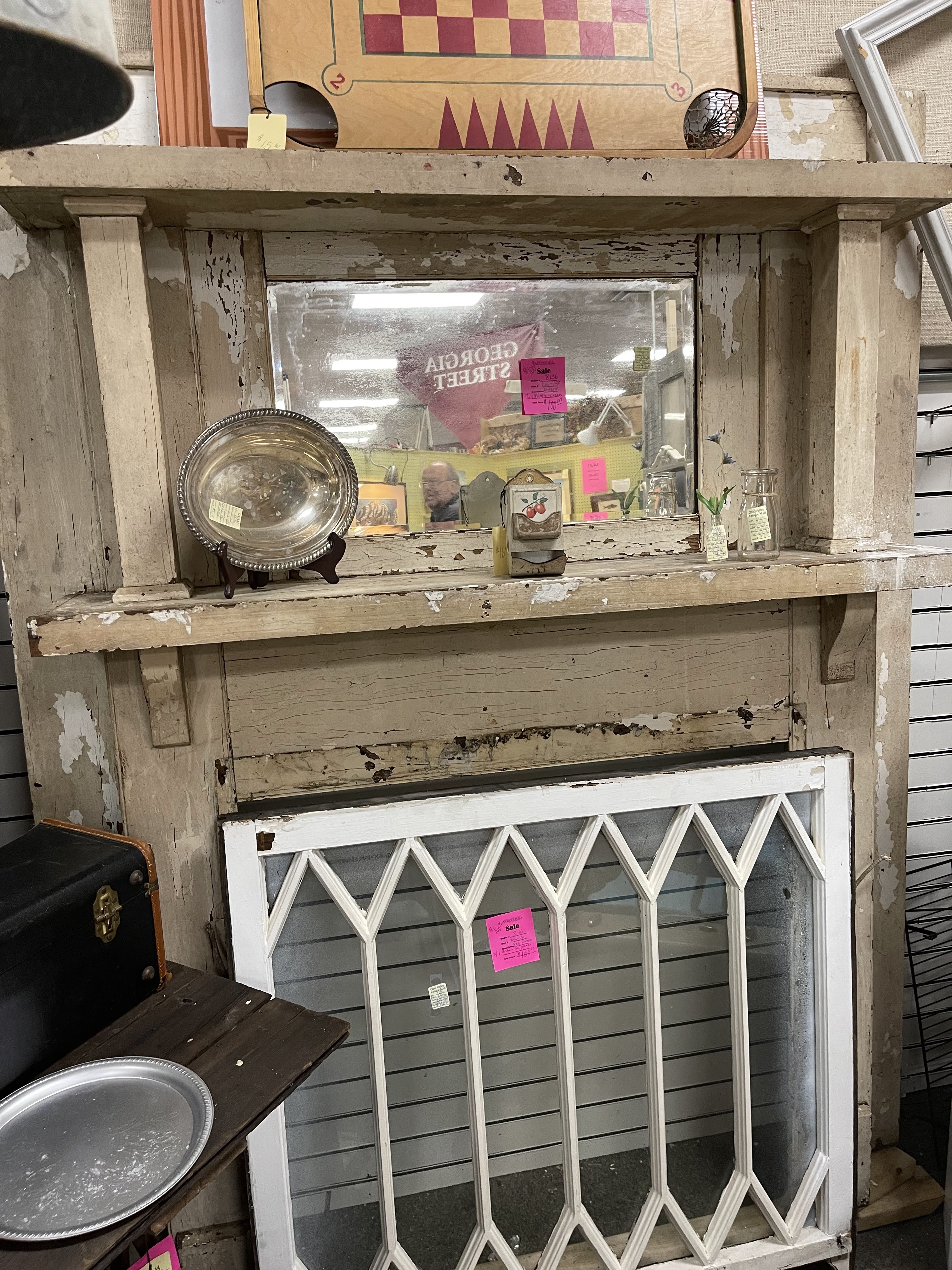
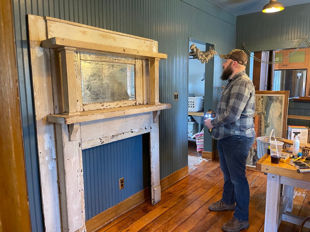
CHIPPY MANTEL?
We added a chippy mantel for a season we scored at the antique mall for just $100. We loved it.
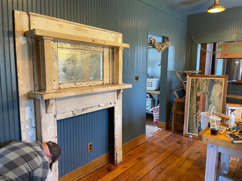
It was very fun to decorate, however, I don’t have any good photos of it because it was around the same time I suffered from a trimalleolar fracture and was living in a wheelchair for a period until I could learn to walk again. She sure was a beauty though.

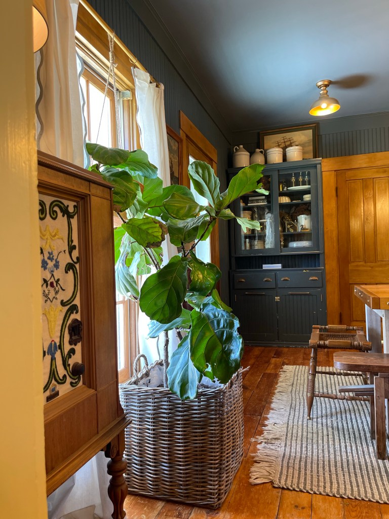
Over time however, we needed more storage so opted for another darling hutch to solve this problem. Hutches are just loads of character. Something about the old glass mixed with their gorgeous wood details and being able to style all your finds inside. True beauty wrapped in one package.

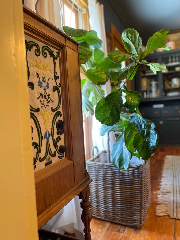
OLD RADIOS?
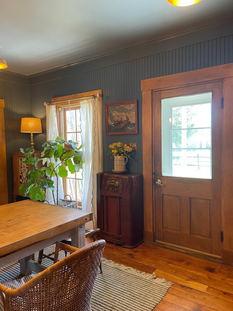
And then we tried these beautiful antique radios we fell in love with. It was snug and cozy. A his and hers radio collection. Mine with the beautiful embroidery on the left and Tom’s more masculine pick on the right of the fig tree. Beauty and warmth together.
THIS CHAIR OR THAT CHAIR?
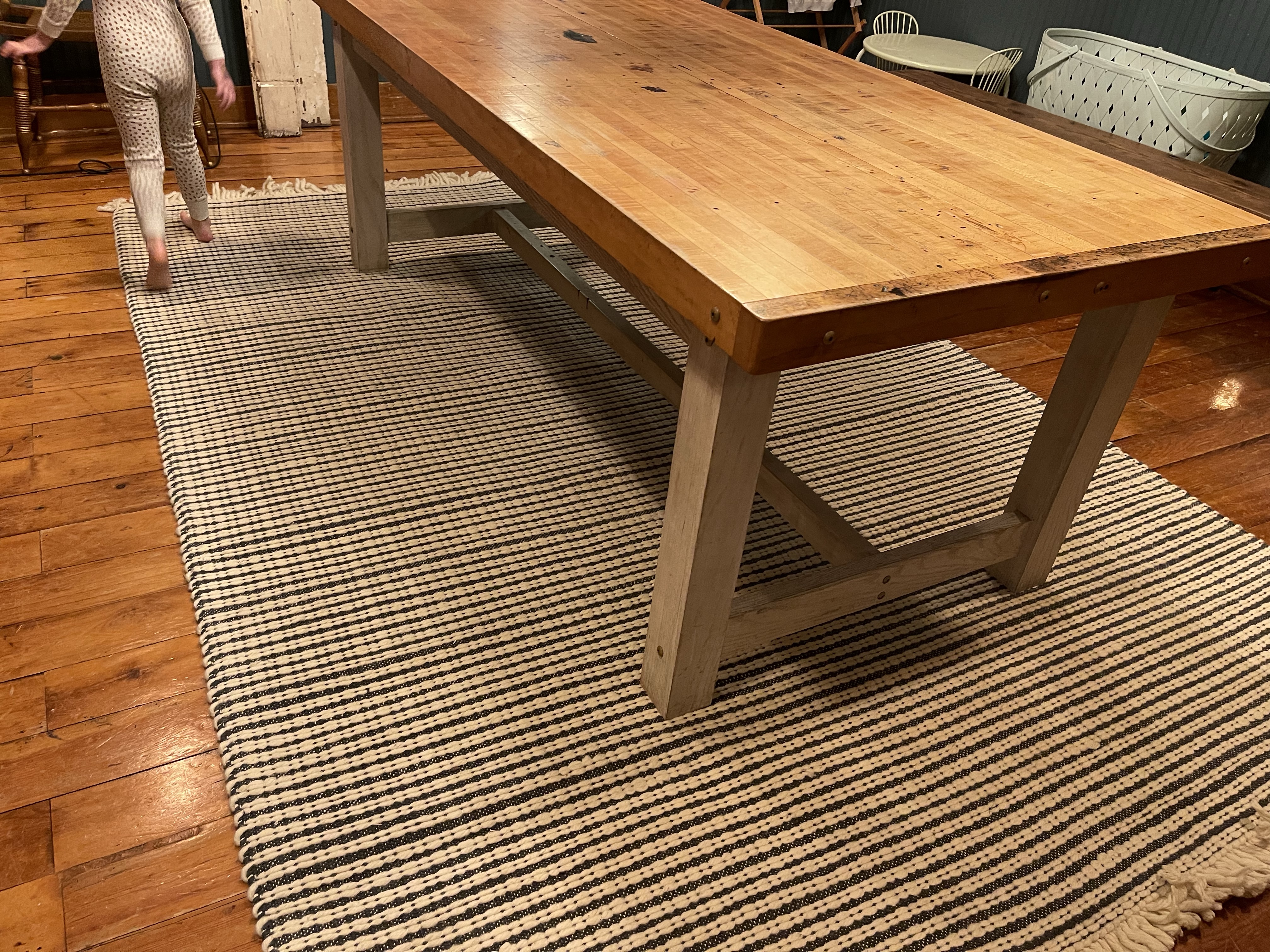
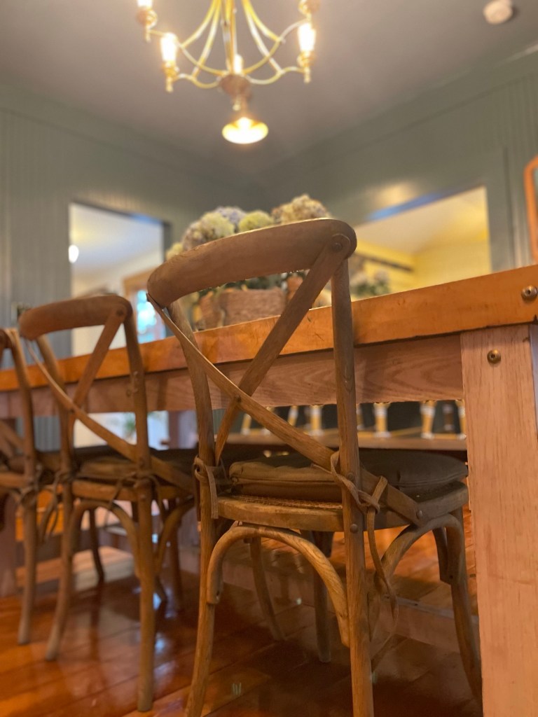
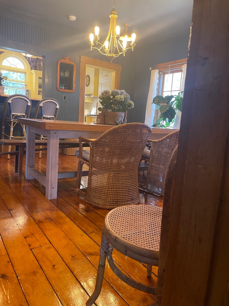
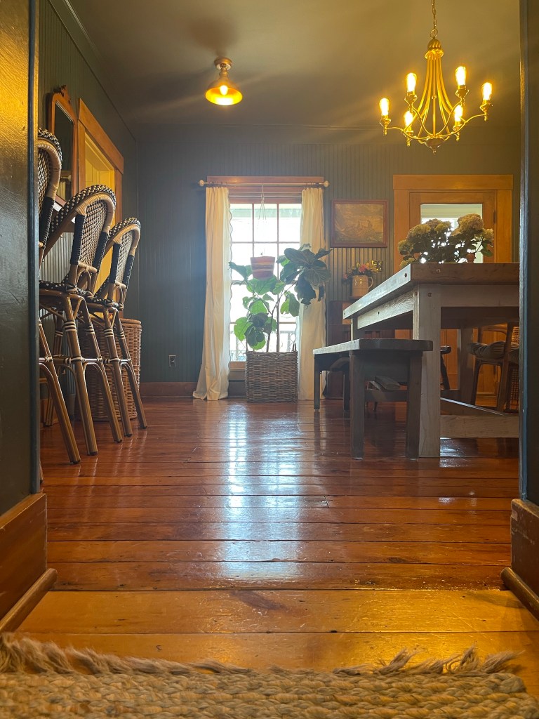
In addition we tried out different chairs as you will see when you scroll through the photos below. Some shots show two larger rattan chairs we purchased on marketplace and others show gorgeous wooden chairs we scored at the curb of a fancy restaurant in Alabama. Their toss out, was one of our greatest scores, and we just so happen to be driving in our truck that day thankfully. Those scores meshed nicely with the true star of the room, our handmade dining room table—which you’ll read about below.
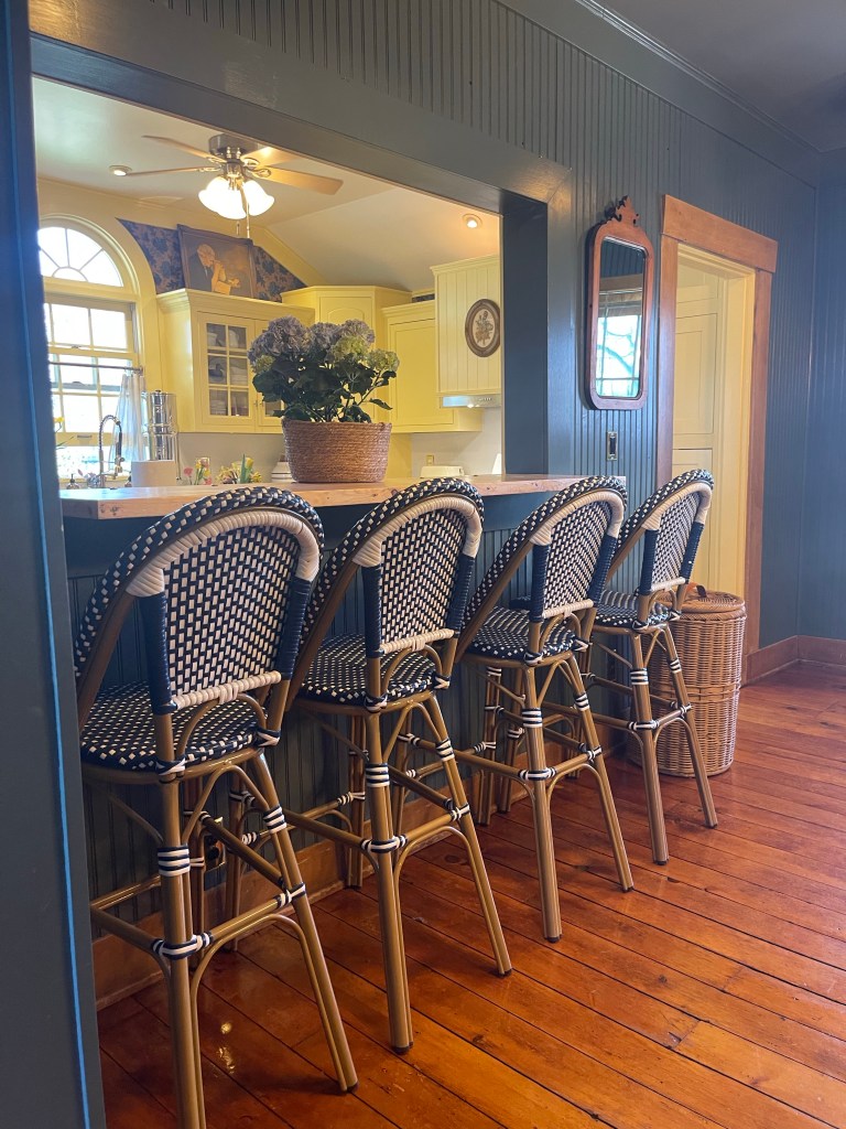
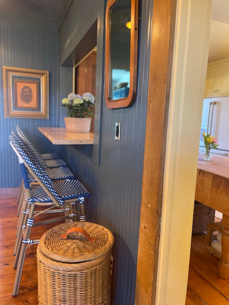
AND THEN WE FINISHED THAT BREAKFAST BAR
The idea that began this room with a bang—we completed. That endearing little idea that dared us to do it did indeed turn out as dear as we imagined it to be. Just confirming that opening up that wall was in fact the right choice.
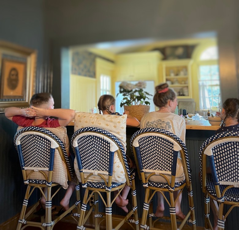
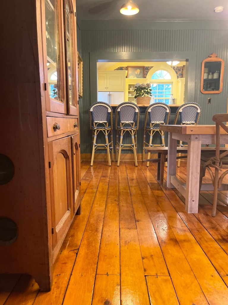
For the counter of it we used an old bowling ball flooring we found on marketplace. Paired with four resin wicker bar stools I’d been dreaming of for each one of our four kiddos.
Simply, adorable.
TO THAT FINAL LOOK AND ALL HER CHARM
What we wanted originally, was everything photographed as fresh as the day we completed it but, everything happened in pieces. Little spurts of time that we got another part done. It took us so long to finish the whole project in fact…(like a few years), that by time I actually felt it was good enough for photographing, some of the pieces were very well used. Even in need of a new coat of paint.
But if I could go deep for just a moment as we wrap this up—what an example of life these very things have displayed!? Little by little they have endured our hard use, yet stand, remarkably beautiful still. And now, we have the most beautiful assortment of which nothing is perfect. Things that were freshly restored or new, now having scars and dents. I believe, together they tell the story of life. Gathered together in a home, these things make the most beautiful displays. In essence, this period of time waiting to complete this project, taught me to love these truthful story tellers that developed in the meantime. They are real in all their imperfections and I do quite like the story they tell. Nicks and chips of paint. I now see their lesson here. We had been creating our own antiques, and its revealed to me that a home weathered with time makes the homiest of homes.
Keeping all that in mind, enjoy the finished styled room with...well…a little more love added to it.
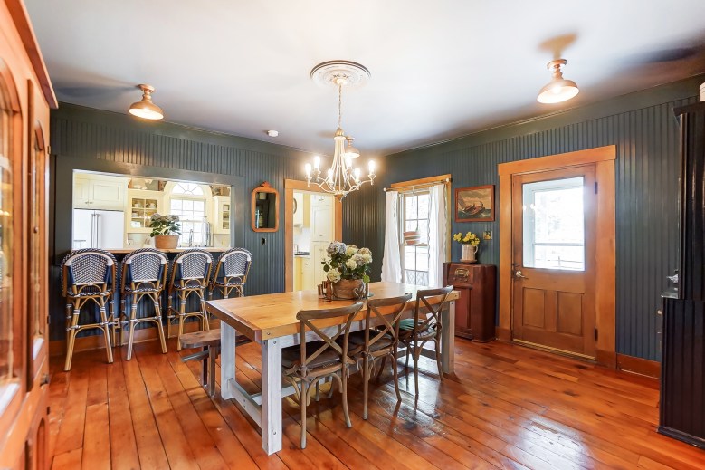
THE FINISHED WORK
Our take on a nantucket inspired dining room. From the color, to the textures and antique choices. To the nods of nautical—without overdoing it. A few collected ships with models and artwork to create a timeless, collected look. In the end, our gathering of well loved goods made this quaint center of our home a place you want to stay.
It took time, muscle, sweat and love to build this winsome space. Many antiquing and thrifting trips. Marketplace hunting. Dreaming and gathering. Our well-used center of our home did undoubtedly meet all of our needs.


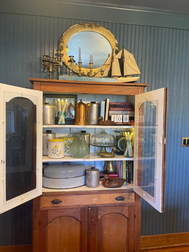
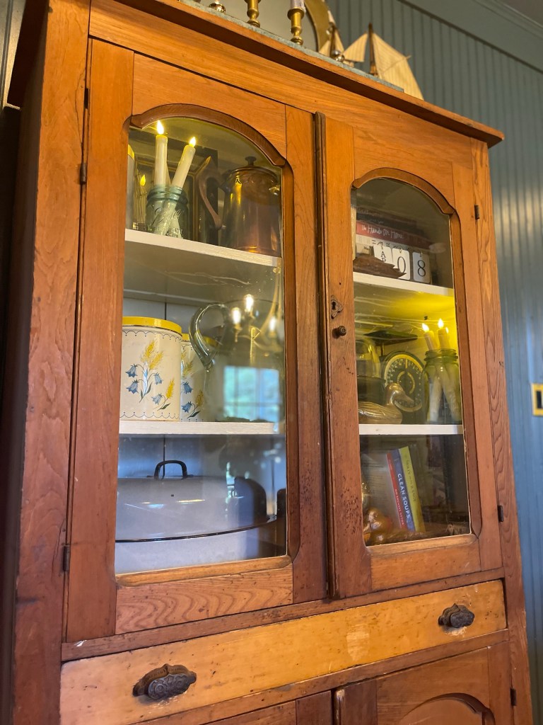
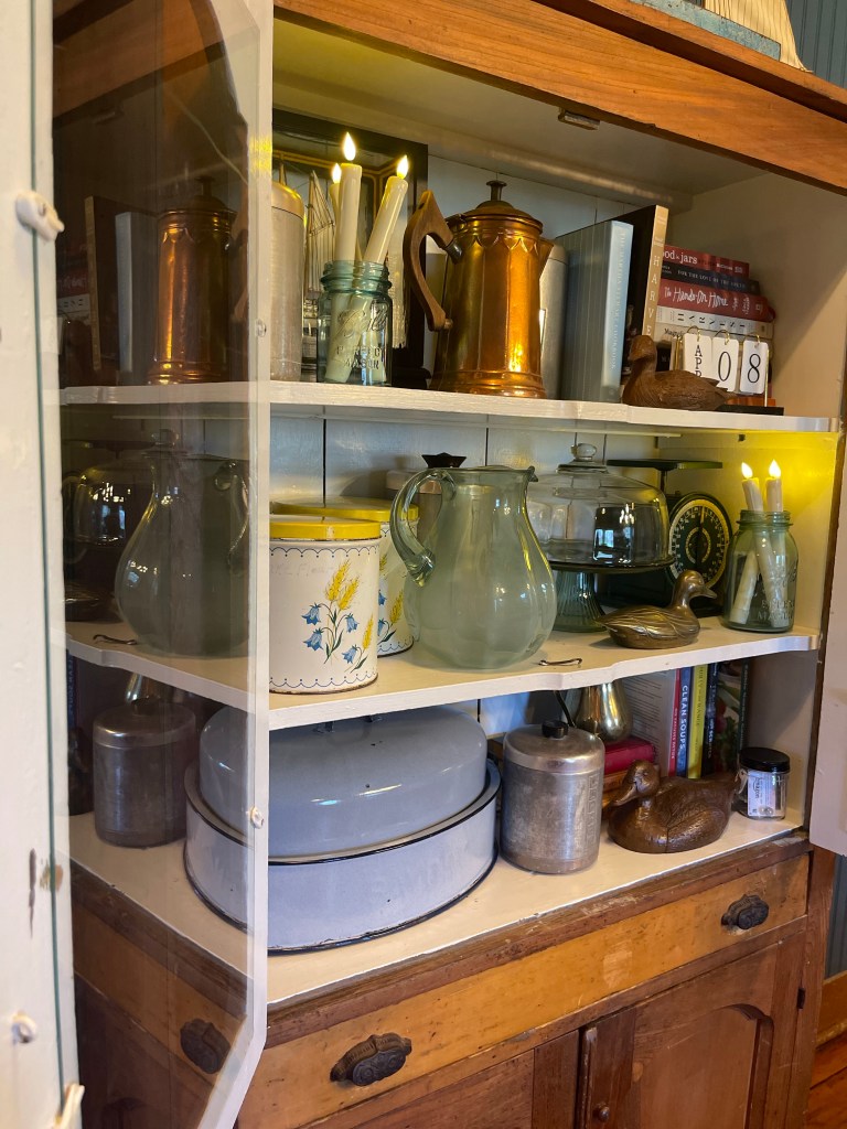
THE STYLED HUTCHES
Styling the hutches were of course a fav. Getting to pull what we had collected for some time from those boxes and put them in their homes just felt right. We utilized a combination of different textures, finishes, styles and colors to feel wise and collected, but also to create a natural feeling of a lived in space. Just like we wanted.
HUTCH 1
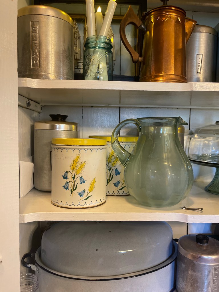
Displayed with scores of cake stands and glass domes, Jesus busts mixed in with some of my loved devotionals and bibles. Vintage bundt pans, an array of pitchers and vases, along with other unique finds was a solid yes for me.
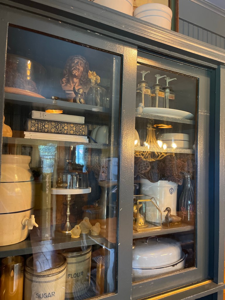

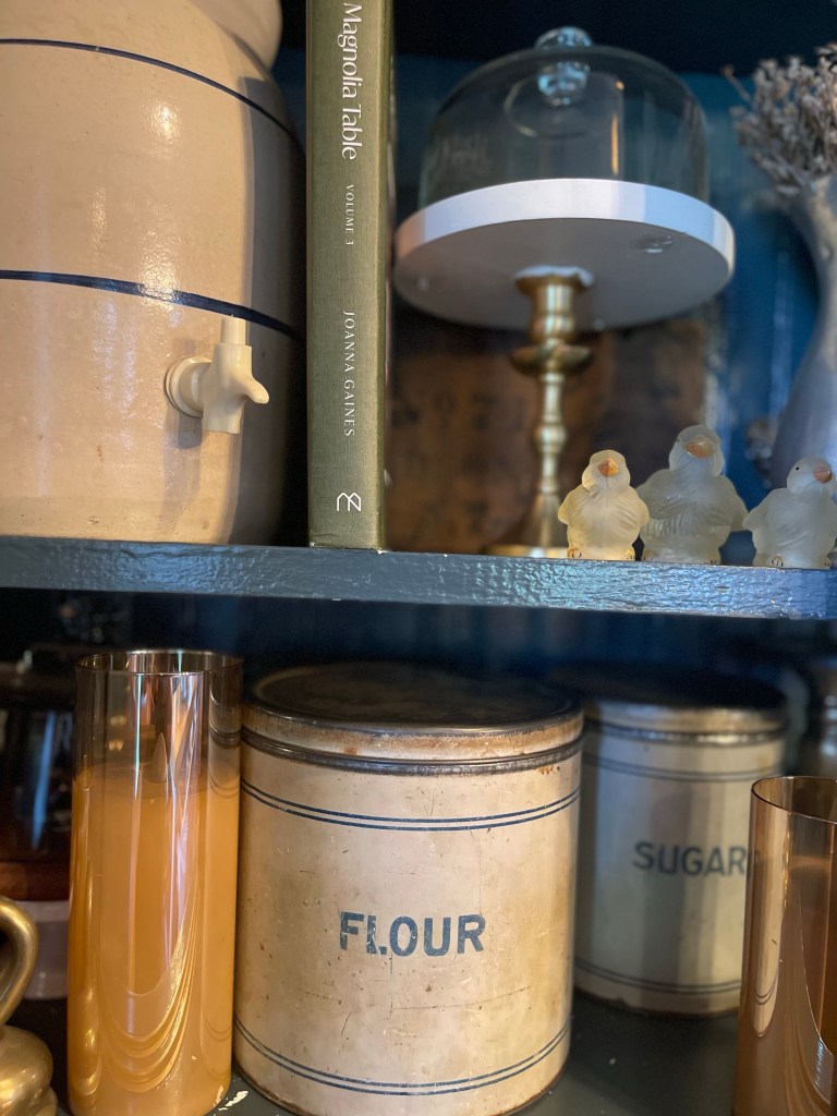


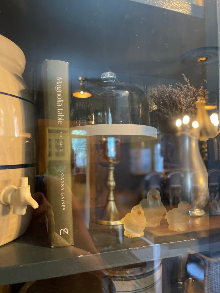


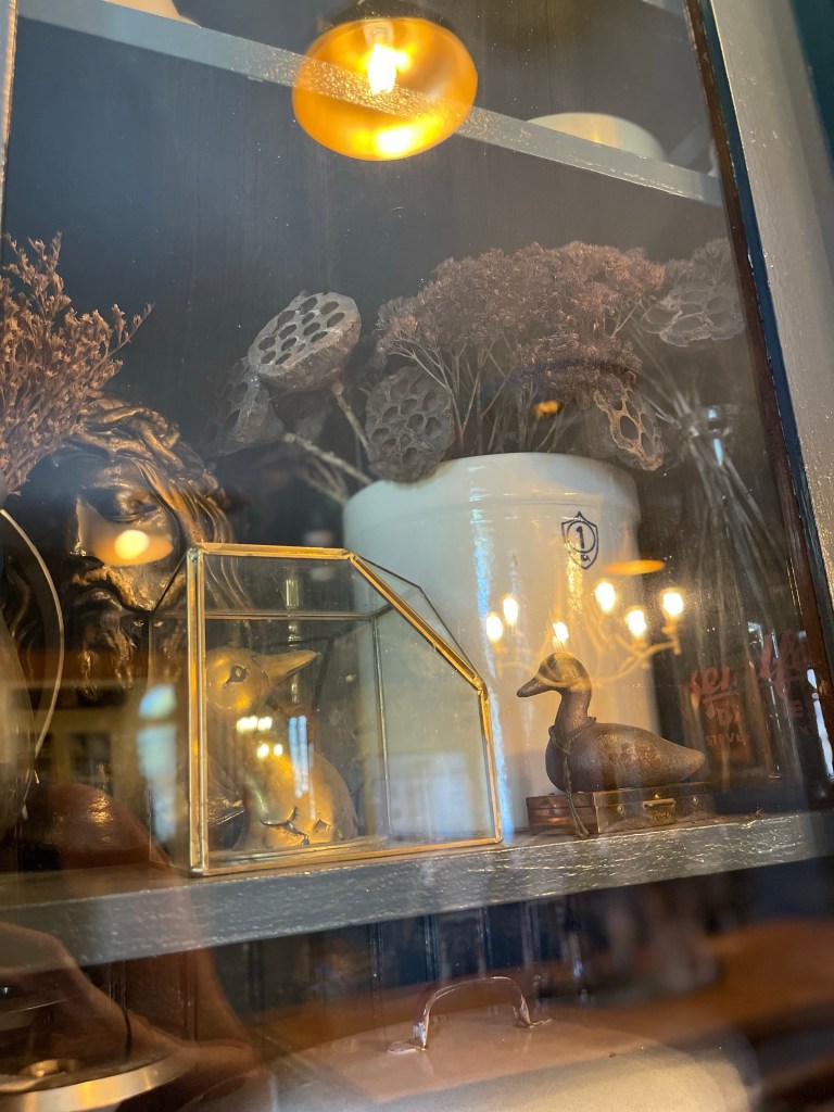
Crock jugs, antique beverage dispensers, and even some newer Magnolia drink dispensers created a cute toss up of old and new.
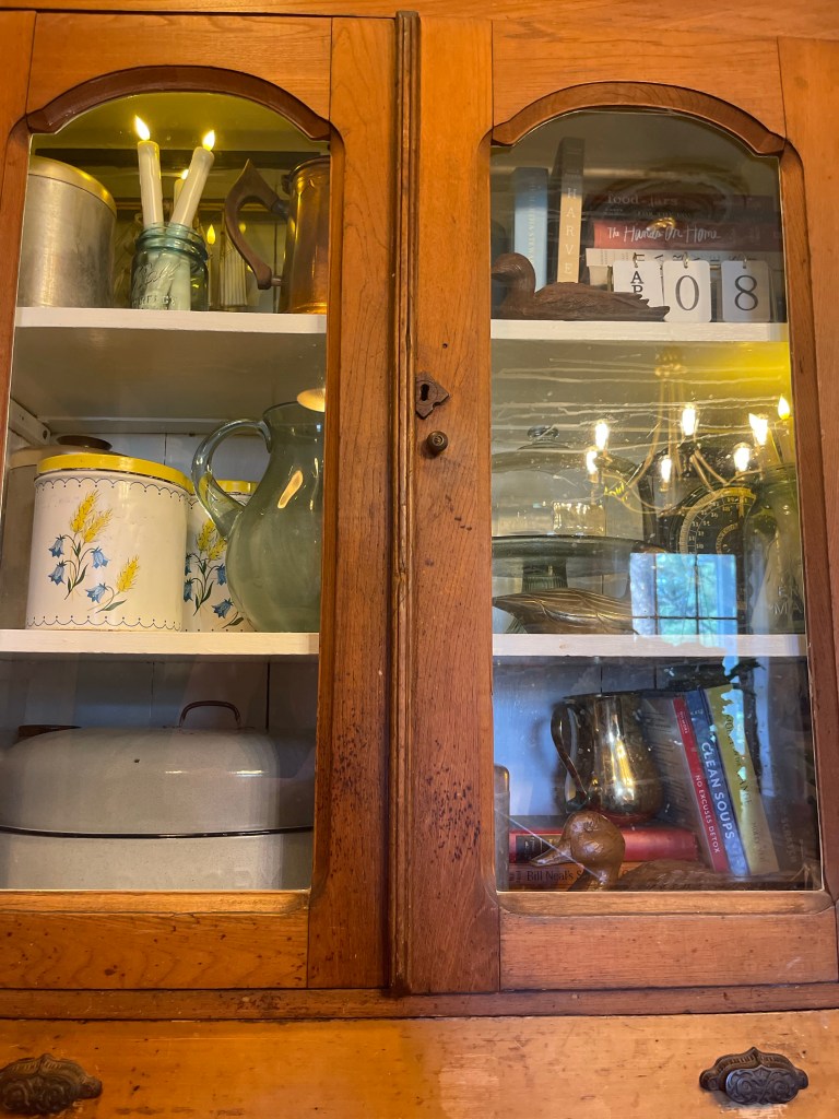
HUTCH 2
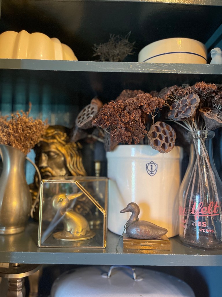
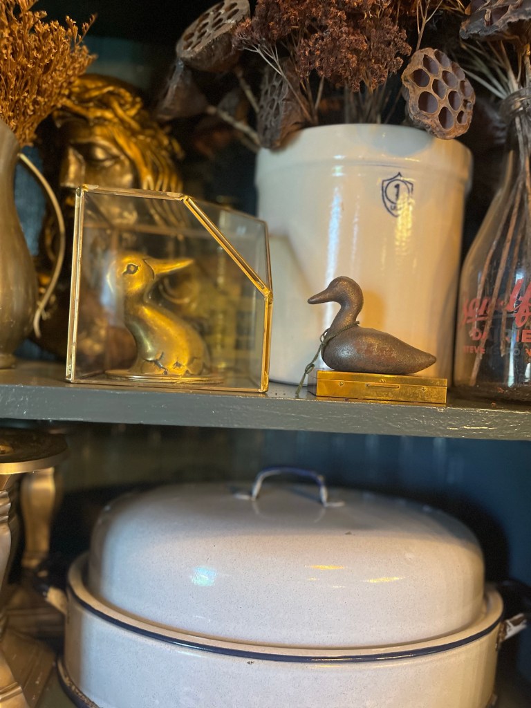
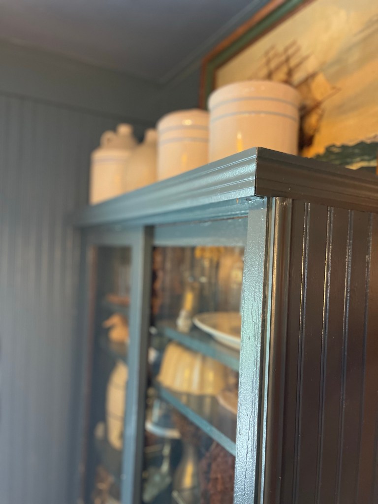
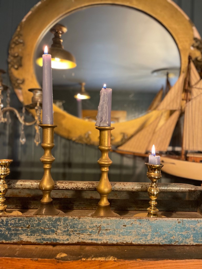
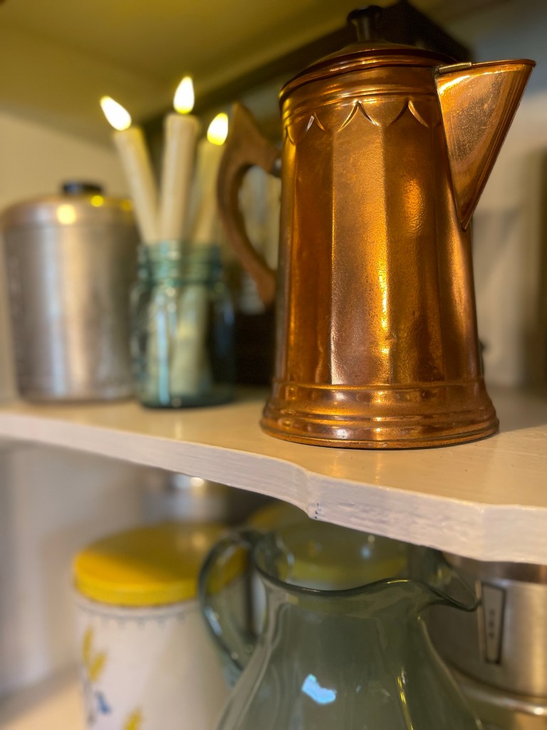
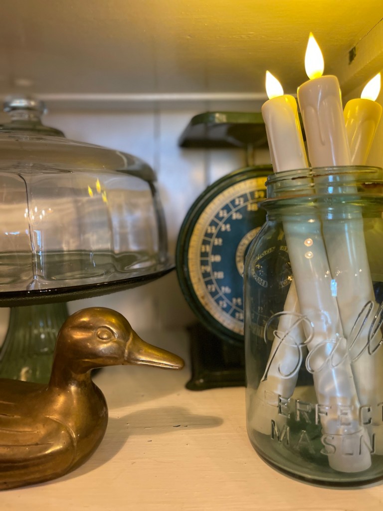
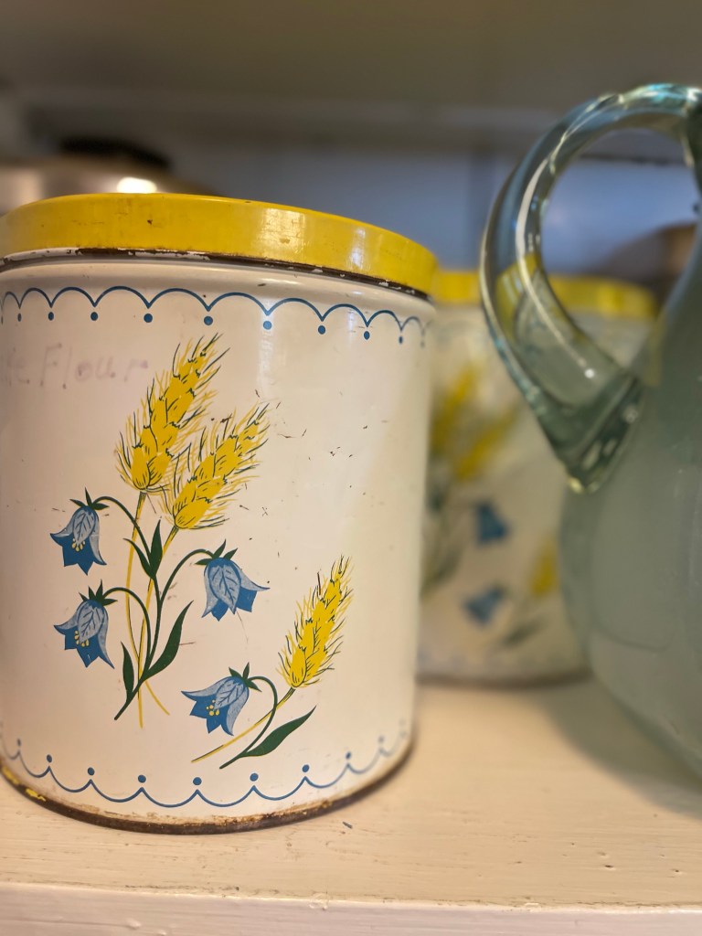
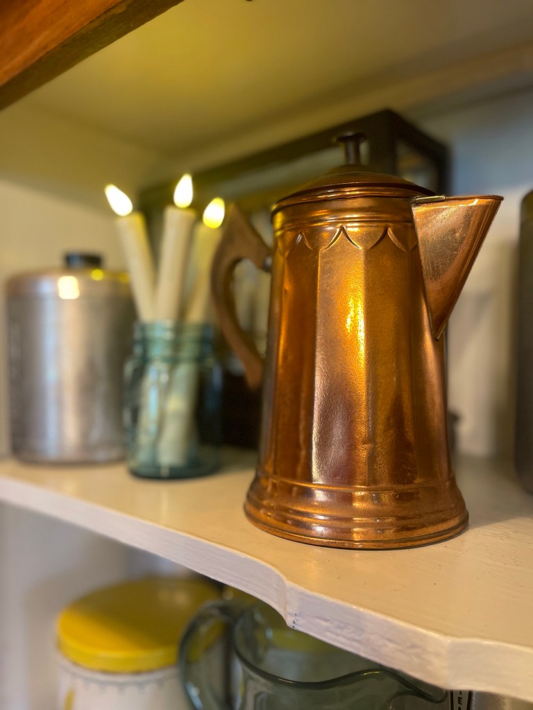
Pieces styled with a mix of metals from copper to brass and silver. From collected canister collections marked with love and age (that also served as smart storage), to illuminating the space with hues of blue candles and (battery operated ones) inside hutches—made our dining room space delightful.
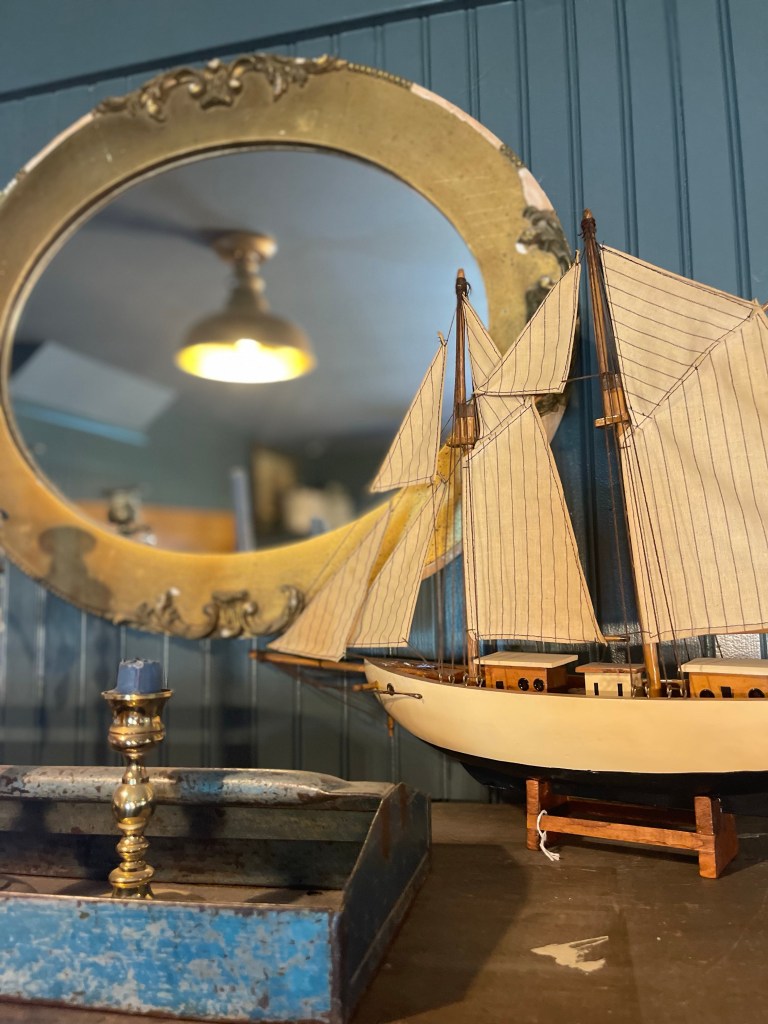
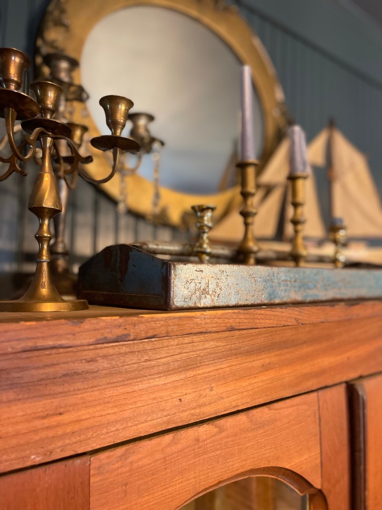
Continuing on with this child like dreaminess that I can’t get away from—let’s talk model ships. My fascination with them started with the movie Hook in 1991 that my sisters and I watched over and over. The ship in a bottle in that old home had sowed a love for these babies in my heart from a young age. Who could forget cute old Tootles?

Are you feeling the warmth?
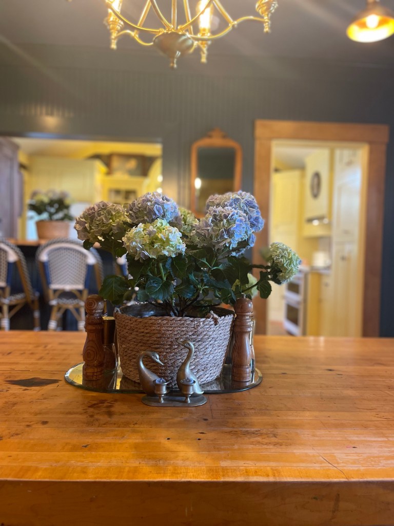
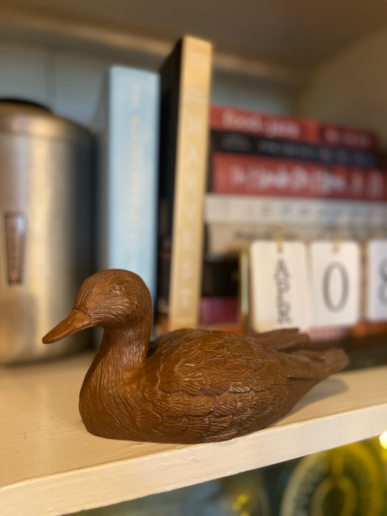
In addition, mixing in my collection of beautifully handcrafted wooden and brass ducks throughout. One could get lost in wonder admiring it all, or maybe just me?
Oh, the mighty fine details.


ADDITIONAL DESIGN TIDBITS FOR FINISHING A SPACE
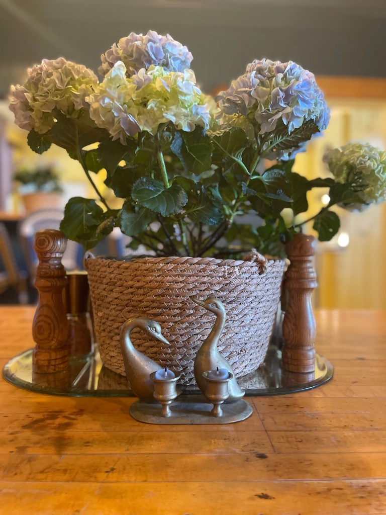
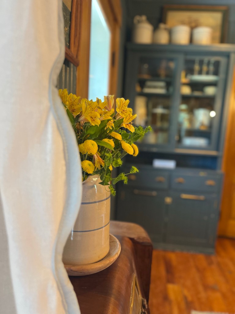
USE THE FLORALS & PLANTS
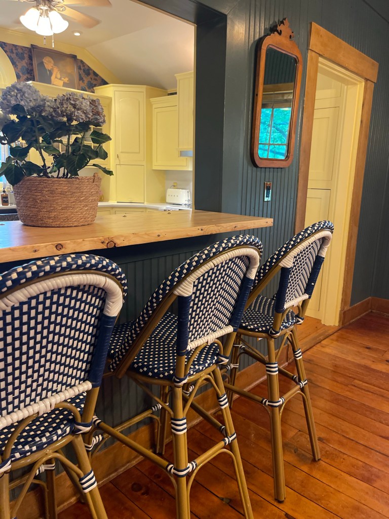
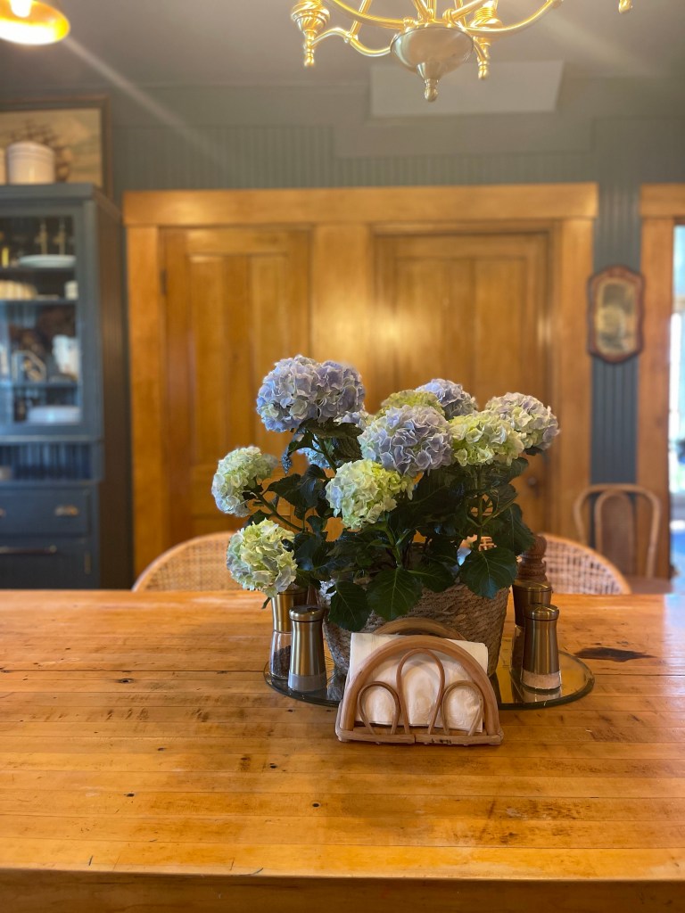
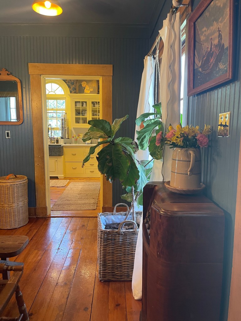
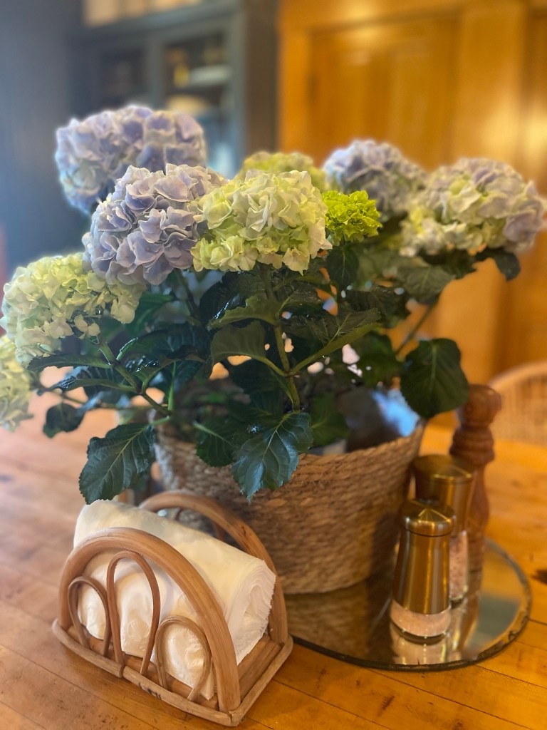
From fig tress, to your weekly floral cuts, to hydrangeas…these babies add that special touch.
UPGRADE THE GARBAGE CAN
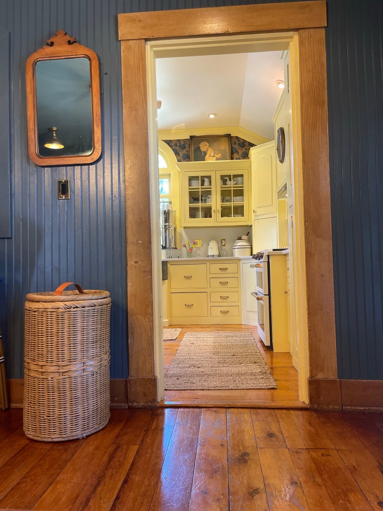
You won’t regret the upgrade aesthetically with this wicker trash can.
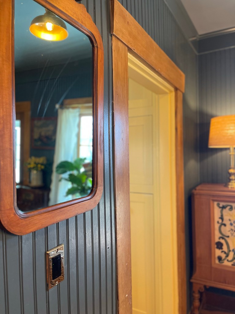
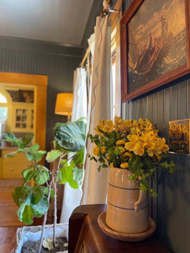
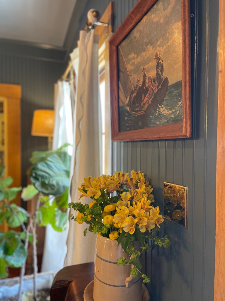
CUSTOMIZE THE OUTLETS
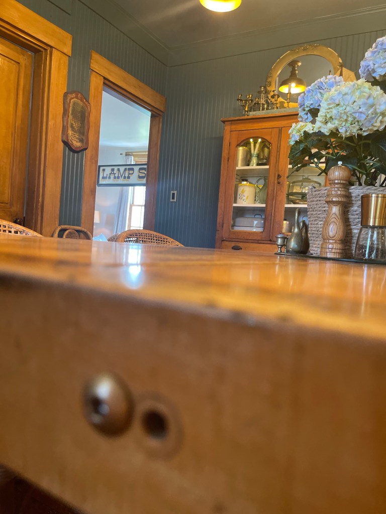
Elevate the electrical outlets and light switches to beyond the basic duo. I landed on black for the interior and a brass plate cover (image above). A simple statement that stands out and looks timeless.
USE MEANINGFUL PIECES
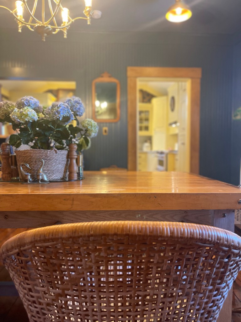
Our dining room table was handmade from my father, a skilled carpenter, who passed in 2019. He made it for us out of an old heavy duty work bench that was Tom’s father’s. An extra special build. A piece we will treasure for a lifetime. The cherry on top of it all, something from both of our dad’s. A build filled with memories of times past and ready for many more to come with our family for generations.
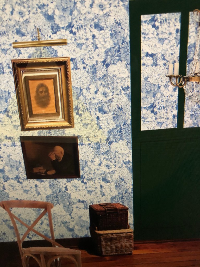
Not gonna forget to mention that beautiful picture of Jesus that I hold dearly that belonged to my father as well. I layered it up with a surrounding gold frame to emphasize it more.
ADD DETAILS THAT SPEAK TO YOU
My heart leapt with joy finding the painting below when antiquing for a price I could afford. I admire everything about it. For me this painting and the other small nautical nods in the space, keep Jesus’s many stories on the water and on the sea, present in my heart and I love that. If I’ve learned anything in my walk with Christ, it’s that we too are as forgetful as those Israelites. These little reminders of Him keep His miracles present in my life and mind on a daily. Sort of a memorial to be remembered. To admire and aspire towards.
DO THE COLORS IN TOUCHING ROOMS
While this won’t always be the answer for every space that touches, in our particular set up it was.
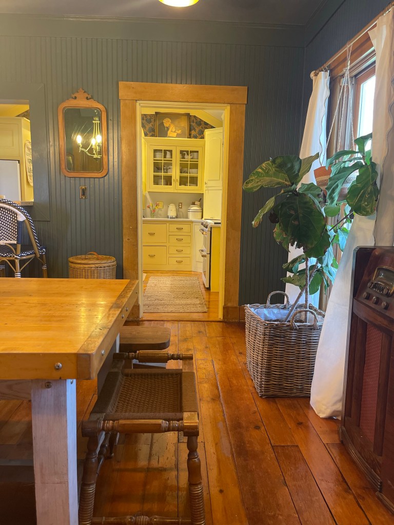
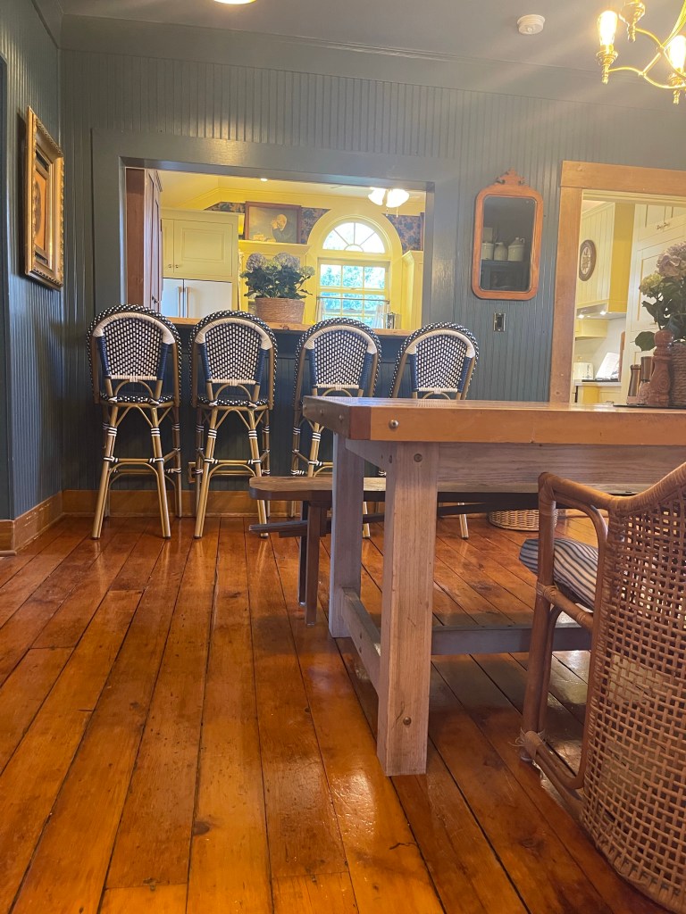
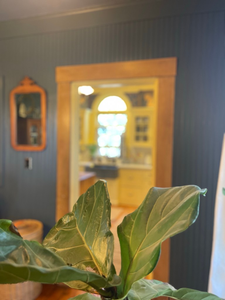
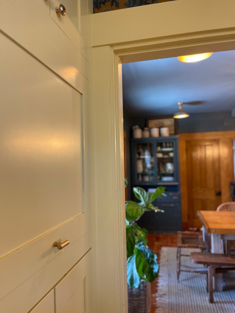
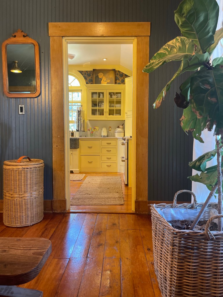
You can see below, that the yet to be revealed kitchen is making a sneak appearance.
In all fairness, it must be shared a little in order to show the accomplishing design of the two rooms existing together. Two different colors working in balance. Harmony? Yes. Cohesiveness? Yes. It’s something quite lovely. Bright and cheery against the dark nantucket dining room. Those daffodils peaking with happiness and joy. They seem to say to me, “Pleasant words are as an honeycomb, Sweet to the soul, and health to the bones.” Proverbs 16:24
We see you. We do. You cheerful room you.
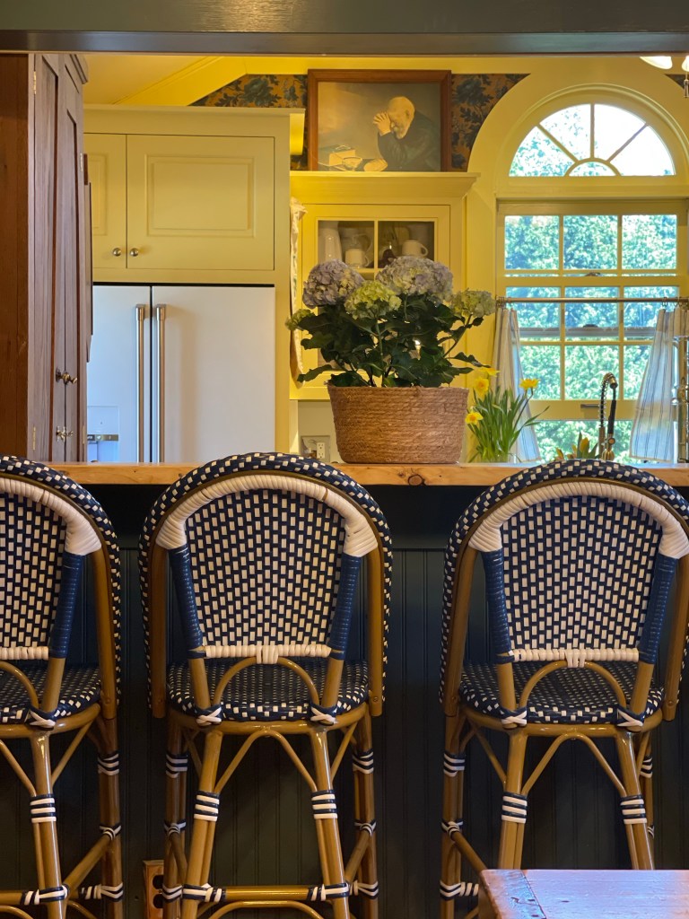
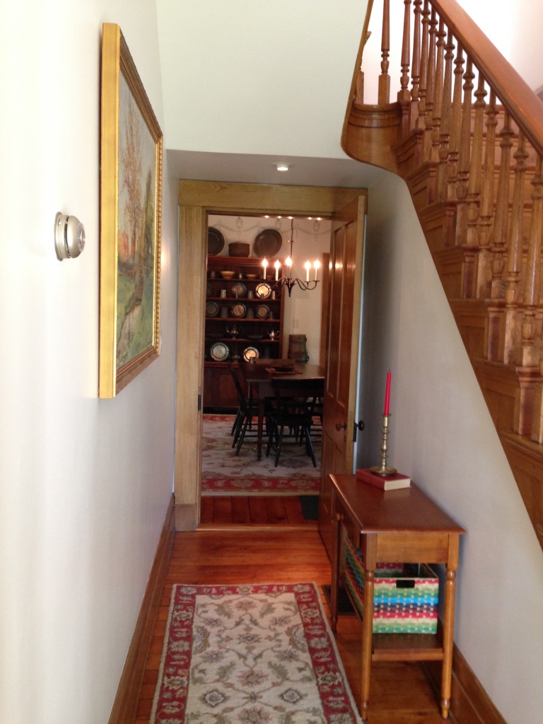
The one below, showing a snippet of the hall, and the kitchen working together quite nicely. A view I came to love. That beautiful wallpaper showing from the kitchen, picking up the hues from the dining room and pulling everything together. The rooms complimenting each other as if they were meant to be.
Just plan to stay tuned sweeties for all the official details on that kitchen—as you can see you’re in for a real treat.
The finished look kept only what was needed and allowed it to be spacious at the same time.
COMPLETION
That picture of something I had drew up in my mind now reality. The center of our home, our meeting place, our refueling space, the place to gather and connect became all we had wanted at the work of our own hands.
This project taught us a lot, as they always do. Many of you may recall who follow my blog, on my last two post, Home of the Tomcats and Curee Schoolhouse Design, we shared the story of making the very hard decision to depart from this very beloved home and yes, that beautiful dining room. Get the scoop if you missed it on those posts.
It was not this home’s fault that we wanted to leave, it was the desire for more land with the historical home. We were outgrowing our borders. While it was so hard to walk away from all these beautiful projects we completed, we knew it was the right time. This particular blog post is just yet another super cool project we did at our favorite blue and red historical home that will forever be in our hearts.
So goodbye again, you beautiful dining room you. You were all we needed you to be and more. We know your new owners are keeping you celebrated and loved, and I’m sure making additions of their own.
Till next time, may you all be living that home sweet home life and customizing away.
Keep following along as the much awaited Kitchen Reveal will be the next post on the design section of this blog. Until then, follow along on socials to see what’s happening, what’s cooking, what’s being built or where we are heading next.
Written by Bethany Curee, God’s Daughter – Freckled & Free
